

BRAND IDENTITY / BRAND EXPRESSION SYSTEM / BRAND STATIONERY DESIGN
Data Analytics Technology Branding Case Study
Project background: Based out of Texas, USA, CX Data Labs was founded to bring a new and holistic approach to data technology and analytics needs. Their mission is to further this craft by providing customized strategy execution services. The company principals have been decision makers decision-makers in large global fortune 50 companies which gives them a unique perspective to help catalyze customer experience, data, analytics, or technology modernization journeys. With a client-first approach, they use their diverse backgrounds to bring forward solutions that can be easily adopted within organizations. The founder, Ranjith Raghunath approached Arabella Design to design a unique and minimalist brand that would convey what the startup is all about.

Brand Archetype
The Magician: CX Data Labs
The Magician strives to make dreams come true. They can take people on a journey of transformation through the experience of a magical moment. They believe that we are limited only by imagination and defy the common belief of the laws of reality to lead us to a better future. Magicians have a thirst for knowledge and they use it to show their vision. They're the kind of people who promote the advancement of the world, thanks to their knowledge and ability to advise and guide others.
Brand Look: Modern / Minimal / Confident
Brand Feel: Reliable / Best in the segment / Young / Problem Solver / Intelligent / Serious

Brand Identity Design
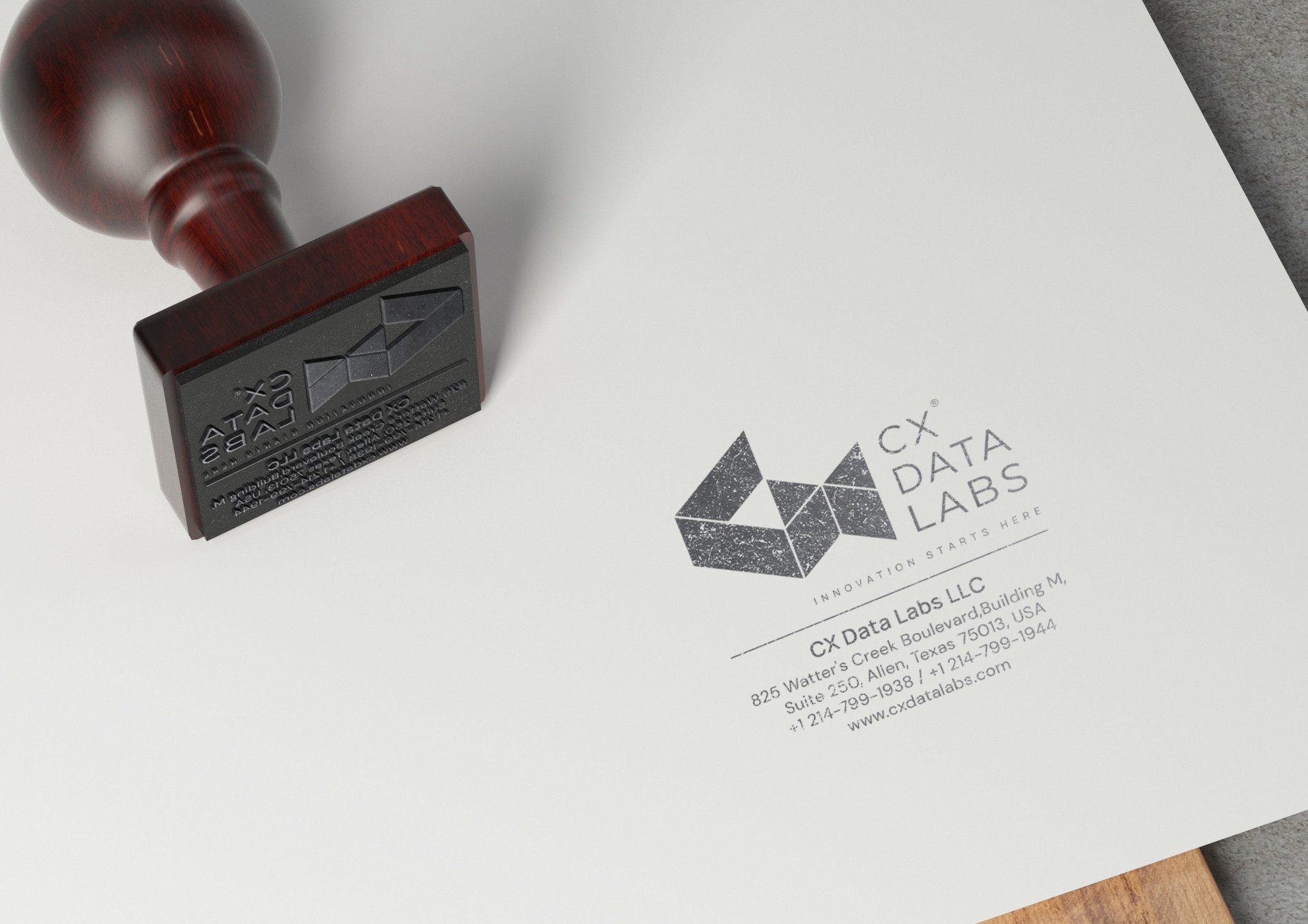
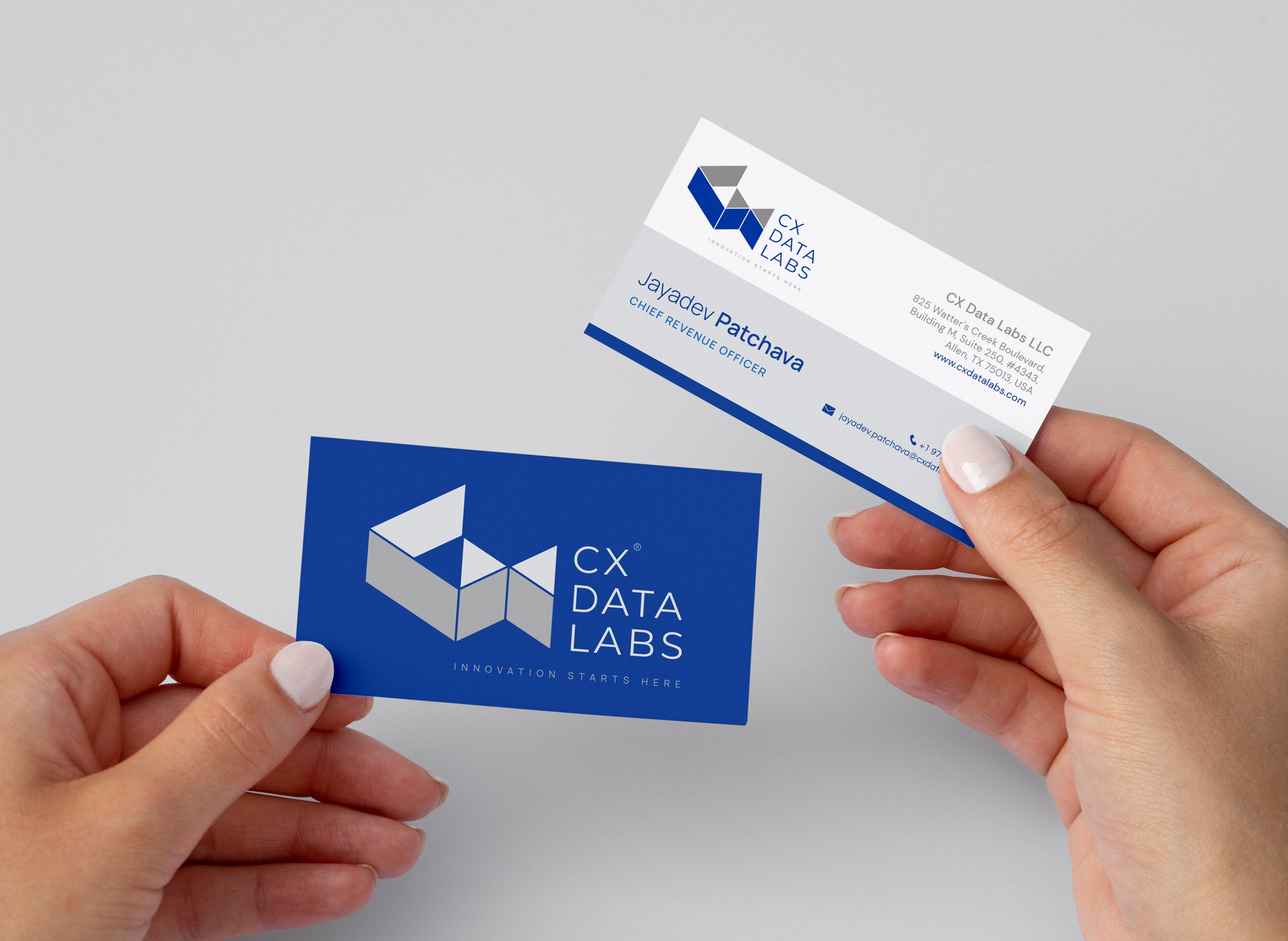
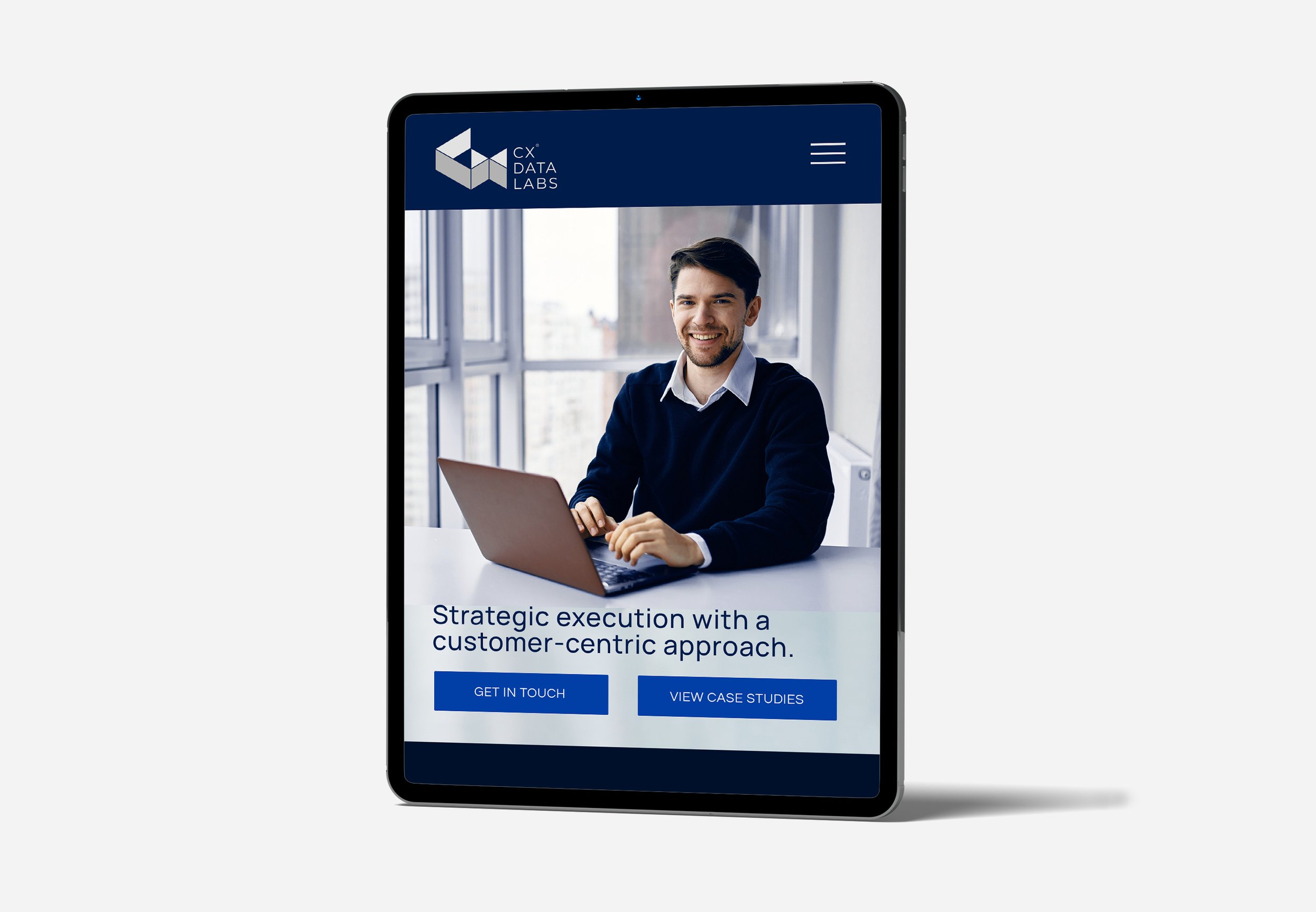
The logo was designed to outstand and break the clutter in the technology market. The unique construction of the perfectly aligned isometric 3D view of ‘CX’ gave it an extra edge. The uniqueness of the brand name ‘CX Data Labs’ lies in ‘CX’ (customer experience). Hence the logo icon was designed to depict ‘CX’ in the most iconic and intellectual way. Using 3D style provided an extra dimension to the brand identity which helped in creating a positive perception that we are always a step ahead and that we go deep to discover and solve business problems. The custom-designed brand icon is a unique mark. The identity design was kept clean and minimal to bring alive the feelings of trust, professionalism, and a positive feel, going well with our magician archetype.
The logo catches immediate attention and the isometric lines make the eye move around the icon. The logo is comfortably visible even in the smallest sizes and looks good even in the bigger size. The clean minimal style makes the logo perfect for printing / screens / engraving etc. The uniqueness of the logo makes it highly memorable, building an instant recall for the brand.
Graphic family: Geometric (Data Graphs & Visualizations)
Look: Technical / Minimal / Bold
Feel: Trustworthy / Knowledgeable
Brand Typography Family
Choosing the right font that reflects the technology brand is essential for communicating the correct message to customers. Typography is the major element in a design that speaks to customers. The typography system was recommended keeping in mind the professional and minimal feel that the brand wants to evoke.

Brand Color Palette
The color palette was recommended to bring alive the ‘technological’ and ‘knowledgeable’ aspects of the brand while keeping in mind the brand’s personality.
Royal Blues: Blue frequently invokes words like dependable, loyal, logical, soothing, calm, and focused. Blue also tends to increase personal productivity.
Bright Blues: The color blue represents both the sky and the sea and is associated with open spaces, freedom, intuition, imagination, inspiration, and sensitivity. Blue also represents the meanings of depth, trust, loyalty, sincerity, wisdom, confidence, stability, faith, and intelligence.
Greys: Grey represents neutrality and balance. Its color meaning likely comes from being the shade between white and black.

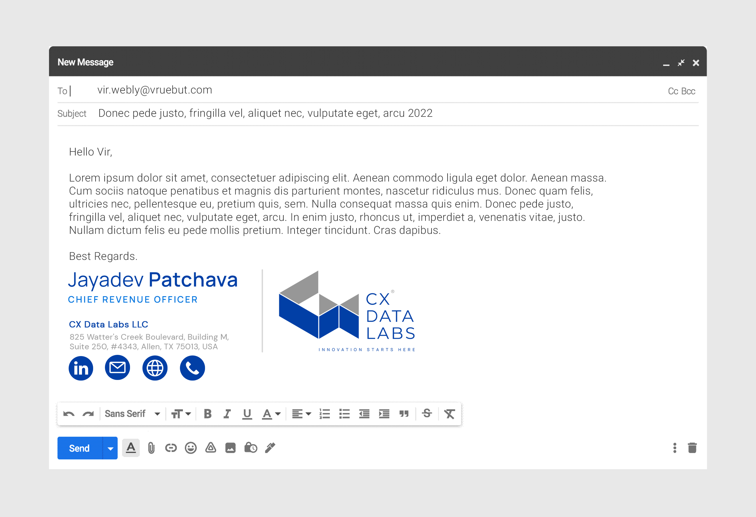
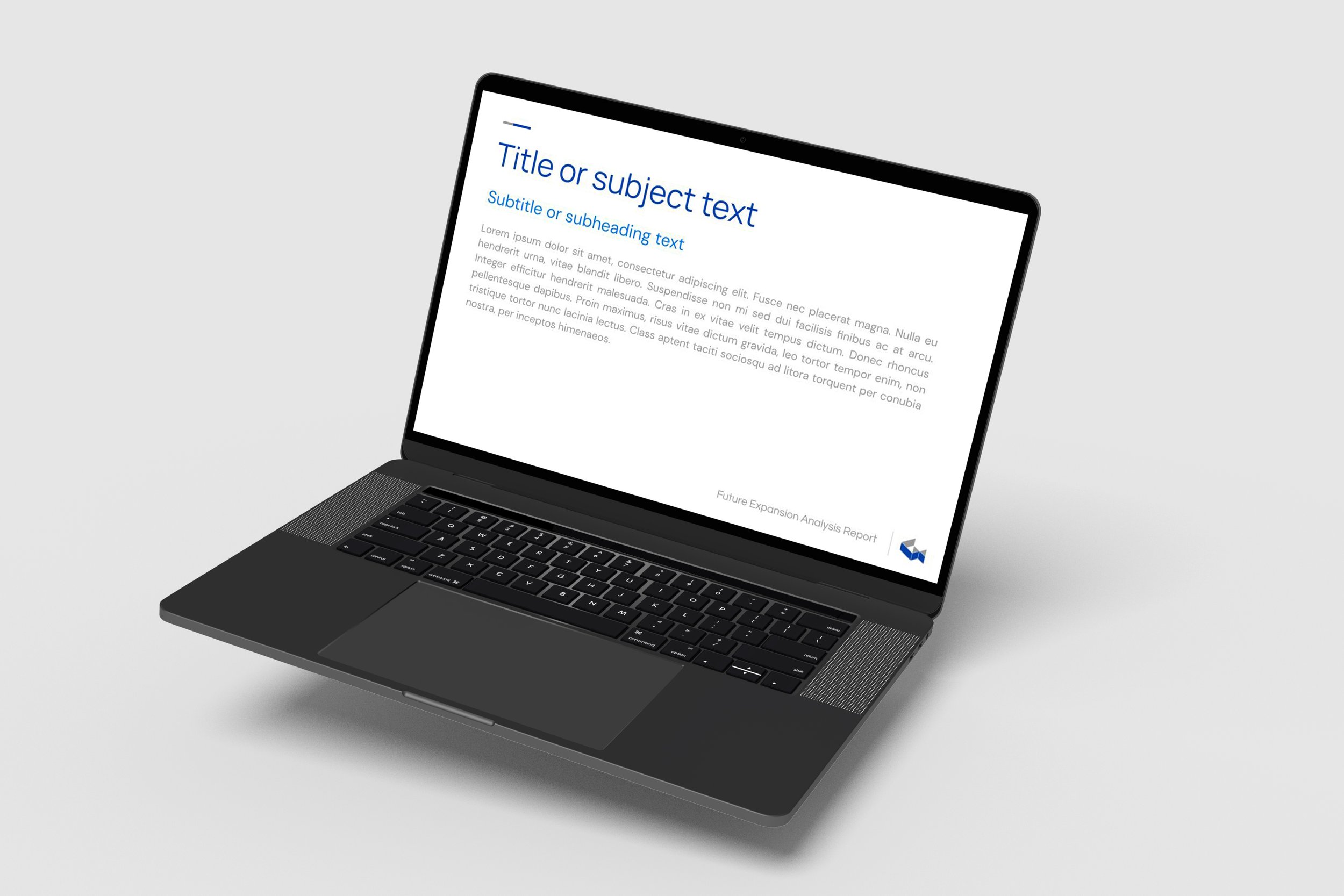
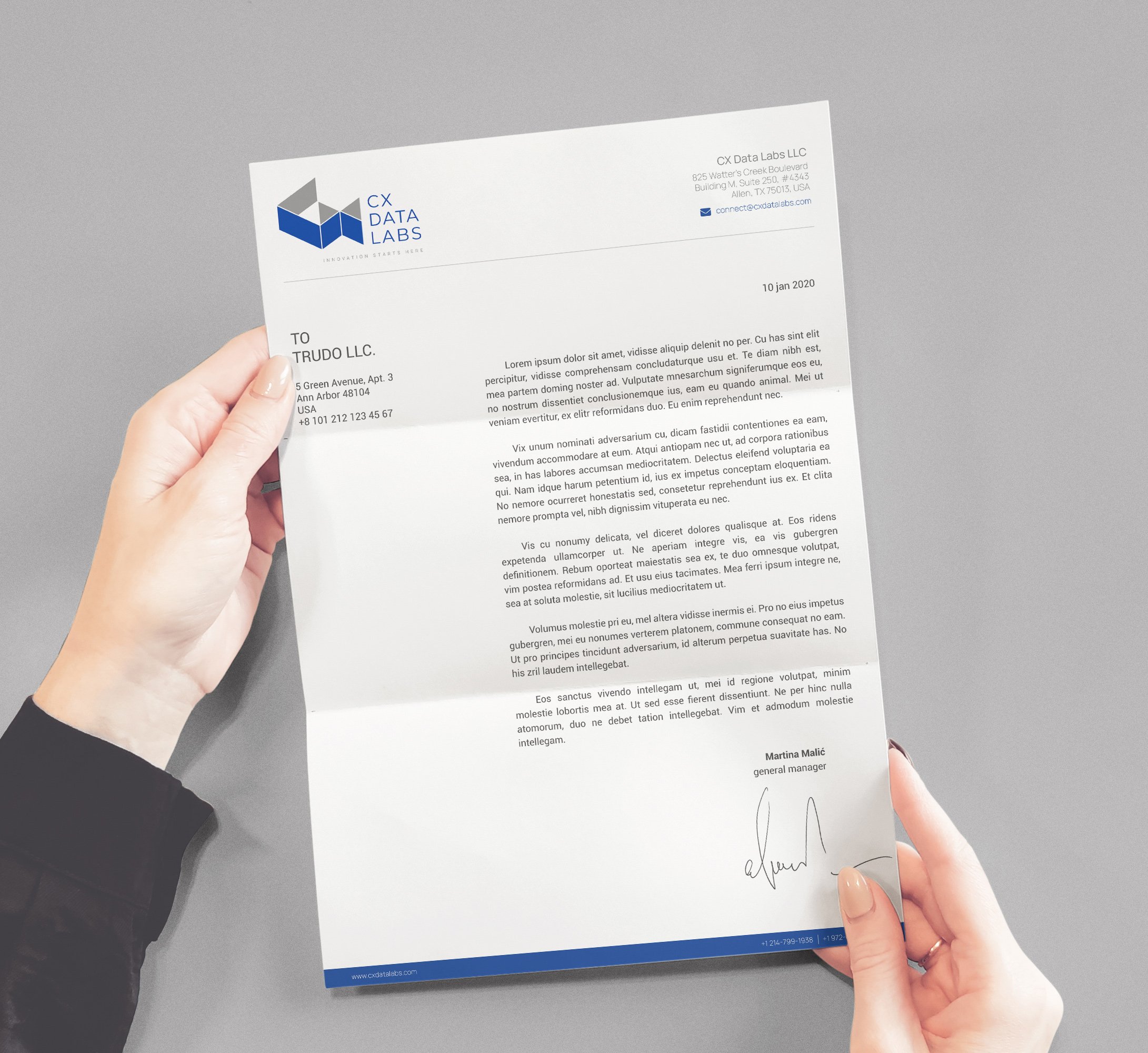
Brand Stationery and Assets
Branded stationery and collateral were leveraged to bring alive the technology brand’s essence. They were designed to generate trust, communicate the brand values, showcase professionalism, and strengthen the brand recall value at every touch point.

Brand Signage Design
It is important to reach the right customers and an eye-catching signage design helps the customer know where the technology company office is located. Unlike other means of advertising like radio, TV, and newspaper, signage is cost-effective. The company signage was designed with the purpose of ensuring high visibility and recall at the brand’s touch-point.

EXPLORE SOME OTHER WORK
Case studies of some other brands we’ve built.
Branding is at the core of everything we do. Every design, every detail, every decision — all purposefully crafted to strengthen the brand. Our outcome-focused solutions span research, strategy, creativity, engagement, and execution.


