

BRAND IDENTITY / BRAND EXPRESSION SYSTEM / PRODUCT PACKAGING / WEBSITE UX & UI
Pure, Unfiltered & Raw Honey Branding Case Study
Project background: Founded by Mr. Mohan Singh Negi, Bawa honey is an upcoming honey brand from Nainital, Uttarakhand, India. Their beekeeping farms are located in the forests of Uttarakhand and Madhya Pradesh, India, away from the polluted city environment. The honey comes straight from the hive, without any pasteurization or addition of other ingredients like corn syrup, sugar, or hidden preservatives. With an ultra-smooth texture and versatile flavors, it comes with a purity guarantee that upholds it to strict testing standards. The business owner approached Arabella Design to design a brand that would feel highly premium, and superior, and reflect the product’s purity and uniqueness.
Brand Identity Design
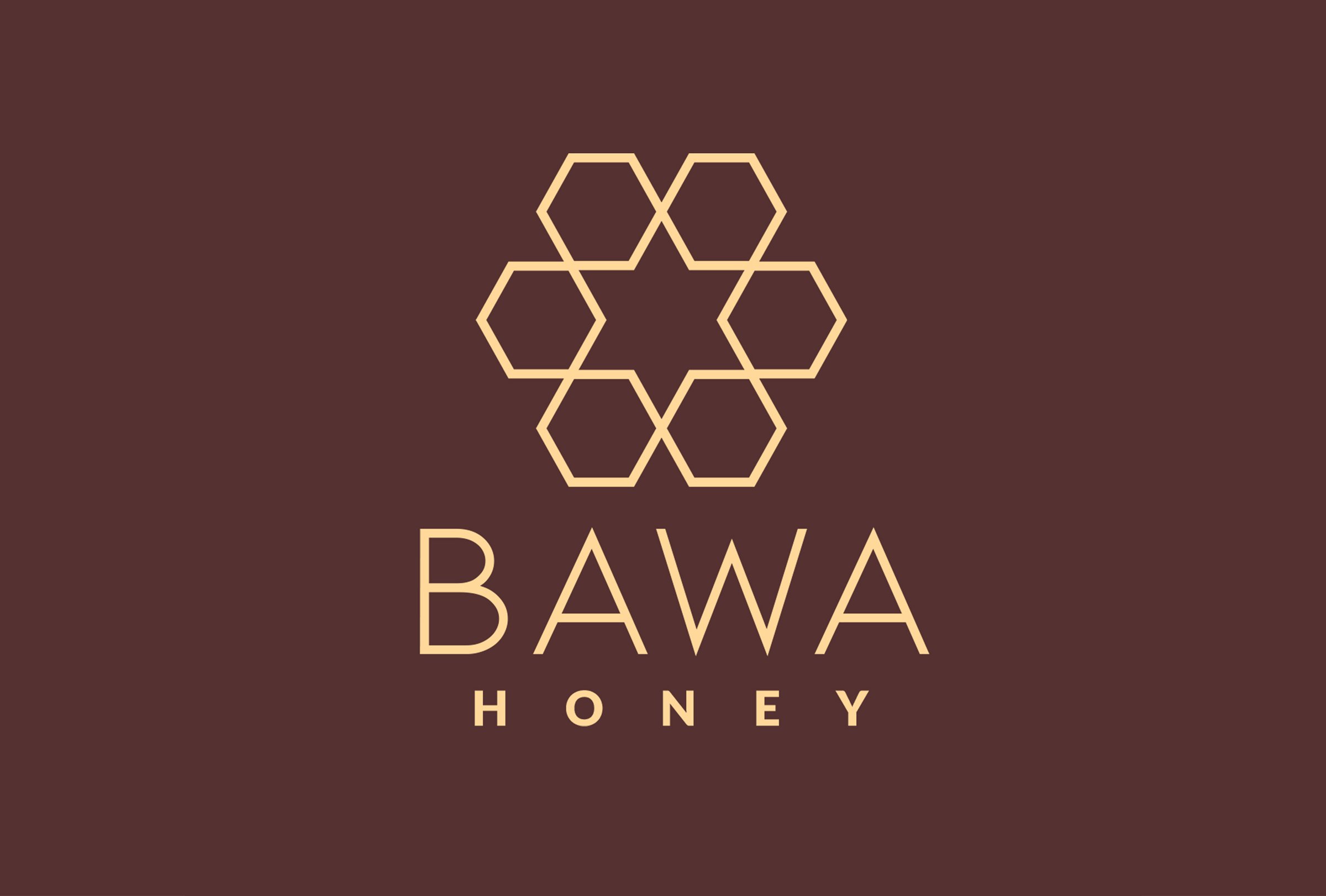
To bring alive the desired superior feel in the raw forest honey branding, we decided to create a star using the hexagonal structures of the beehive. The logo depicts a unique kind of honeycomb hexagonal structure packing, creating a star in between. The star generates a sense of high-quality honey. We used the sharp-edged hexagonal structure to break the monotony of organic shapes usually used for honey branding in the market.
Look and Feel: Superior, honest and unique
Logo Exclusion Zone
The exclusion zone is the designed clear space that ensures that the logo has some breathing space around it. It is to ensure that the logo is always visually distinct. Both the variants of the identity have different exclusion zones. These exclusion rules are for future placements of the logo on various surfaces.
Brand Expression System
Based on the brand’s personality, the brand colour palette and typography systems were designed to consistently communicate an honest and premium look and feel.

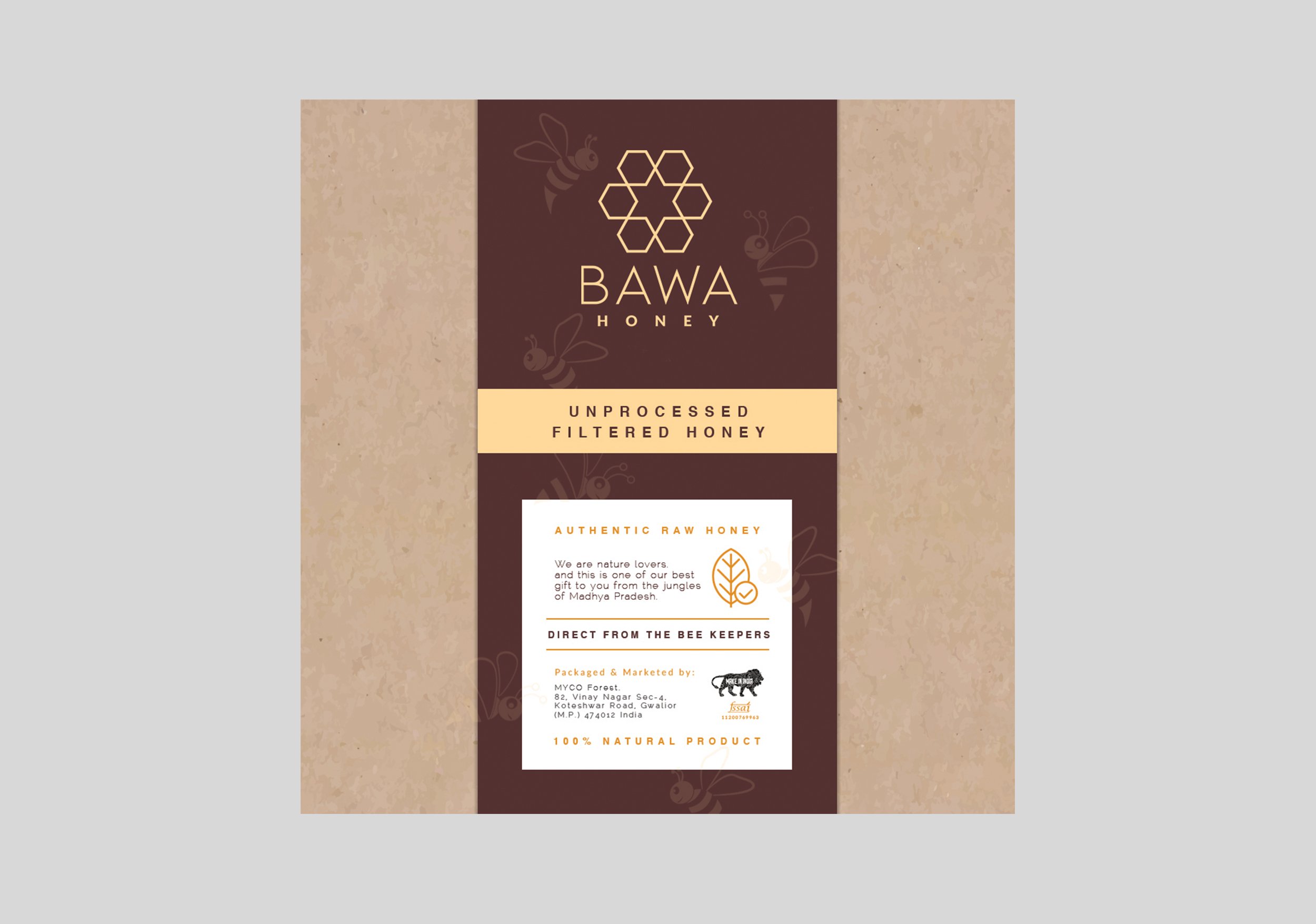
Honey Packaging Design
The design is kept clean yet informative.
Since it was a new honey brand, it was important to establish the uniqueness of the honey through its packaging. If you have any queries regarding this raw honey branding case study, kindly get in touch.


EXPLORE SOME OTHER LATEST WORK
Case studies of some other brands we’ve built.
Branding is at the core of everything we do. Every design, every detail, every decision — all purposefully crafted to strengthen the brand. Our outcome-focused solutions span research, strategy, creativity, engagement, and execution.


