

BRAND IDENTITY DESIGN / BRAND EXPRESSION SYSTEM / PACKAGING DESIGN / 3D MOCK-UPS / WEBSITE DESIGN / BRAND GUIDELINES / SOCIAL MEDIA BRAND GUIDELINES
Skincare Branding Case Study
Project background: Pure Brown is a brand of Purushya Wellness LLP, a cosmetics and skincare company based out of Raipur, Chhattisgarh India. Redefining the modern age men and addressing their skin issues with unique 100% plant-based active ingredients, the brand Pure Brown makes the finest quality vegan cosmetics specifically designed for male skin. As a cosmetic and skincare brand, Pure Brown wants to break the current stereotypical approach in the male grooming industry. The founder, Mr. Jigar Shah approached Arabella Design for the branding of the company. The brief was to bring alive a sense of purity and a natural feel, shifting the focus of male grooming from beauty to daily care.

Brand Archetype
The Caregiver
Caregiver brands tend to depict the realness of everyday life. They don't shy away from reality and, in fact, wish to shed light on the world's problems.
Protects others from harm / Makes them feel cared for
Values: Well-being / Compassion / Empathy / High-end Quality
Personality attributes: Caring / Optimistic / Generous / Friendly / Nurturing

Brand Identity Design
The logo was designed to exude trust and purity, in alignment with the men’s skincare branding strategy. The typefaces were crafted to be smooth, aesthetically pleasing, and inviting, in line with the cosmetics and skincare branding strategy. The combination of uppercase and lowercase characters was designed to produce a compact visual. Ultra spacious and distinct letters were recommended to ensure high visibility even in small sizes. The logo was designed to be a combination-mark type. The unique icon is a visual representation of pristine nature, represented using the Himalayas since the natural resources are the purest in the Himalayas. The flying bird in the logo makes it dynamic and completes the frame of the mountains in a balanced way.

The brand was designed to be a revolution to break male stereotypes and eliminate the toxic masculine mentality.
Graphic family: Organic (Natural Ingredients)
Look: Premium / Minimal but Informative
Feel: Pure and Natural / Premium
Brand Typography Family
We chose the font family to bring alive the emotions of purity and premium quality. The minimal circular choice of text style was selected to achieve this and connect consumers to the very core of the brand.

Brand color palette to bring alive the proposed skincare branding look & feel.
The brand colour palette was recommended to bring alive the emotions we wanted to evoke for cosmetic and skincare branding, i.e., feelings of freshness, purity, and nature. The unique colour palette was designed to make the cosmetic and skincare brand stand out in the category and look premium.
Dark Browns ( #2a1709 & #543627 ) : The color of security, protection and material wealth. The color brown is a serious, down-to-earth color signifying stability, structure and support. Relating to the protection and support of the family unit, with a keen sense of duty and responsibility, brown takes its obligations seriously. It encourages a strong need for security and a sense of belonging, with family and friends being of utmost importance.
Skin Browns ( #946a57 & #c0907d ) : An attribute shaped by biological forces, skin color has come to influence our social interactions and societies in profound and complex ways. Its story illustrates the complex interplay of biological and cultural influences that defines and distinguishes our species. This color is what we brown Indians belong to.
Off White ( #ede9e8 ) : Off white shades are likely to conjure similar associations, though perhaps less so than pure white. Its link with religion means white can symbolize goodness, spirituality and sacredness. White is also often associated with innocence—for instance, a “white lie” is one considered to be harmless.
Turquoise Blues ( #0d6b7e & #14454e ) : The color turquoise is associated with meanings of refreshing, calming, sophisticated, energy, wisdom, serenity, wholeness, creativity, emotional balance, good luck, spiritual grounding, friendship, love, joy, tranquility, patience, intuition, and loyalty.

Demonstration of Brand Colors and Font Usage
These creatives show the importance and weightage of different brand colours. The application of the colour palette, as per the branding guidelines we recommended, ensures consistency in the brand’s communication and complete uniformity in style and formatting for the skincare brand.
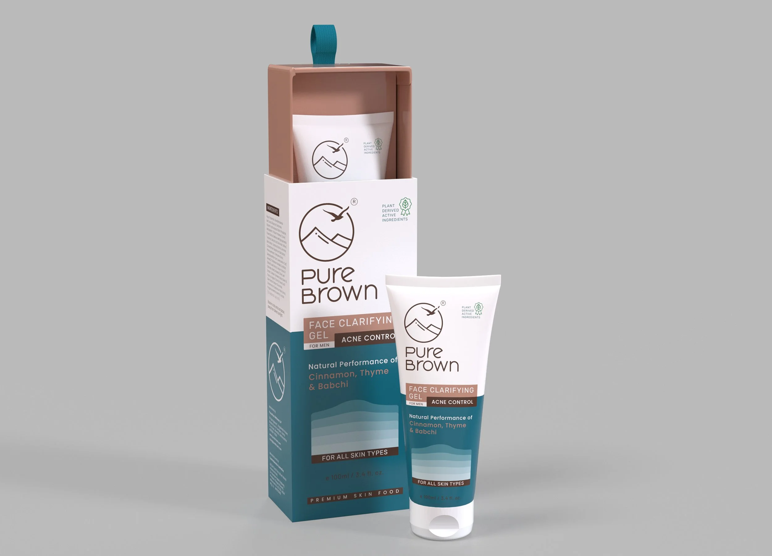
Product Packaging Design
The cosmetics and skincare product packaging was designed to outshine the competition, generate trust, and persuade its shoppers to purchase the offerings at a premium. We studied the product selling cycle and the target audience’s buying mindset and crafted the product branding strategy and packaging look and feel strategy. The skincare branding strategy included defining the prioritization of the elements of packaging/content for the desired eye movements of the customer. The packaging strategy and design worked highly well for the cosmetic and skincare brand on e-commerce portals with high conversion rates at giants like Amazon, Flipkart, Nykaa, etc.


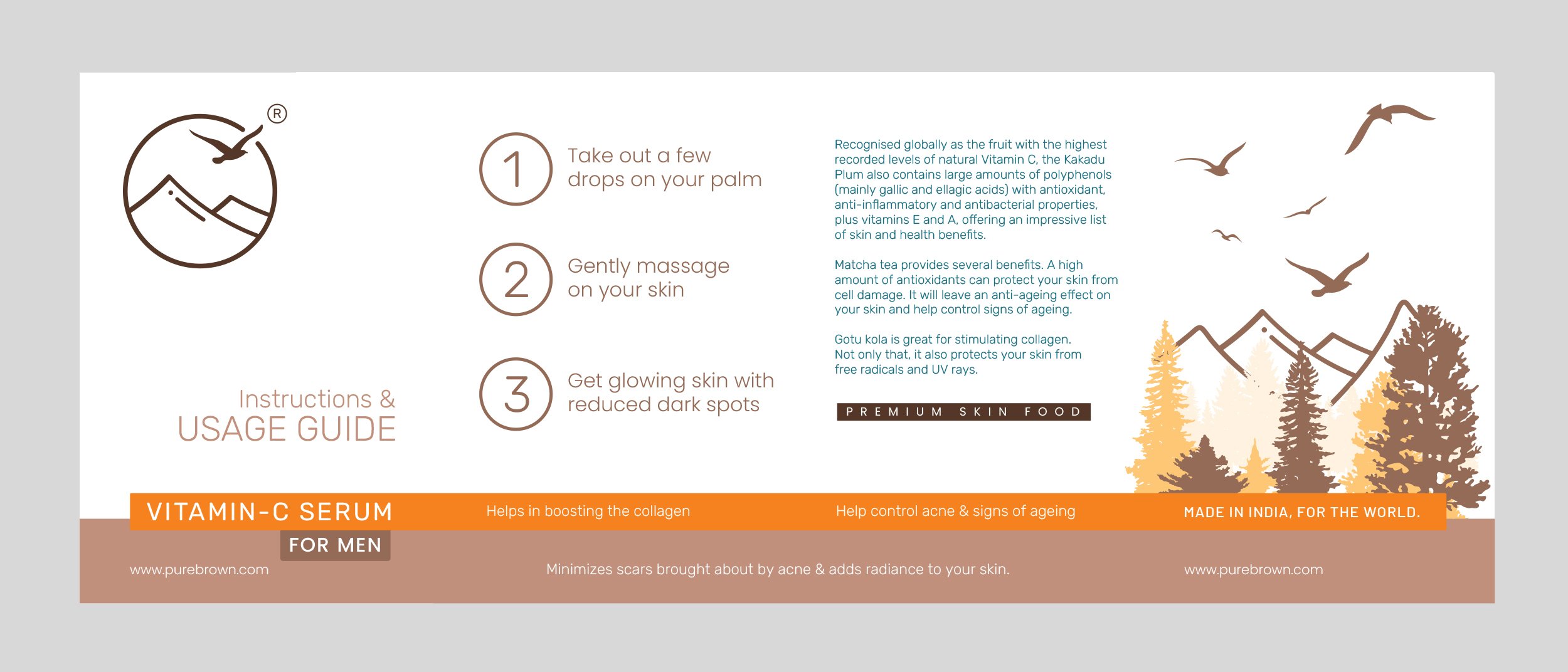
Product Usage Guide Design
For a caregiver archetype skincare branding, it was crucial to educate first-time users on how and when to apply the creams and oils correctly in order to achieve the best results. These fold-able booklets were designed to be a part of each packaging box.


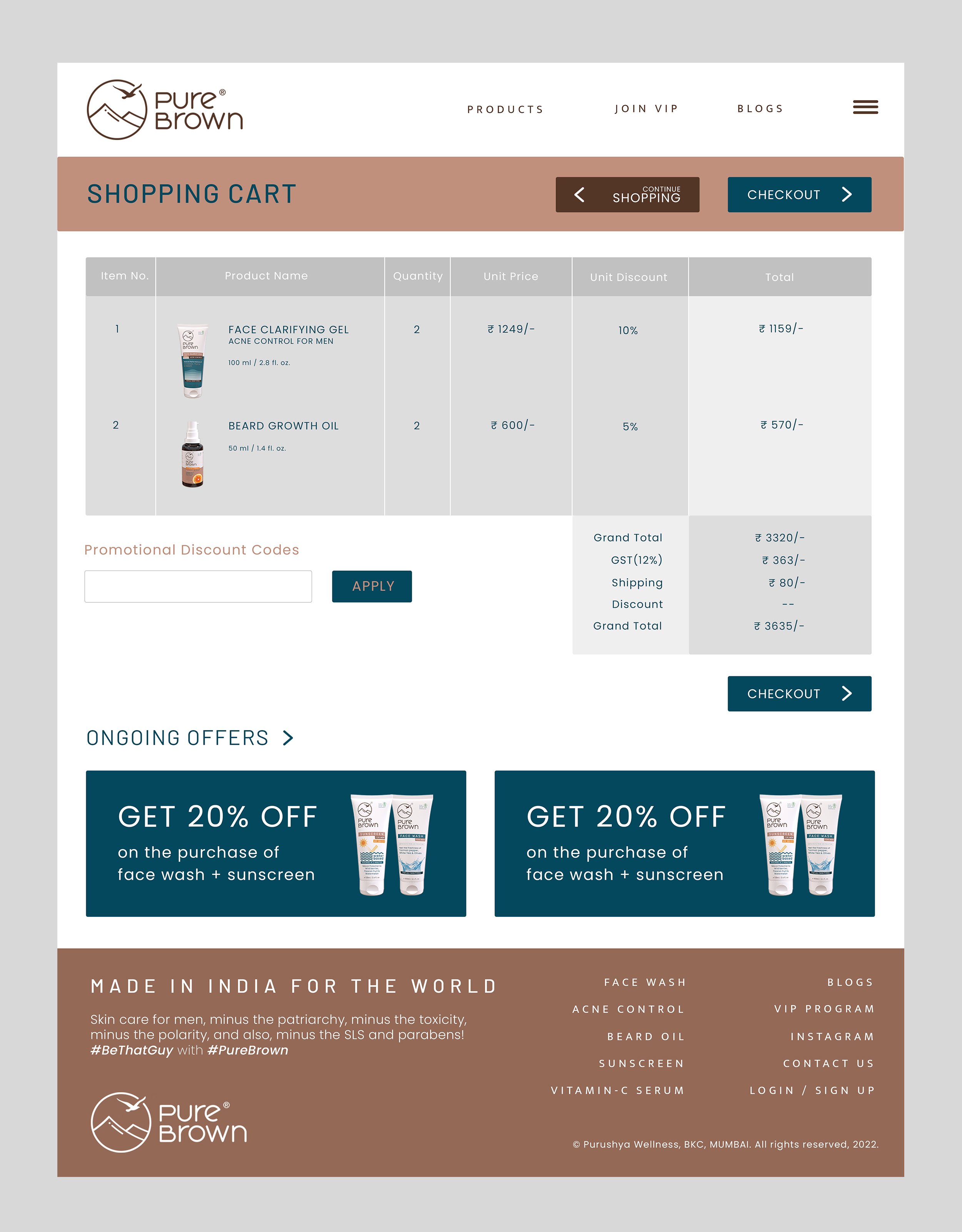
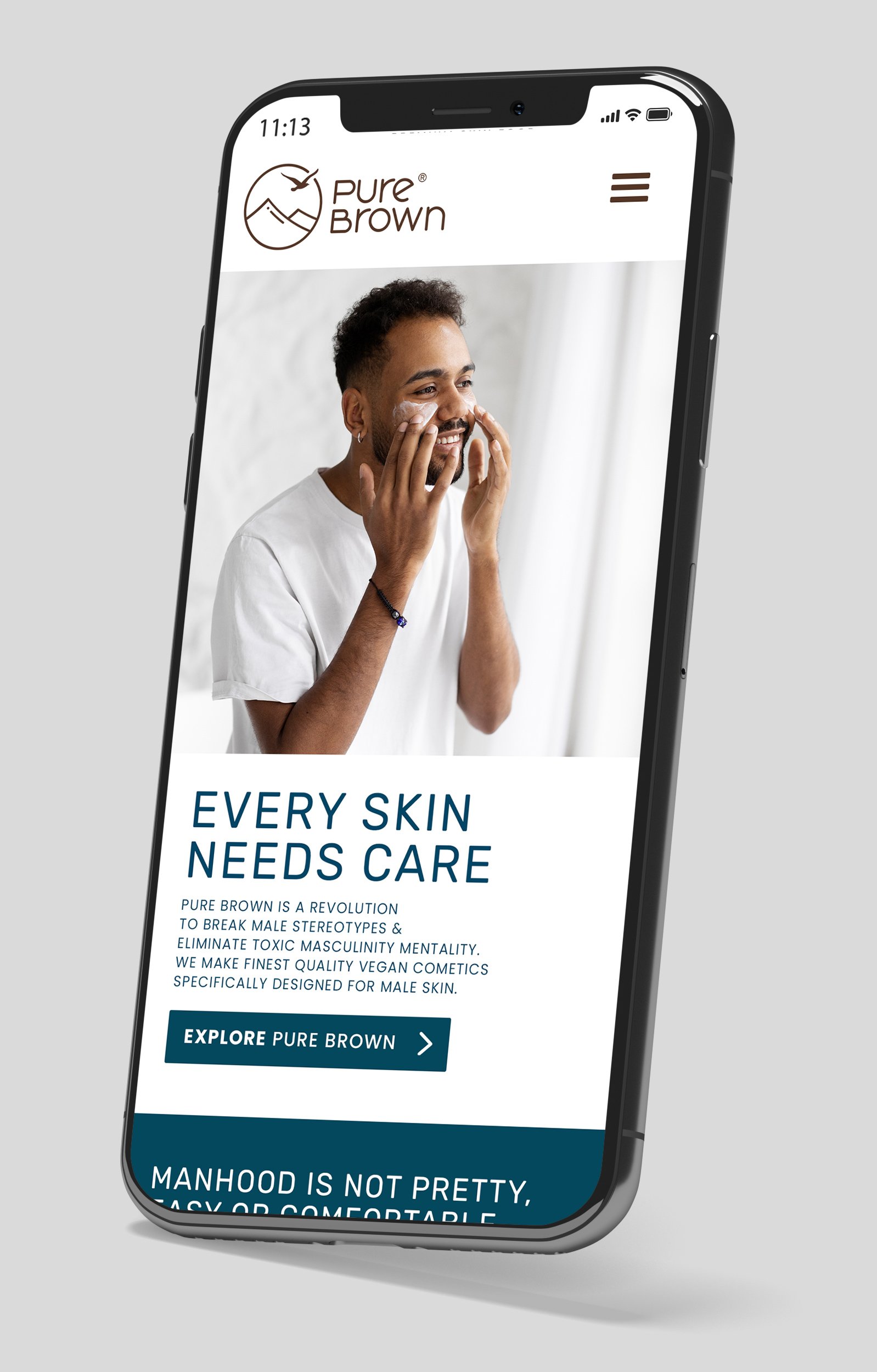
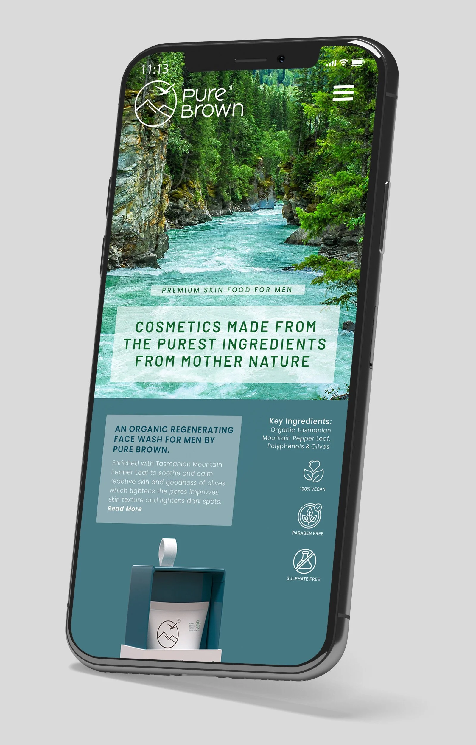
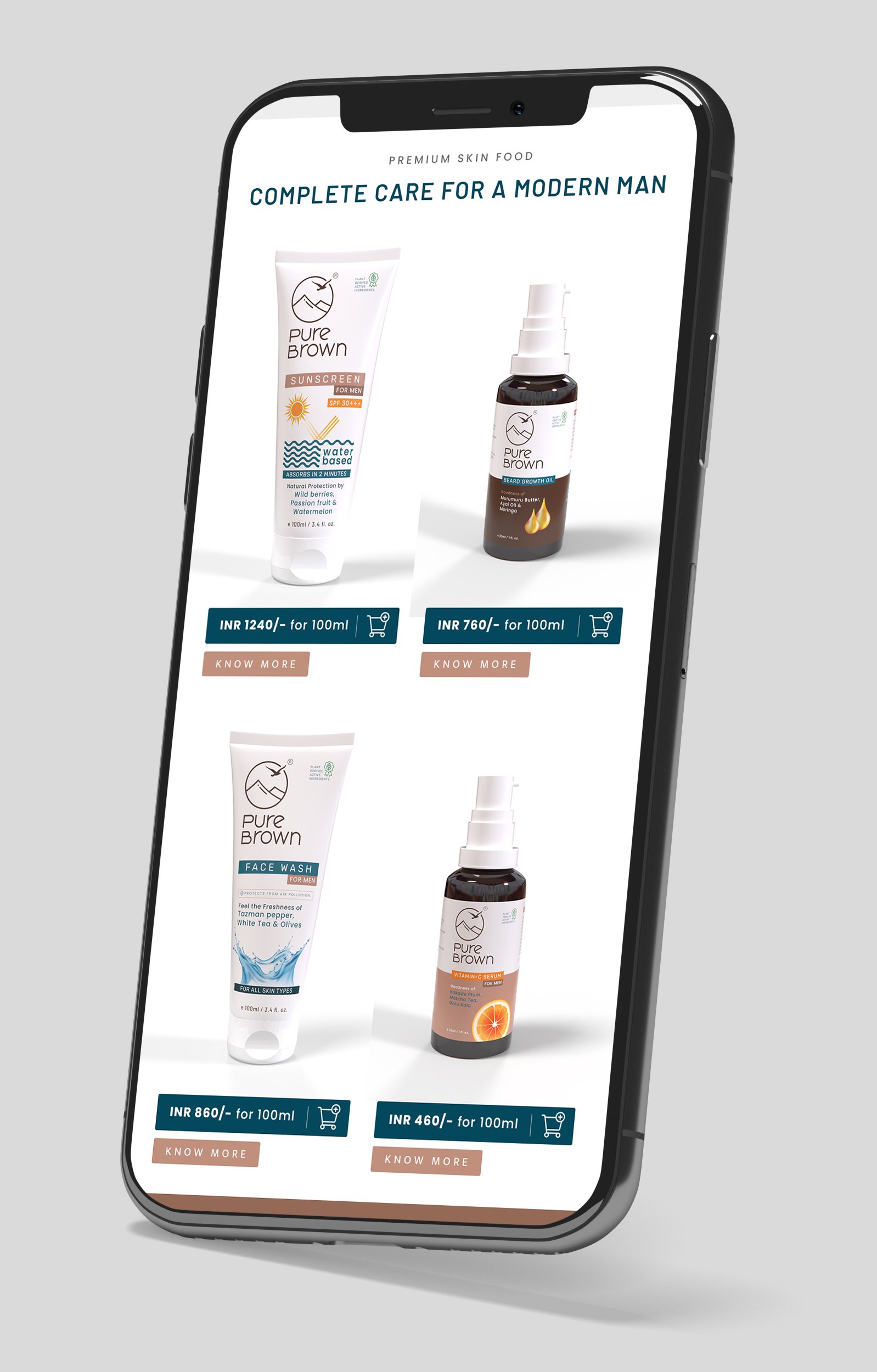
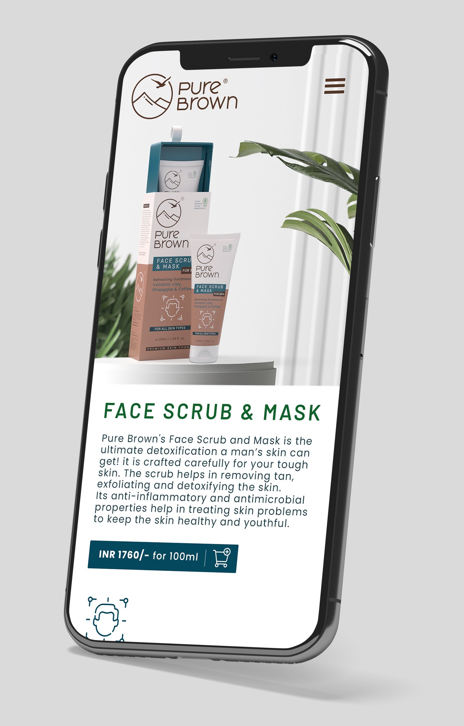
Website UX/UI Design
We helped the strategic skincare branding come alive by building a memorable, conversion-focused, and future-proofed website cum e-commerce store, reinforcing and increasing brand value and customer loyalty.
We started by understanding the audience and their mental model and then marrying these insights with creativity to deliver impactful user experiences to produce desired results, better engagement, and higher conversions. The strategy seems to be working well today for the company looking at engagement, conversions, and returning customer purchases on the brand’s website.


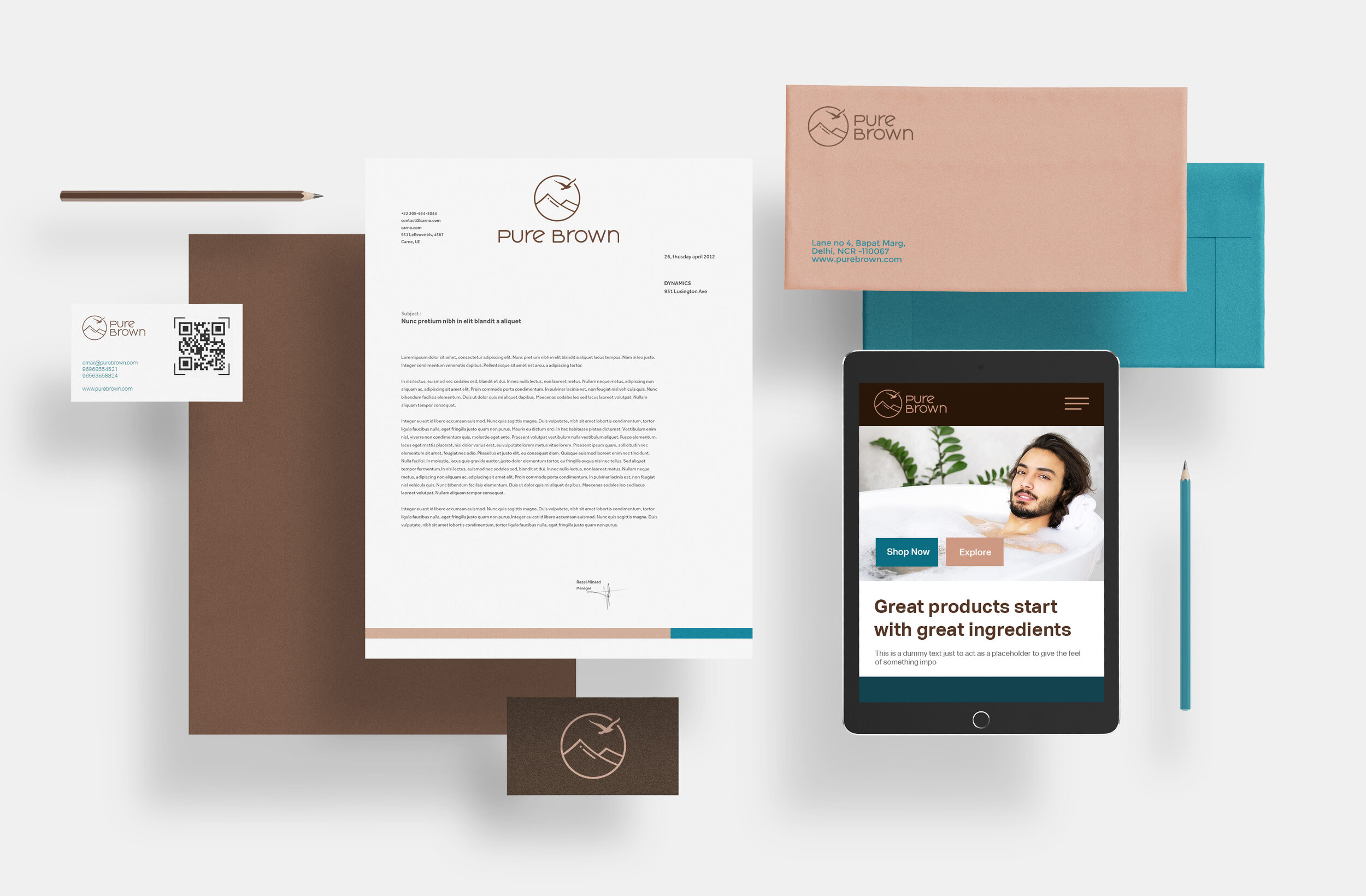
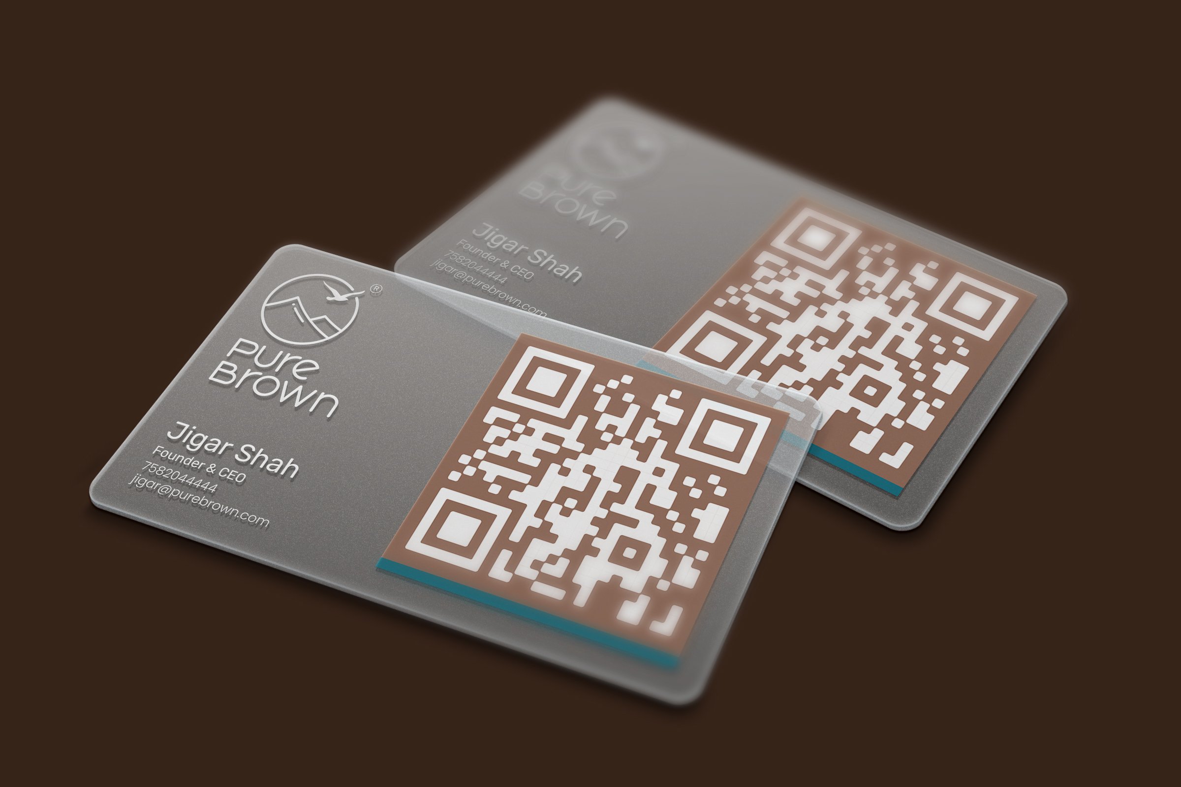
Brand Collateral Design
Branded stationery and collateral were designed to bring alive the skincare branding essence, to help generate trust, communicate the brand values, showcase professionalism and strengthen the brand recall value at every touch point.


EXPLORE SOME OTHER LATEST WORK
Case studies of some other brands we’ve built.
Branding is at the core of everything we do. Every design, every detail, every decision — all purposefully crafted to strengthen the brand. Our outcome-focused solutions span research, strategy, creativity, engagement, and execution.


