

BRAND IDENTITY DESIGN / BRAND EXPRESSION SYSTEM / PRODUCT PACKAGING DESIGN
Indian Food Company Branding Case Study
Project background: Mr. Gyan Prakash, the owner Agrik Processing Pvt. Ltd., a company based out of Bihar, India, approached Arabella Design to design its new brand in the packaged food market. The owners wanted the brand to stand out and look premium and superior in comparison to the existing pure-quality products in the market. The brand is exporting fox nuts (makhana), dry fruits, pulses, oils & other grocery items. It is in the process of expanding to include more food products.

Brand Archetype
The Innocent + The Everyman
The Innocent is a positive personality with an optimistic outlook on life. Treating all equally. They often want to go back to nature and natural living. They're honest and pure and they have no ill will towards anyone. Ultimately they want themselves and everyone else around them to be happy. The Innocent's core desire is to experience paradise.
Values: Pure / High-end Quality / Honesty
Personality attributes: Positive / Genuine / Friendly / Best-in-class

Brand Identity Design
The logo icon is inspired by Yin/Yang, two halves that mutually form the wholeness of Qi. The leaves also form the letter ‘S’ between them. The circle generates a sense of wholeness & positivity.
Recommended logo type - Combination mark type

Graphic family - Organic + Geometric
Look: Sophisticated and Trustworthy
Feel: Balanced, Natural, and Premium

Brand Color Palette & Typography Family
The brand color palette and typography system were defined to bring alive the desired emotions in the customer’s mind and help differentiate the brand meaningfully in the market. Choosing the right font that reflects the brand is essential for communicating the correct message to customers. The spectrum of color was developed to symbolize ‘nature’ while the recommended fonts brought alive the ‘sophisticated’ and ‘organic’ feel that the brand wants to stand for.


Brand Stationery Design
Branded stationery helps generate trust, communicate the brand values, showcase professionalism and strengthen the brand recall value at every touch point. The well-designed brand assets were crafted to help the brand deliver a consistent, unified experience and bring the business to the top of customers' minds.

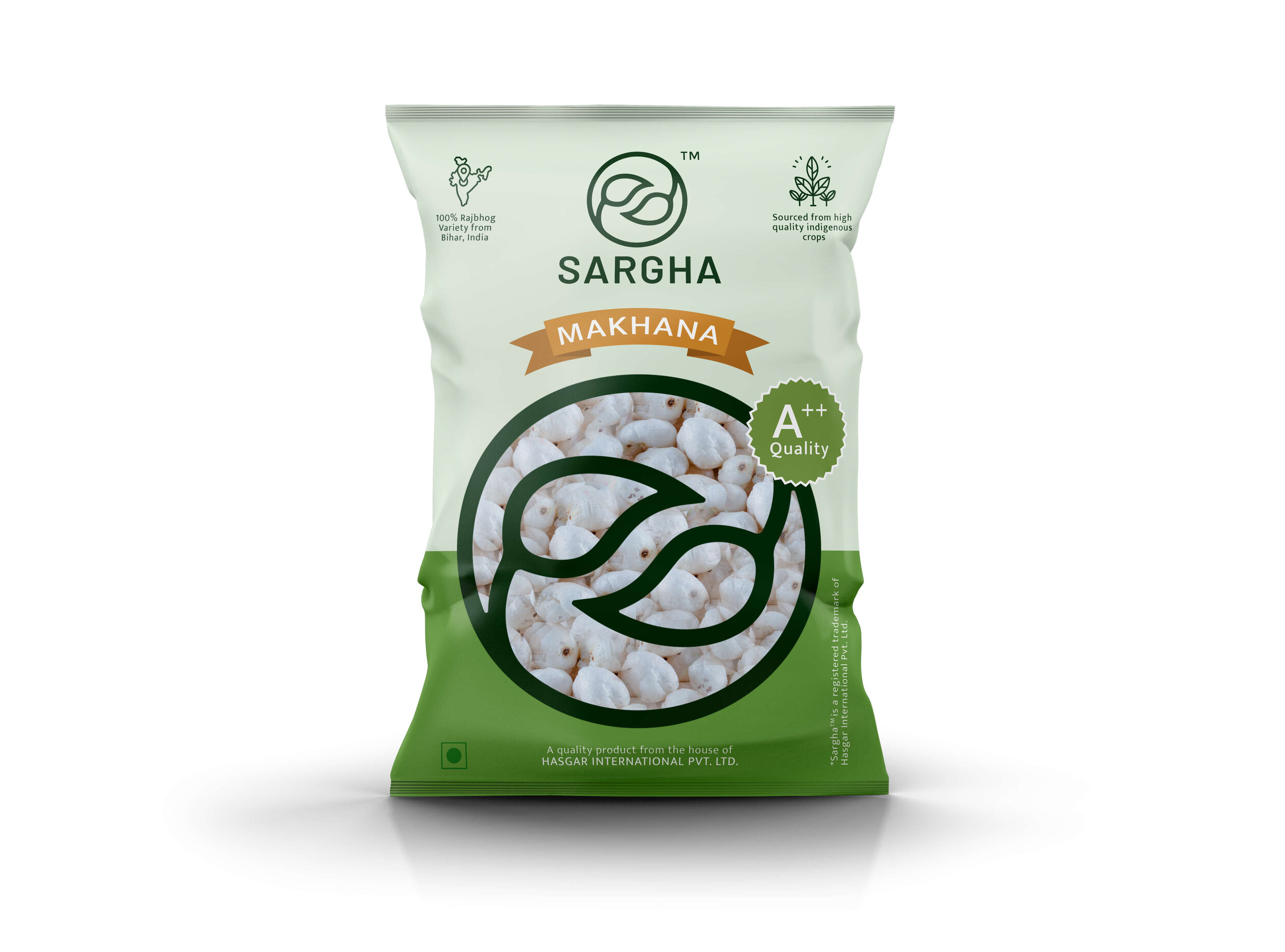
Makhana Packaging Design
We use design as a tool to increase the product’s value and enhance the brand image. Our packaging designs were developed to outshine the brand’s competition, generate trust, and persuade shoppers to purchase the offerings.


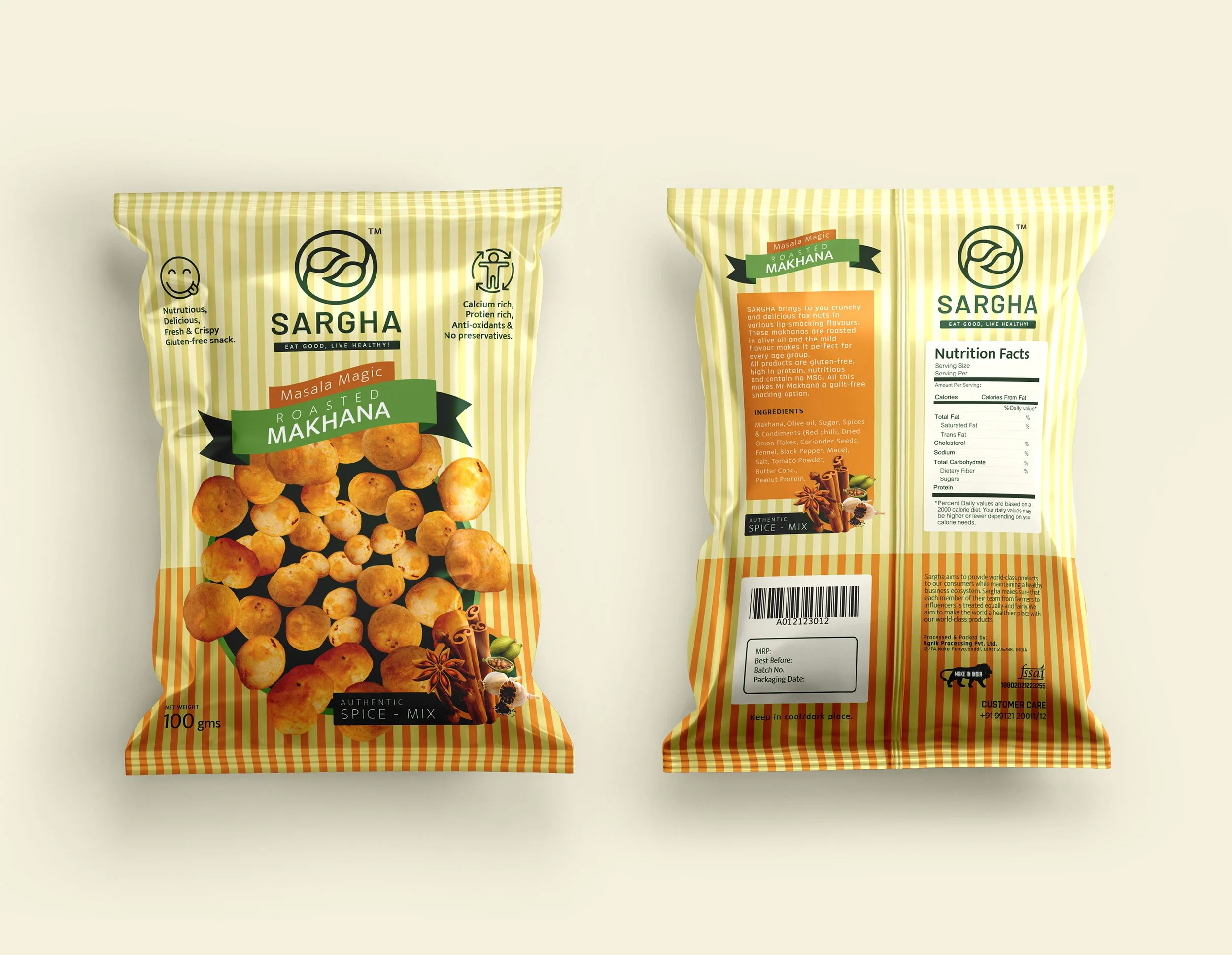
Roasted Makhana Snack Packaging Design
This product packaging was strategically designed to evoke the feeling of taste and hunger in the customer’s mind. The vertical line pattern was recommended to make the product look crisp and fresh.
Dry Fruits Packaging Design
This product packaging was strategically designed to evoke the feeling of premium dry fruits and quality in the customer’s mind. Since this is the generic packaging for all the dry fruits, the look was kept generic and and a transparent window was provided in the front to make the product inside visible and help differentiate the packaging.

EXPLORE SOME OTHER LATEST WORK
Case studies of some other brands we’ve built.
Branding is at the core of everything we do. Every design, every detail, every decision — all purposefully crafted to strengthen the brand. Our outcome-focused solutions span research, strategy, creativity, engagement, and execution.


