

BRAND IDENTITY / BRAND EXPRESSION SYSTEM / STATIONERY DESIGN / PRODUCT PACKAGING / WEBSITE UX & UI DESIGN
Healthy Food Branding Case Study
Project background: A start-up in the area of organic and quality food products from Haryana, India, wanted to enter the market and become the one-stop solution for certified organic grocery. The owners, Mr. Vikalp Goel, and Ms. Khyati Goel approached Arabella Design for the branding of their company. They wanted us to evoke the feeling of trust and healthy in the food branding, in line with their customer value proposition.

Brand Archetype
The Caregiver
Protects others from harm / Makes them feel cared for / Authentic / Trustworthy
Values: Well-being / Compassionate / Empathetic / Best Quality
Personality attributes: Caring / Optimistic / Generous / Friendly / Nurturing / Organised / Knowledgeable

Brand Identity Design
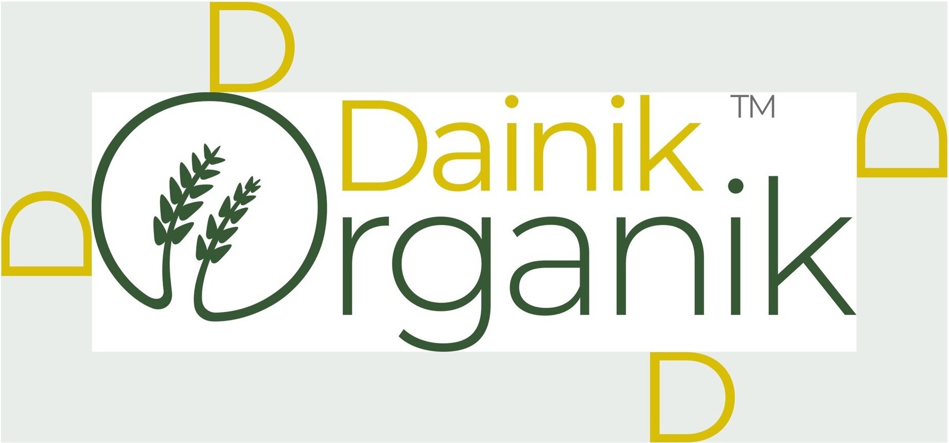
The two branches of the wheat crop depicted in the logo have a strong recall and association with something related to food. It also symbolizes farming/crop fields, a key part of the organic food system.
‘Organik’ is kept bigger than ‘Dainik’ because ‘Organik’ was more important to emphasize in the brand than ‘Dainik’.
Recommended logotype: Combination mark type
Graphic family: Organic (food)
Look and feel: Knowledgeable, professional, and problem solver.

Logo Exclusion Zone
The exclusion zone is the designed clear space that ensures that the logo has some breathing space around it. It is to ensure that the logo is always visually distinct. Since our logo is minimal with a lot of negative space, the logo did not need much of a clearance/exclusion zone. The zone was kept equal to the height of the ‘D’ of ‘Dainik’.
Brand Color Palette
The recommended brand color palette was kept light and diverse in line with the product range and overall healthy food branding personality.
Light Golden Yellow - Golden yellow represents crops (maize/wheat, etc.). The color is associated with higher ideals, wisdom, understanding, and enlightenment. It is to inspire knowledge in consumers about good food.
Fresh Leaf Green - Green is a cool color that symbolizes nature and the natural world. Because of its strong associations with nature, green represents tranquility, good luck, and health.
Light Pista Green - Light Green is very faint, fresh, and a very down-to-earth color. It will be one of our preferred choices for background colors.
Sap Green - With sustainability and organic being at the top of mind, this is the darker shade to be used to create emphasis on these aspects. It will be used in combination with Light Pista Green, Light Golden Yellow, and Faint Mud Yellow.
Faint Mud Yellow - Yellow is perceived as the happiest color and is used widely in various food products. It evokes optimism and general good feelings.
Soil Red - This is a natural color associated with the earth and as a result, gives a sense of stability and support. Given its link to the earth and nature, Soil red (brown) brings to mind farming and agriculture, and other outdoor activities. This is a color that will be used in very specific places to attract attention / create importance since it is very distinct from the rest of the palette.

Brand Typography Family
The recommended fonts were chosen to convey professionalism, and superior quality and build up trust. The choice of text styles has a huge impact on the consumer’s mindset and makes them connect with the very core of the brand (eat good food and stay healthy).

Demonstration of Brand Color Usage
These creatives show the importance and weightage of different brand colors. The guidelines were recommended to ensure consistency in the brand’s communication and complete uniformity in style and formatting for the brand.

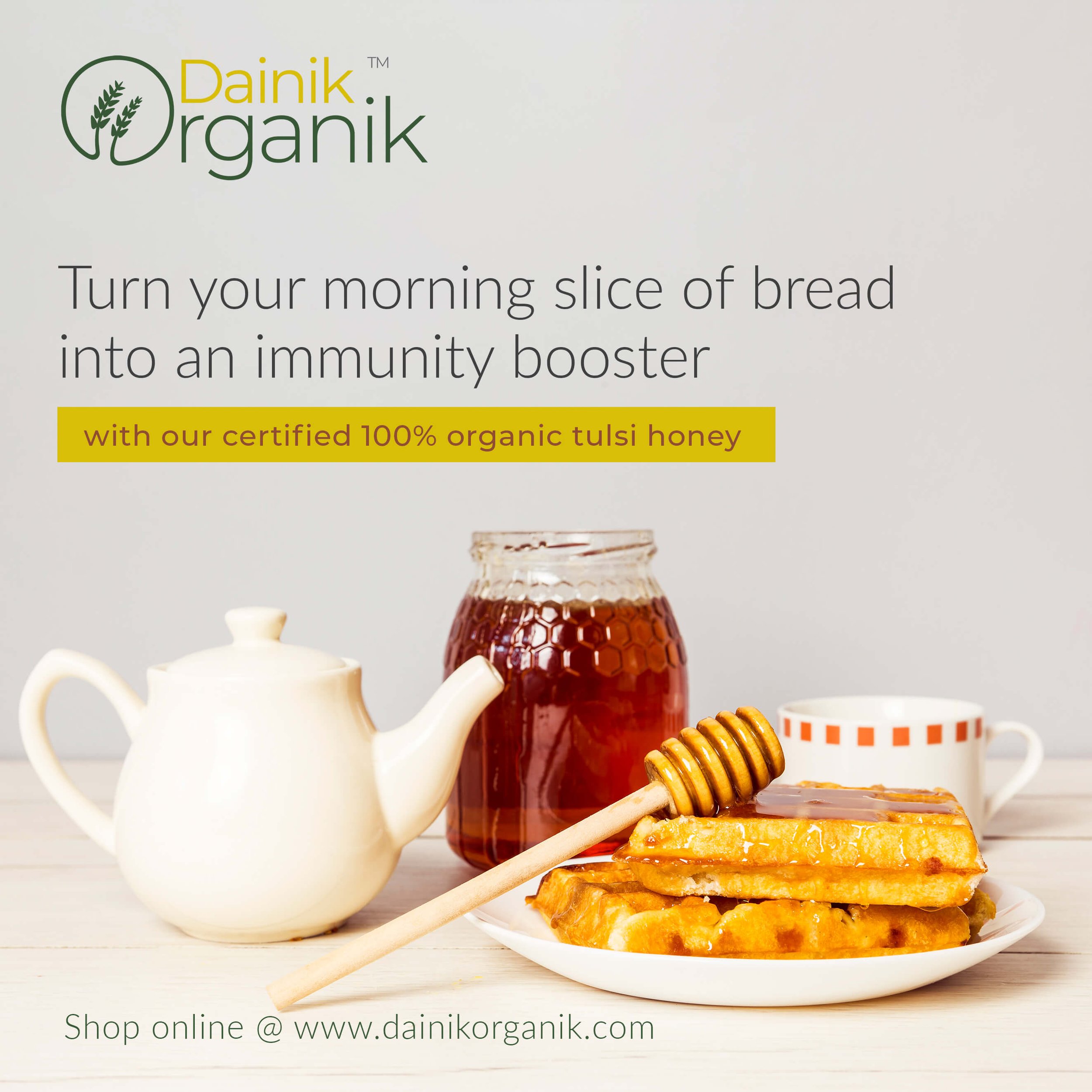
Demonstration of how brand colors and typography is used to bring alive a healthy food branding feel.
The guidelines were recommended to ensure consistency in the brand’s communication and complete uniformity in style and formatting for the brand.
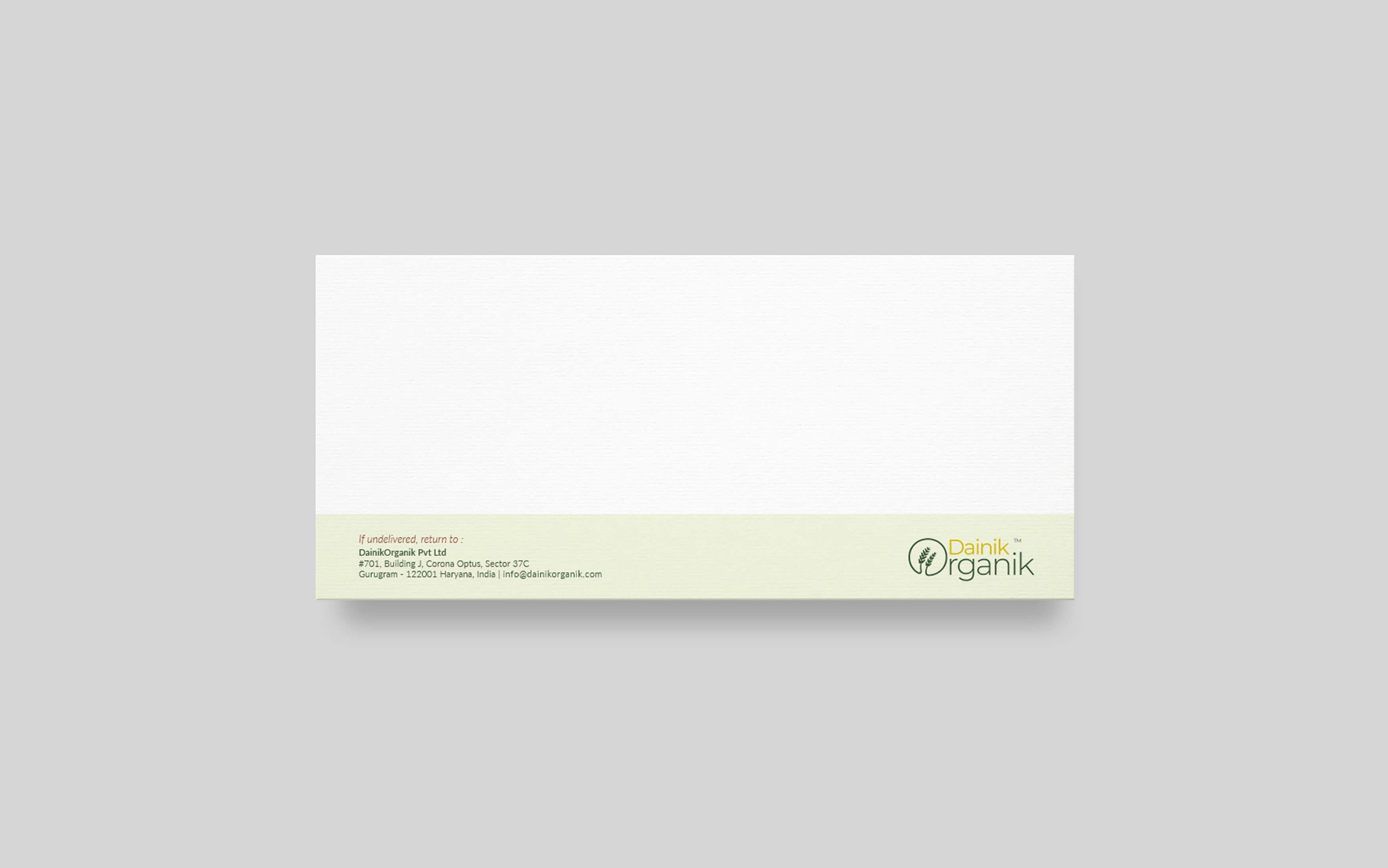
Our healthy food branding campaign was successful thanks to the cohesive brand stationery designs that we created for all of the marketing materials.
The branded stationery and collateral designs were crafted to bring alive the essence of healthy food branding. They were designed to help generate trust, communicate the brand values, showcase professionalism, and strengthen the brand recall value at every touch point.


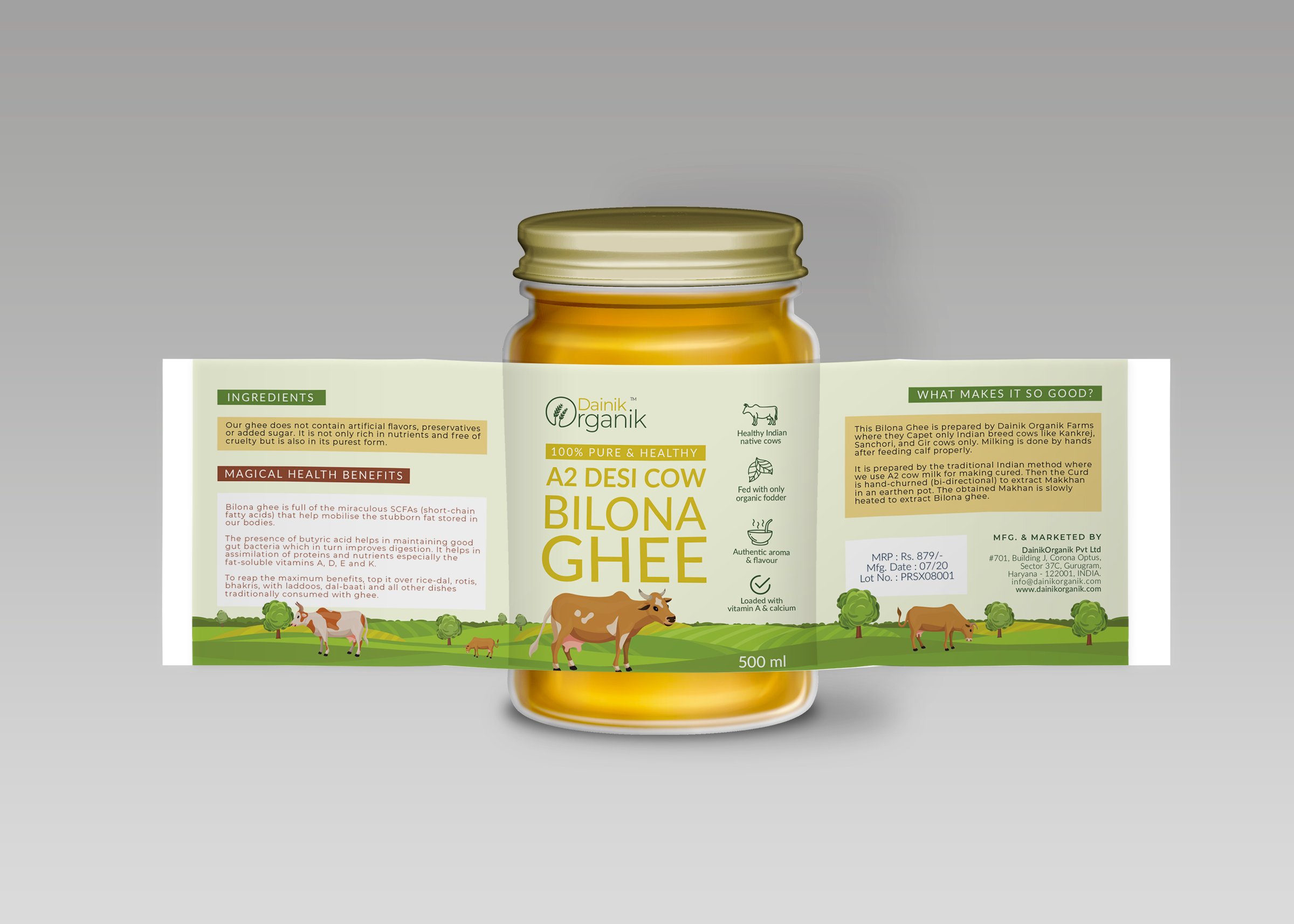
Product Packaging Design
It is the design of the packaging that builds up the value of the product inside. We used design as a tool to increase the product’s value and enhance the brand’s image in the market.


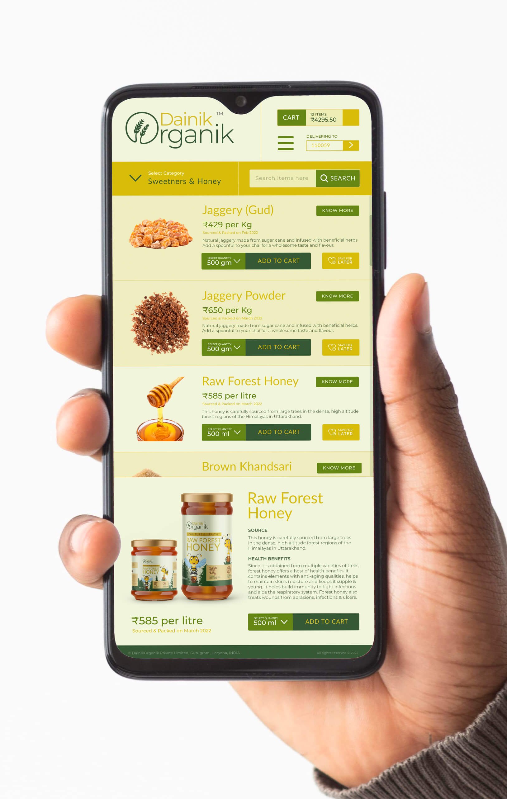
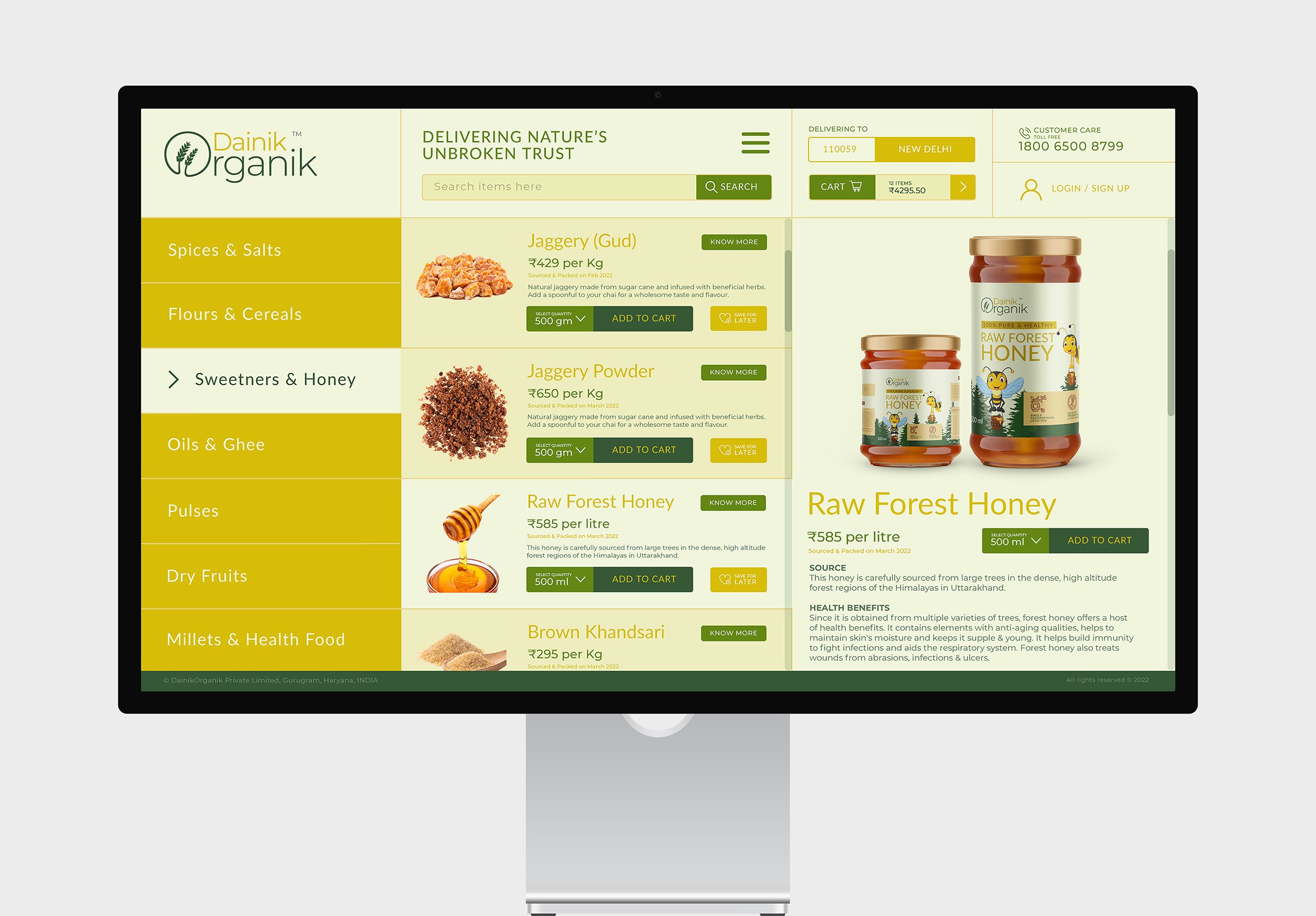
Website UX & UI Design
Website is a key customer touchpoint in D2C business, the UI was strategically designed to bring alive a healthy food branding strategy.
A website is the backbone of any business’s online presence. We helped the brand build a memorable, conversion-focused, and future-proofed website and e-commerce store, reinforcing and increasing brand value and customer loyalty. We wanted the brand’s website to be clean and purchase experience oriented so that people enjoy their grocery shopping from the company’s portal.
EXPLORE SOME OTHER LATEST WORK
Case studies of some other brands we’ve built.
Branding is at the core of everything we do. Every design, every detail, every decision — all purposefully crafted to strengthen the brand. Our outcome-focused solutions span research, strategy, creativity, engagement, and execution.


