

BRAND IDENTITY / BRAND EXPRESSION SYSTEM / MOBILE APP UX & UI DESIGN / PRODUCT PACKAGING DESIGN / WEBSITE UX/UI / WEBSITE DEVELOPEMENT
Innovative Company Branding Case Study
Project background: Zunzunbee is a product based brand by Things Of A Feather LLC, a technology startup with its operation base in Oregon, USA. The startup is dedicated to enhancing lives through thoughtful design and sustainable practices. Their user-centric approach ensures that every Zunzunbee product is crafted to meet the unique needs of our customers, making their lives easier and more enjoyable. They are committed to sustainability, from the materials the company uses to the way they manufacture and distribute their products. By minimizing waste and reducing the environmental footprint, the company strives to leave a positive impact on the planet. Driven by a passion for innovation, the brand aims to constantly evolve and improve their products. They believe that by staying at the forefront of technology and design, they can continue to elevate the quality of life for our customers while contributing to a more sustainable future. The founder, Mr. Harish Raman, approached Arabella Design to help the startup build a brand that resonates with the company’s vision & mission.
Brand Archetype : The Creator
We recommended the ‘creator’ archetype as Zunzunbee provides customers with innovative products that improve their quality of life. Creator attributes such as independence, honesty, curiosity, and excellent quality are also embedded in the brand’s principles.
The Creator brand archetype is all about innovation and creativity. These brands are typically non-conformists, becoming pioneers in new technology or creating unique combinations of features. Creators strive to create meaningful products with enduring value that align with their vision. They also empower their clients to express themselves freely, with the help of a tool, a new feature, or a design. Because of this, they naturally appeal to more creative or artistic consumers who place a lot of emphasis on self-expression.

Brand Look & Feel
Brand Look: Minimal / Bold / Innovative
Brand Feel: Highly Professional / Exclusive / Premium
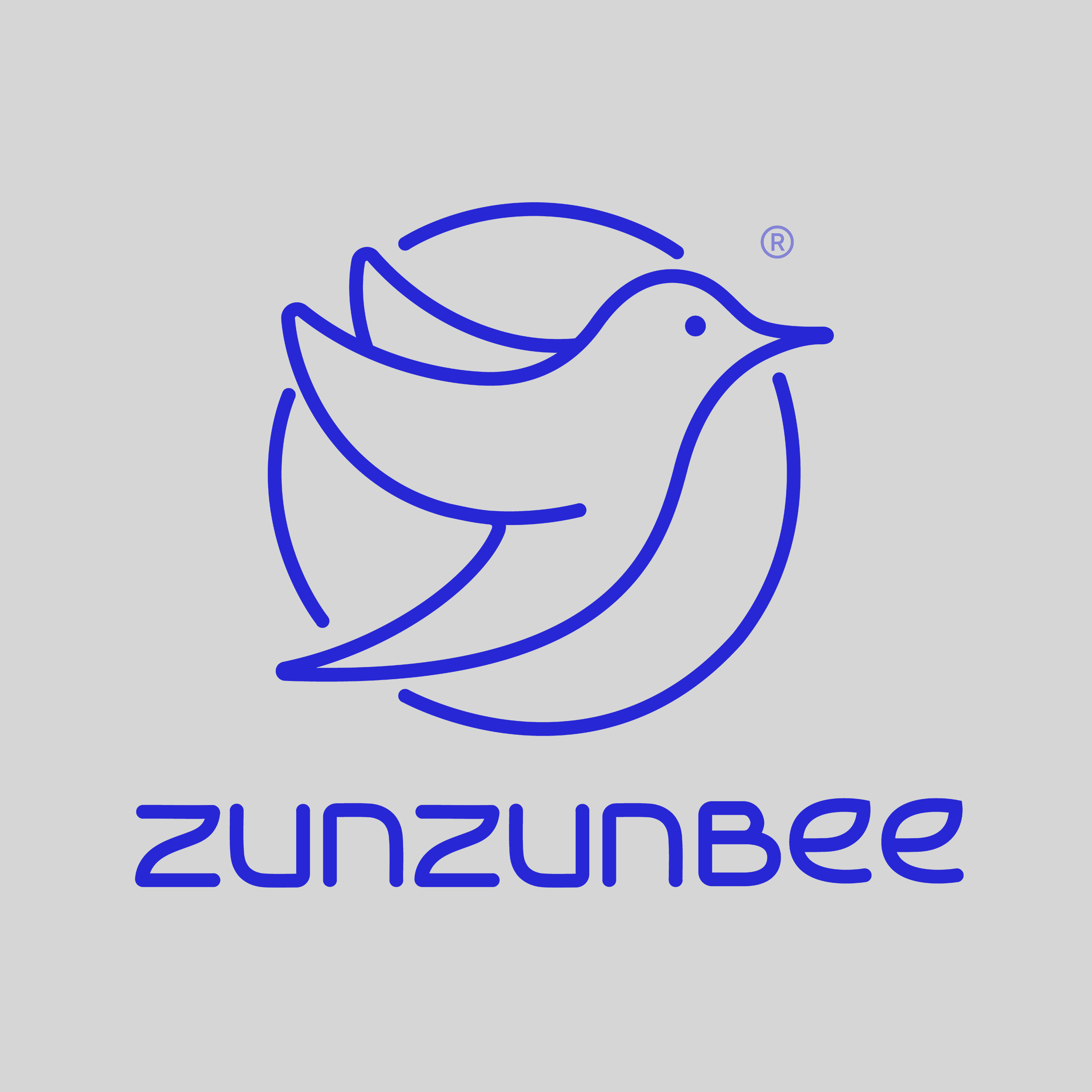
Brand Identity Design
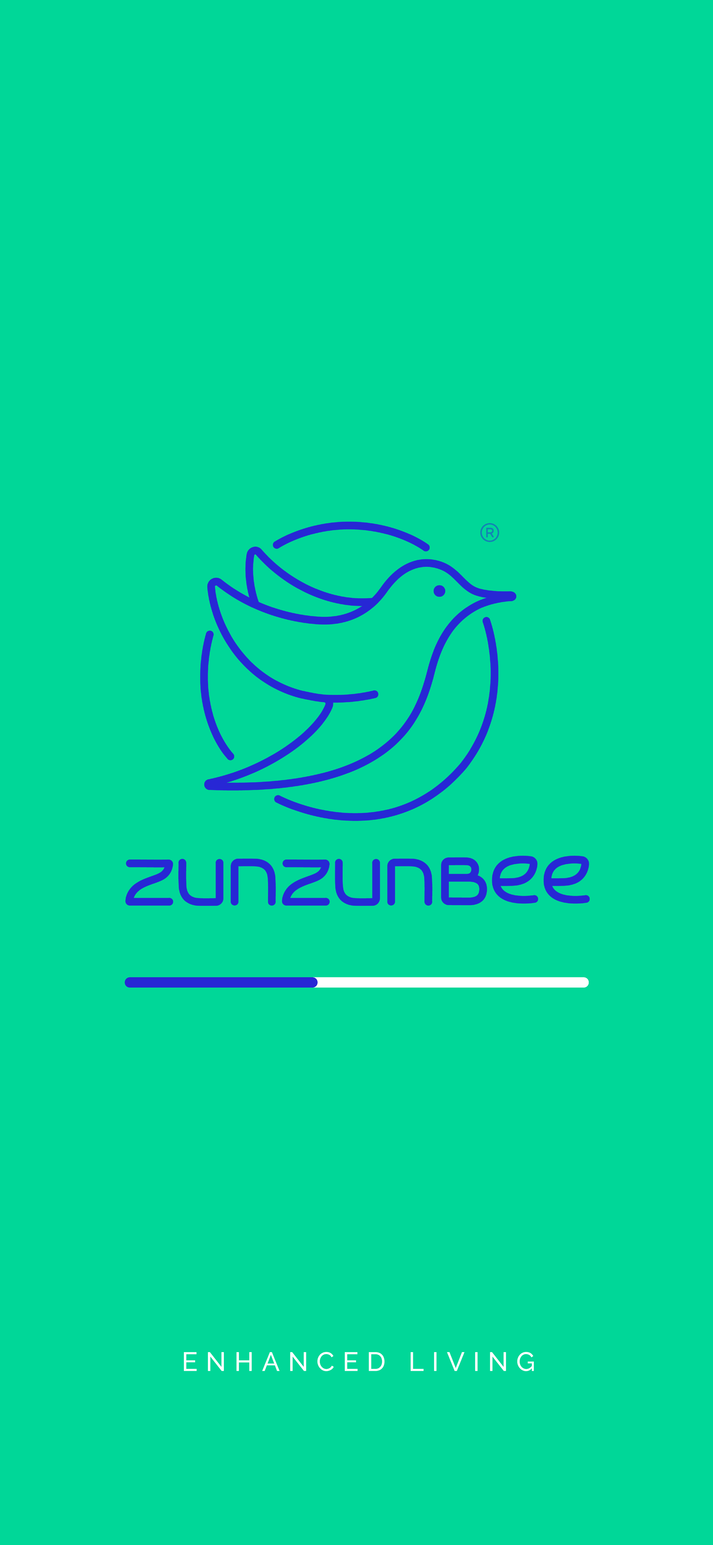
The logo is designed to be minimal, modern and positive, a brand icon (bird) is also recommended to be used at various locations.
The custom designed organic and fluidic typefaces create a unique identity that goes well with the creator archetype and innovative products that the brand offers. The icon of the bird is designed with the same design language making them a visual family.
Graphic family: Organic + Geometric
Look: Simple / Minimal / Neat and Clean
Feel: Highly Useful / Thoughtful / Innovative


Brand Logo Design Variations


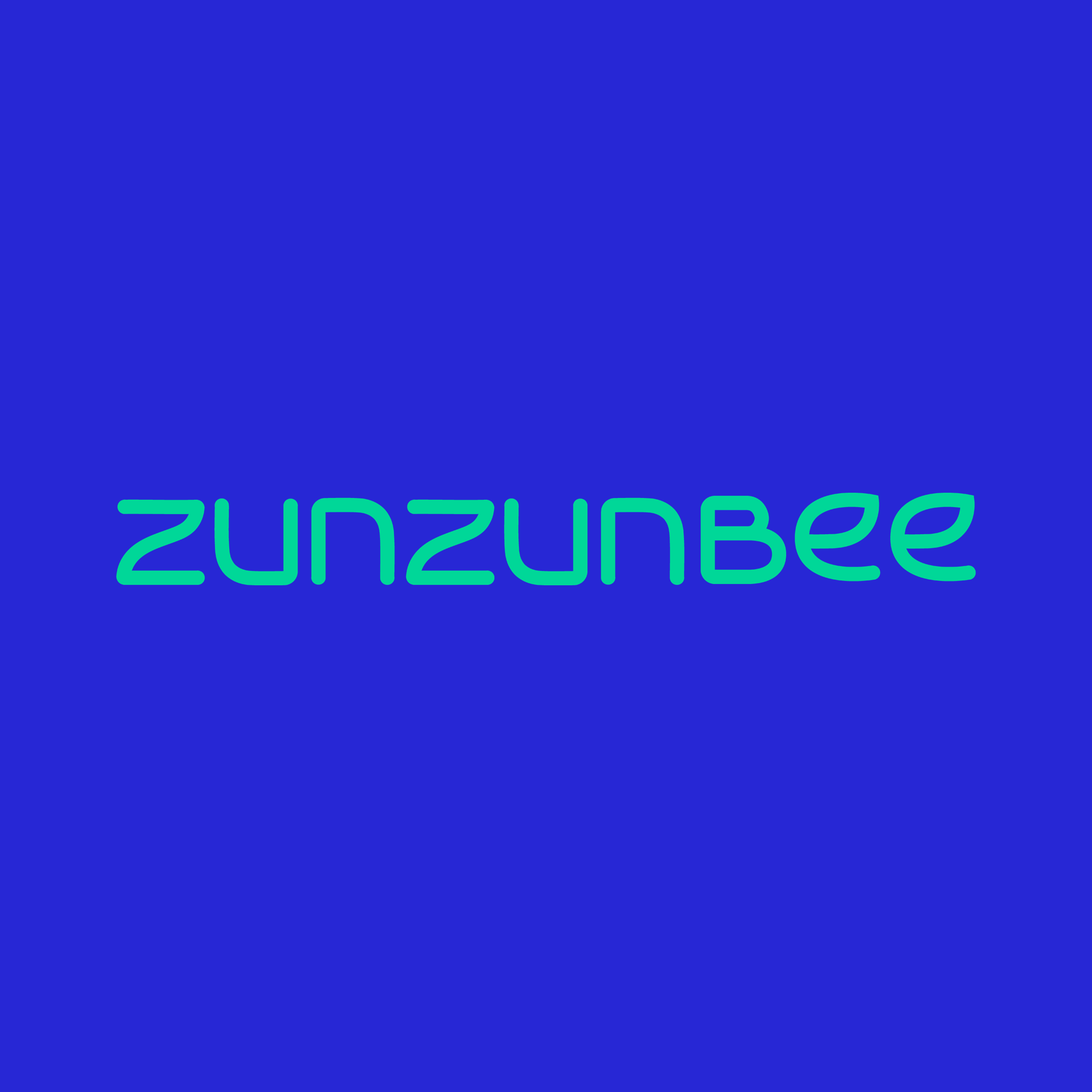

Brand Colour Palette
We recommended using a combination of electric blue & sea green for the brand identity. The complete palette contains turquoise, white, grey and black as well.
The colors have been decided in alignment with the brand archetype and look & feel.
Blue boosts our ability to think creatively; reaffirming that blue is the color of innovation. Blue is a primary color across all models of color space. It is the color of the ocean and the sky; it often symbolizes serenity, stability, inspiration, or wisdom.
Green is in general a calming and relaxing color. Being the color that represents nature, it's one that makes us feel good and positive. It is also synonymous with good health.

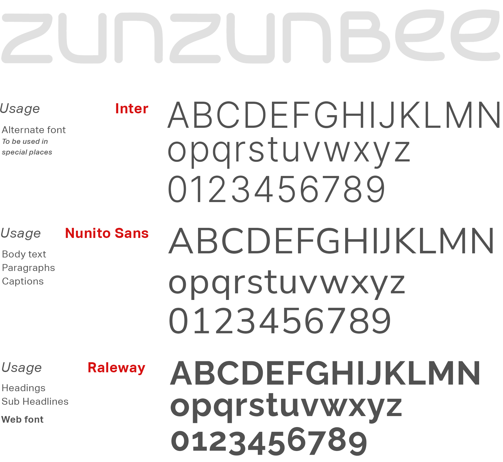
Brand Typography Family
We chose the following font family to reflect the correct brand’s personality in all the brand communications. Typography is the major element in a design that speaks to the customers.

Product Packaging Design for Smart Mat


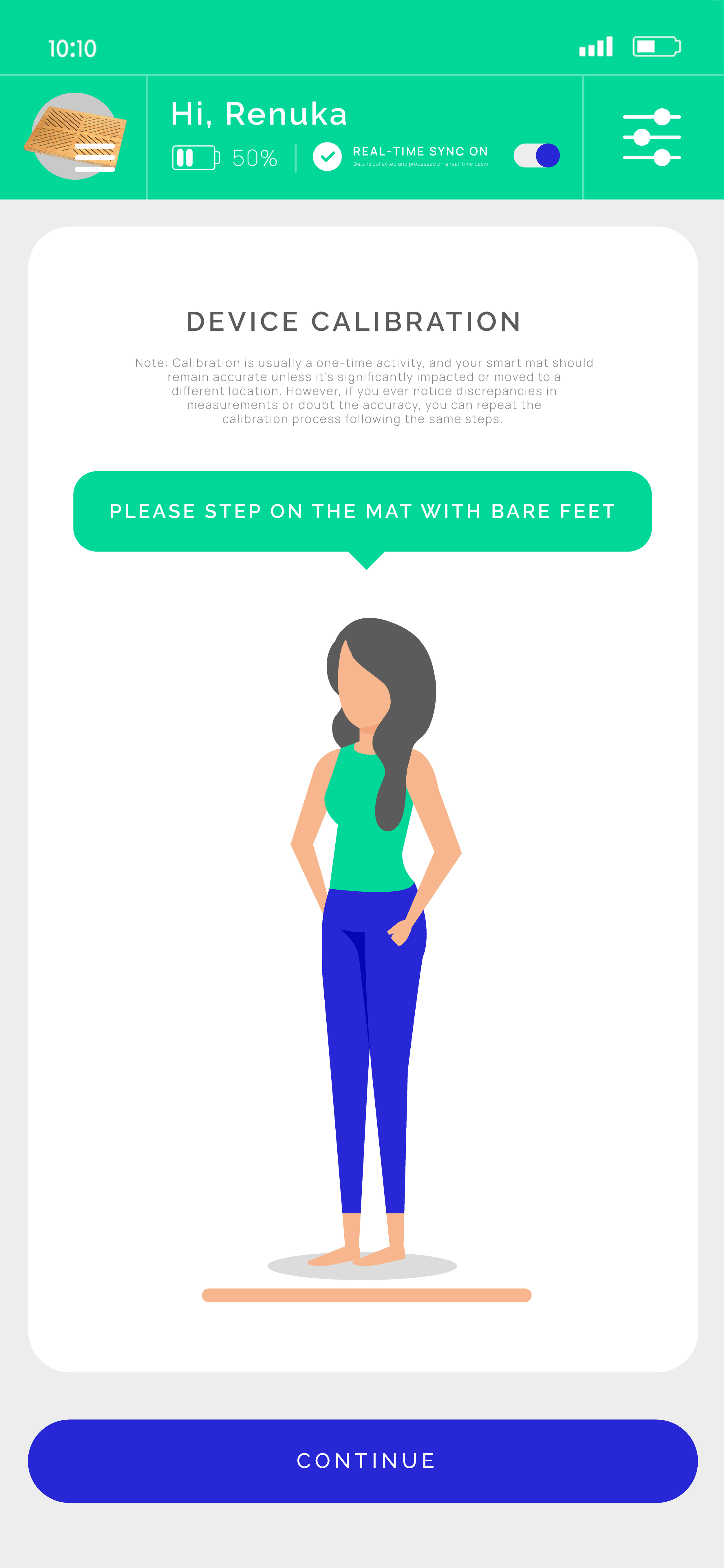
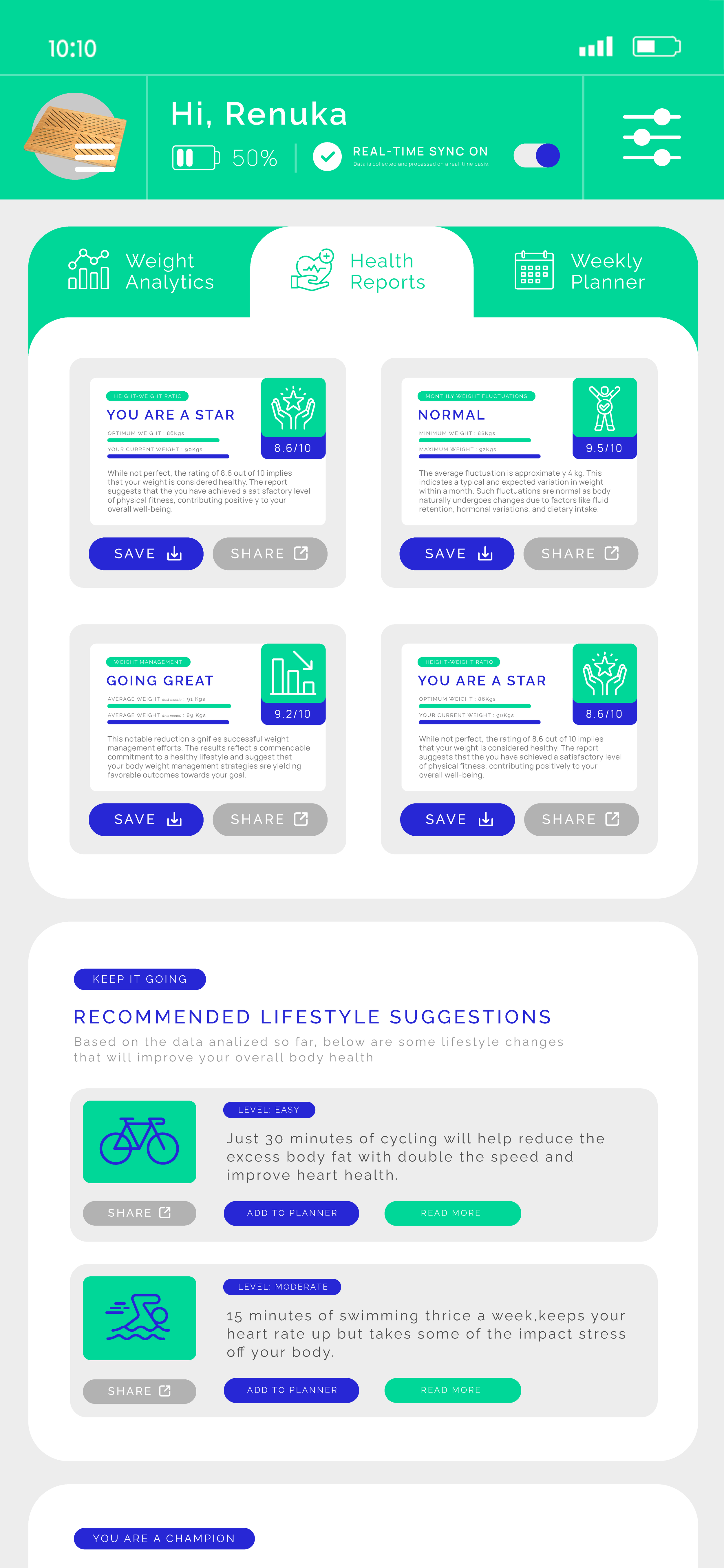
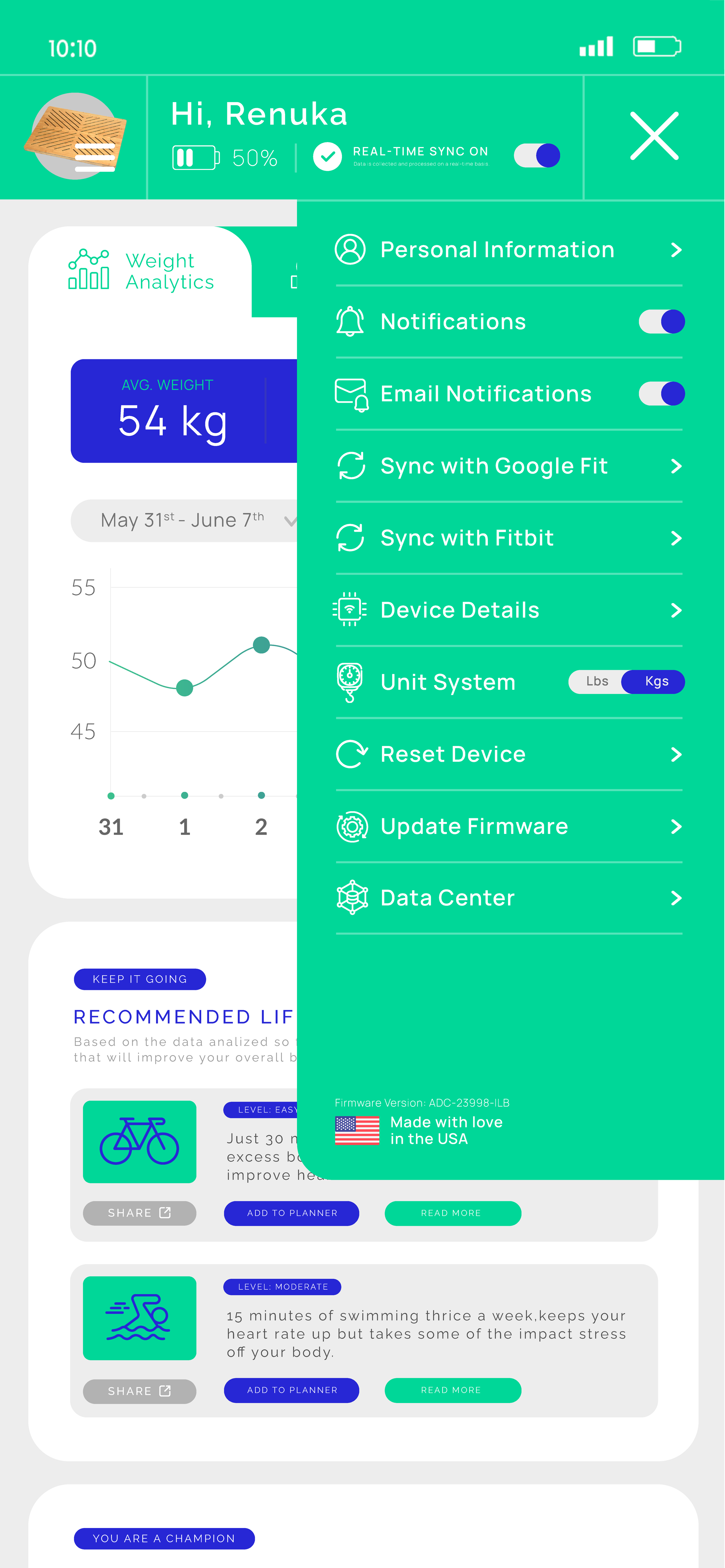
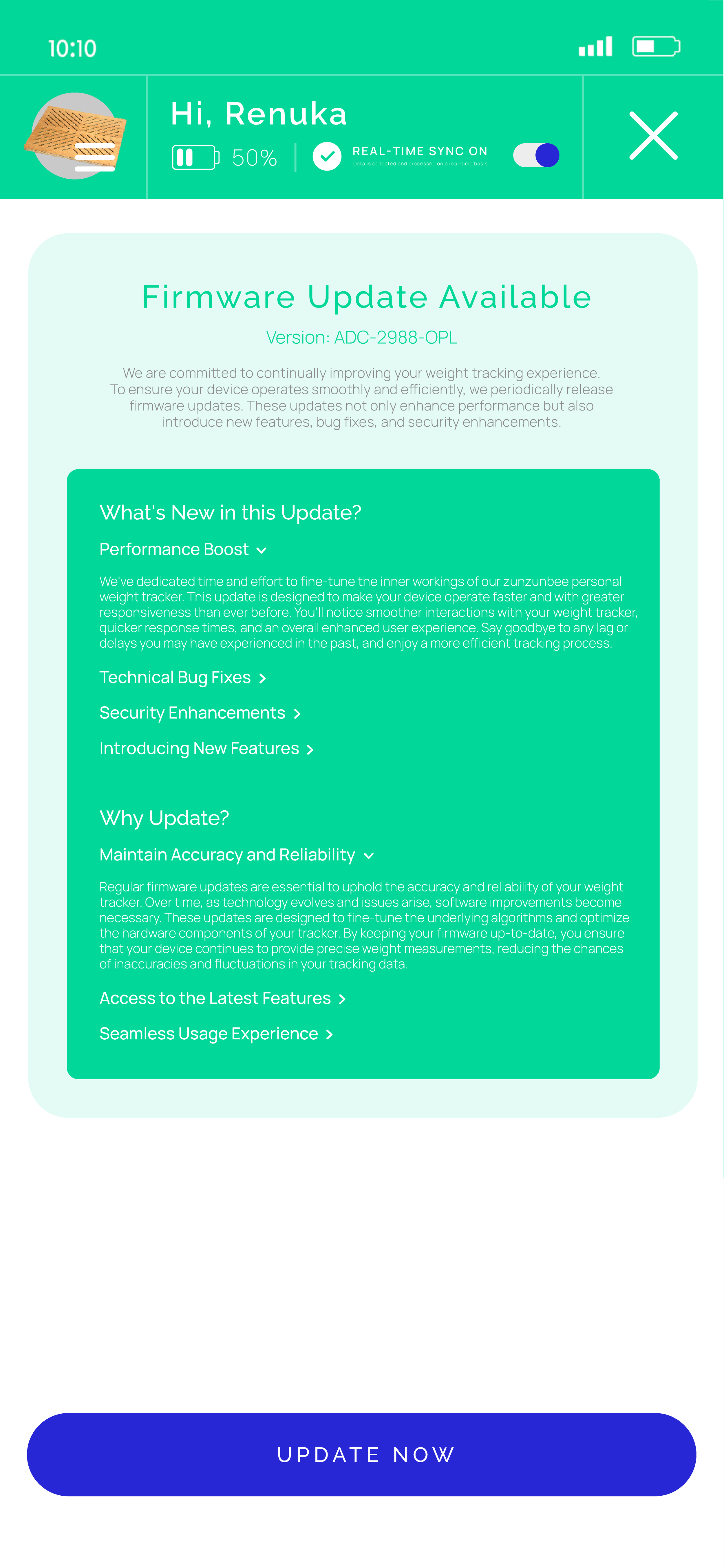
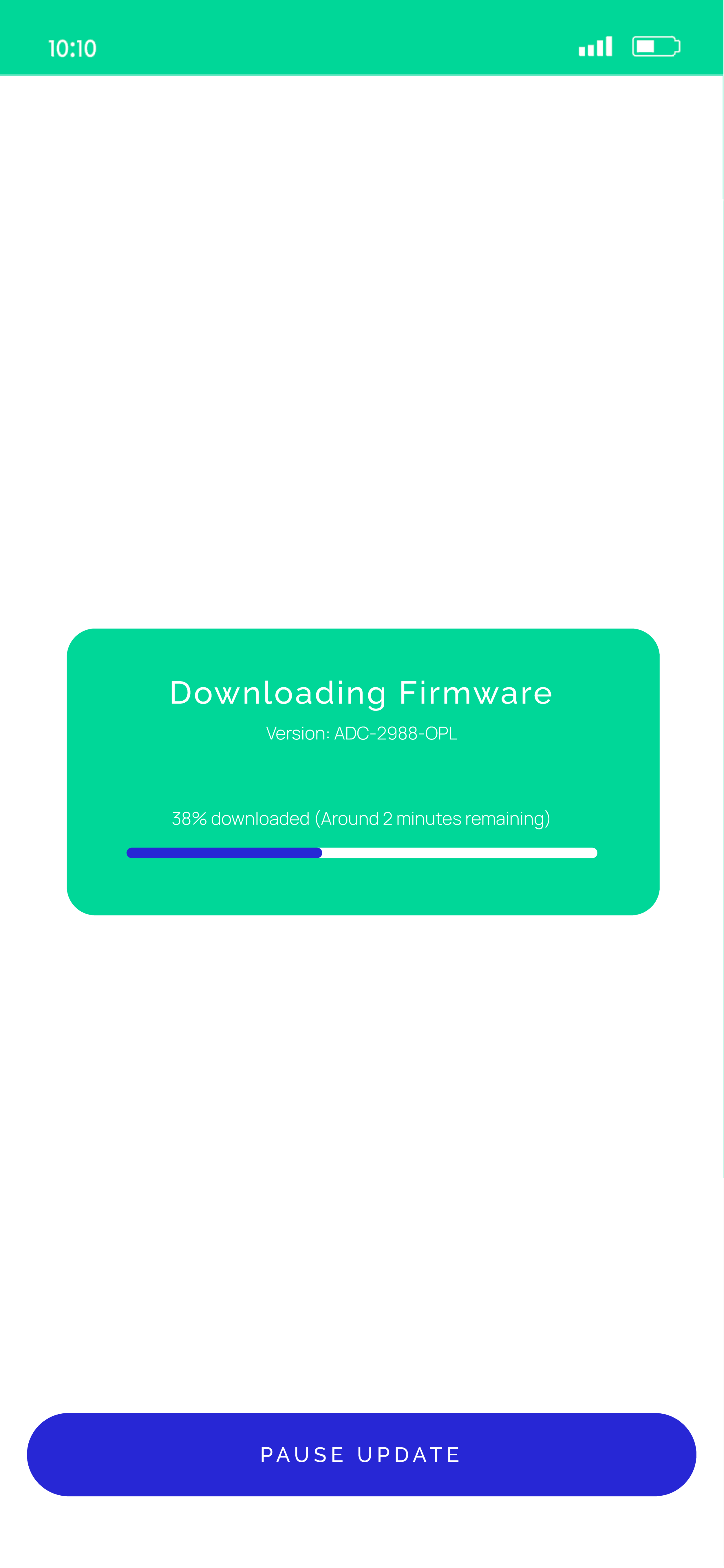
Mobile App UX/UI Design
UI/UX is a very crucial aspect of the mobile application. To make the app successful, we developed an engaging user interface and user experience. By understanding the need of the target audience and their market preference, we made the app highly interactive.


Website UX Design
In terms of UX design, our goal is to create a seamless and enjoyable shopping experience for customers. We prioritize ease of navigation and a user-friendly layout, ensuring that customers can quickly find the information they need and complete their purchase with minimal effort. By incorporating user feedback and testing our design iteratively, we strive to create a product page that not only meets but exceeds customer expectations.


Website UI Design & Development
Our UI design focuses on creating a visually captivating and intuitive interface. We aim to showcase the product in a way that highlights its unique features and benefits. By using a clean and modern design, we ensure that the user's attention is drawn to the product itself, making the shopping experience engaging and memorable.


EXPLORE SOME OTHER WORK
Case studies of some other brands we’ve built.
Branding is at the core of everything we do. Every design, every detail, every decision — all purposefully crafted to strengthen the brand. Our outcome-focused solutions span research, strategy, creativity, engagement, and execution.


