

BRAND IDENTITY / BRAND EXPRESSION SYSTEM / BRAND STATIONERY DESIGN / WEBSITE UX & UI / ADVERTISEMENTS
Data & Analytical Music Industry Branding Case Study
Project background: Based out of Beverly Hills, California, the project is backed by leading producers and artists from Hollywood. The company approached Arabella Design to position its brand as the leading provider of music industry analytics, parsing, rankings, and all sorts of content and metrics related to the music industry. Music Maven is a private company that has been in the industry for 7 years. The company currently specializes in the Music area. Its headquarters is located at BeverlyHills, California, USA. The Music Maven annual revenue is estimated at < 1M. Total funding of the company - $620.4K.
The brand strives to create an environment of an intertwined community of music geniuses (artists, producers, songwriters) and music lovers who influence each other to elicit the kind of responses that will rule the creation of music and the economics of the music industry ecosystem. To this end, Music Maven provides a comprehensive report card for each artist based on various metrics and offers a one-stop shop that allows artists, managers, labels, and even fans to obtain the most current and up-to-date rankings of every artist in the world. Using their proprietary technology, Music Maven offers an innovative “artist ranking list” that takes into account each artist’s ranking in social media presence, streaming charts, digital downloads, and concert ticket sales to accurately reflect each artist’s true rank among peers in each of the above categories. They help artists take a bow and bask in the glow of respect from their peers and adoration and pride from their fans. They crown these artists with quantitative, objective, and dynamic rankings that allow them to measure themselves against all of today’s and historical artists and genres. Music Maven provides these most influential artists access to its brand partners.

Brand Identity Design
Look and feel: Bold, confident, and accurate yet sophisticated and beautiful.
Music is a very vast segment. It has a diverse set of many different environments and emotions. Music Maven’s branding had to be done to create an identity that would blend magically across all of them. The wavy pattern in the logo was hence recommended, representing music, even when the icon is used in isolation and the smallest size.


Brand Expression System
Aligning with the music domain brand look and feel, the brand color palette was recommended to have shades from deep orange to green. In the music domain, every music album has a new color, and the logo should go with them all. We, therefore, allowed all colors from the palette, while deep blue remained the primary color. The primary brand color ‘blue’ was chosen keeping in mind the brand’s sage archetype, as blue signifies loyalty, professionalism, and trust. The typography system was recommended to bring alive the bold and confident feel that the brand wants to evoke while positioning itself as the ultimate authority in the music industry.


Exclusion Zone
The exclusion zone is the designed clear space that ensures that the logo has some breathing space around it. It is to ensure that the logo is always visually distinct. The logo’s exclusion zone is equal to half of the logo height (depicted as ‘2x ‘in the image). The icon also follows the same rules.

Minimum Size
The minimum sizes of brand identity applications were recommended keeping in mind that that brand visibility and legibility are never compromised.
1.8 cm for print & 120 px on screens
1 cm for print & 60 px on screens
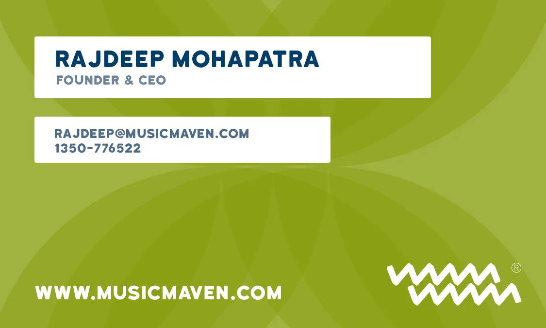
Email Signature
The email signature was designed to add a touch of the brand and provide the relevant business details at the end of every email communication. It can also be considered a business card.


Social Media Look
Red was our preferred color choice for social media identity due to its higher visual wavelength and eye-catching ability.


Website UX & UI Design
The website was designed to keep it informative and action-oriented. We wanted the user to scroll as little as possible, so we came up with a novel self-rearranging framework of blocks. These blocks rearrange themselves as per the screen size to effectively use the whole screen.

Brand Stationery Design
We crafted the branded stationery and collaterals to bring alive the brand’s essence. They were designed to help generate trust, communicate brand values, showcase professionalism, and strengthen brand recall value at every touch point.


Outdoor Hoarding
To be able to increase sales and establish steady growth, ads have to influence the consumer to take the desired action. Billboards are perfect in this case because they remain publicly displayed 24/7 throughout various urban areas. The billboards and hoardings were designed to introduce the brand to its audience in a meaningful way and increase the brand’s recall.

EXPLORE SOME OTHER WORK
Case studies of some other brands we’ve built.
Branding is at the core of everything we do. Every design, every detail, every decision — all purposefully crafted to strengthen the brand. Our outcome-focused solutions span research, strategy, creativity, engagement, and execution.


