

BRAND NAMING / BRAND IDENTITY / BRAND EXPRESSION SYSTEM / WEBSITE DESIGN / SOCIAL MEDIA STRATEGY AND CONTENT
Bollywood & Hindi Film Industry Startup Branding Case Study
Project background: Box Office Forecast (BOF) makes unbiased and accurate box office forecasts of upcoming Hindi movies to prevent people from falling prey to cruel marketing campaigns intended to make a bad movie seem promising and popular. The platform also offers the latest Bollywood news from Indian Cinema. The team wanted us to design a brand that looks and feels ‘strong, bold and unbiased’.

Brand Archetype
The Sage: Box Office Forecast
The Sage is motivated by independence, cognitive fulfillment, and truth. This archetype has a foundational identity attachment to the belief that thinking is what defines the human experience. They're also known as experts, scholars, advisors, researchers, thinkers, mentors, or teachers. Possessing a high need for autonomy, the sage values learning for its own sake because it allows for detachment from the masses and the capacity to remain objective.
A sage in any category always stays in the top position in terms of brand perception. The sage relies on knowledge and is a firm believer in the fact that goodness and truth will prevail and set us free.

Brand Identity Design
The sharp cut edges and confident strokes used in the brand identity design help build the confident image of the brand. The logo was designed to make the abbreviated version of the brand name ‘BOF’ prominent and popular. The Indian flag was included as part of the brand identity to showcase that we are proud Indians and that the brand is secular and not biased in any way as the brand would deal with films from all religions and regions of India.
The film reel in the center of the logo was designed to visually connect with the film industry. The logo was designed to be a compact logo unit and minimal in its construction so that it is comfortably visible even in small sizes and easy to emboss and engrave on all surfaces and materials.
Look: Elegant / Iconic / Minimal / Unique
Feel: Confident / Creative / Proud / Leader / Unbiased

Brand Typography Family
We recommended the below set of fonts for the brand to bring alive an iconic look, and showcase the brand's best side - ‘confident and unbiased’. The font family was also chosen because of being bold.

Brand Color Palette
The primary brand colors of ‘Box Office Forecast’ were chosen as white and black. These were used in a specific ratio and proportion to bring alive the ‘strong and unbiased’ feel and emotion, in line with the overall brand personality. In most cases, black was recommended as the background color, and white on top of it.

White: Some of the positive meanings that white can convey include cleanliness, freshness, and simplicity. The color white often seems like a blank slate, symbolizing a new beginning or a fresh start.
Grey: Grey is the color of intellect and compromise. It's a diplomatic color, negotiating all the distance between black and white. Grey represents neutrality and balance. Its color meaning likely comes from being the shade between white and black.
Black: Black is a popular color in the film industry. In color psychology, black’s color meaning is symbolic of mystery, power, elegance, and sophistication. Wearing black clothing can symbolize many things such as power, elegance, sophistication, and even intelligence. Black is a strong color that usually represents strength and boldness, especially when paired with other colors.
Social Media Content Strategy and Design
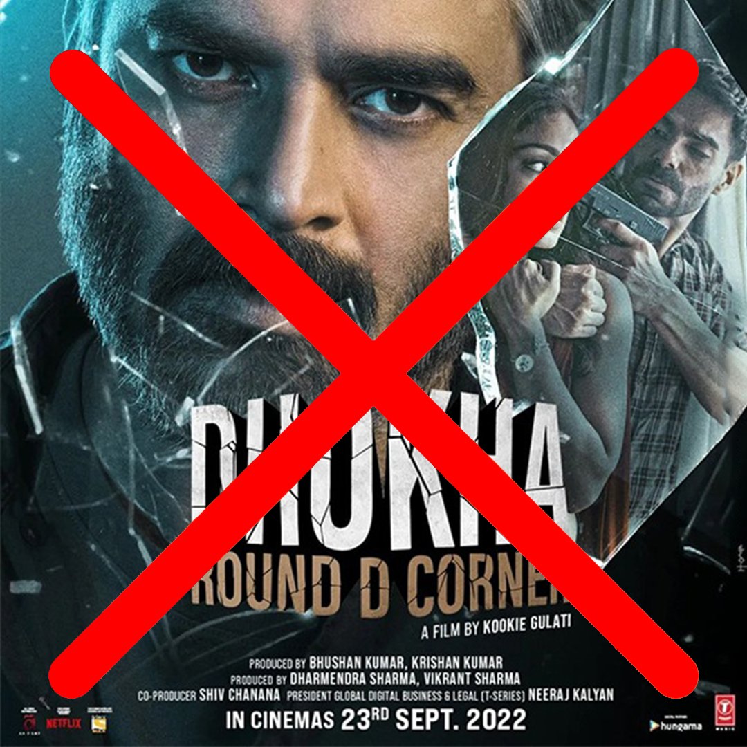
Instagram was chosen as the only social medium for the brand keeping in mind the target audience’s availability and its popularity in the film industry. It was recommended to keep the social media post designs free of any text and yet make them self-explanatory, clearly communicating that it is a forecast. The clean, unambiguous visual communication was developed to help the brand stand out and deliver a consistent, unified experience, bringing it to the top of customers' minds.


Website UX/UI Design
The website is the backbone of the business’s online presence. It was designed to reinforce and increase brand value and customer loyalty. The communication was designed to be minimal and to the point. The website design is a content-based design that grows over time with more data and information.


Visiting Card Design
The visiting card was designed to be minimal in the look and feel. We recommended to keep the brand prominent on both sides, in line with the brand’s bold personality. Since the website is the main showcase platform of the business, it was featured on both sides of the visiting card.

EXPLORE SOME OTHER LATEST WORK
Case studies of some other brands we’ve built.
Branding is at the core of everything we do. Every design, every detail, every decision — all purposefully crafted to strengthen the brand. Our outcome-focused solutions span research, strategy, creativity, engagement, and execution.


