

BRAND IDENTITY / BRAND EXPRESSION SYSTEM / BRAND STATIONERY DESIGN
Family Business Consultant Branding Case Study
Project background: Based out of Mumbai, India, Dr. Mita Dixit is well known for years in the family business consulting domain (B2B). She is also an independent director on various company boards. She founded ‘Equations India - Family Business Advisors’ and has been advising and mentoring prominent family businesses in India. She approached Arabella Design for the rebranding of her company. The brief was to make it more relevant to family business owners while bringing alive her B2B Consulting business value proposition.

Brand Archetype for Equations India
The Teacher / Investigator / Mentor / Expert - Trustworthy and Visionary


Brand Identity Design
We decided to keep the look minimal. The logo was designed to depict the three generations of the family business. The different sizes of the three people showcased as part of the brand identity denote the importance and power of the three generations. The icon also represents a graph, as the company solves personal and professional equations of family businesses.
Recommended logotype: Combination mark type
Graphic family: Geometric (documents)
Look & feel: Knowledgeable, professional, and problem solver.

Brand Color Palette & Font Family
Since the company is strictly into B2B, i.e. offering professional services to business owners, the colors used in the identity were chosen to influence the perception of the company in a major way. It is one of the major reasons why we recommended a dual-color identity for the business and made it stand out.

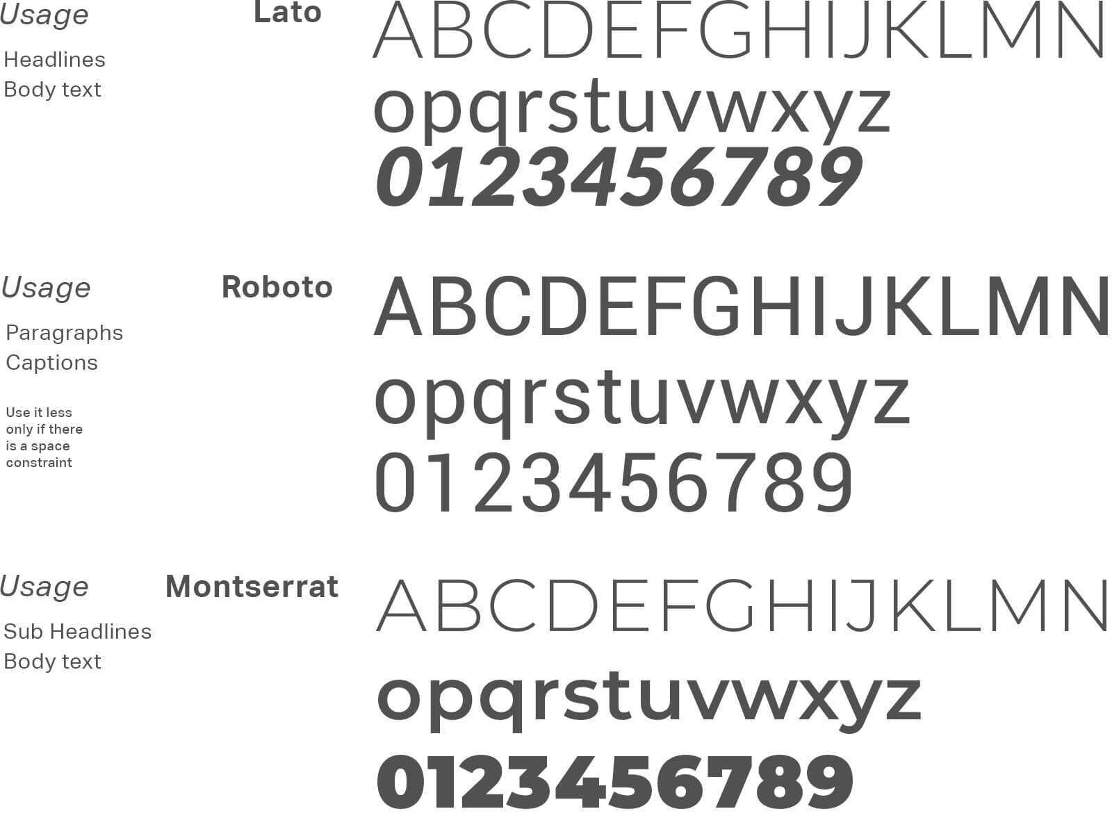
Demonstration of Color & Typography Usage
The creative communications show the importance and weightage of different brand colors and demonstrate how the brand fonts are to be used for effective B2B branding.

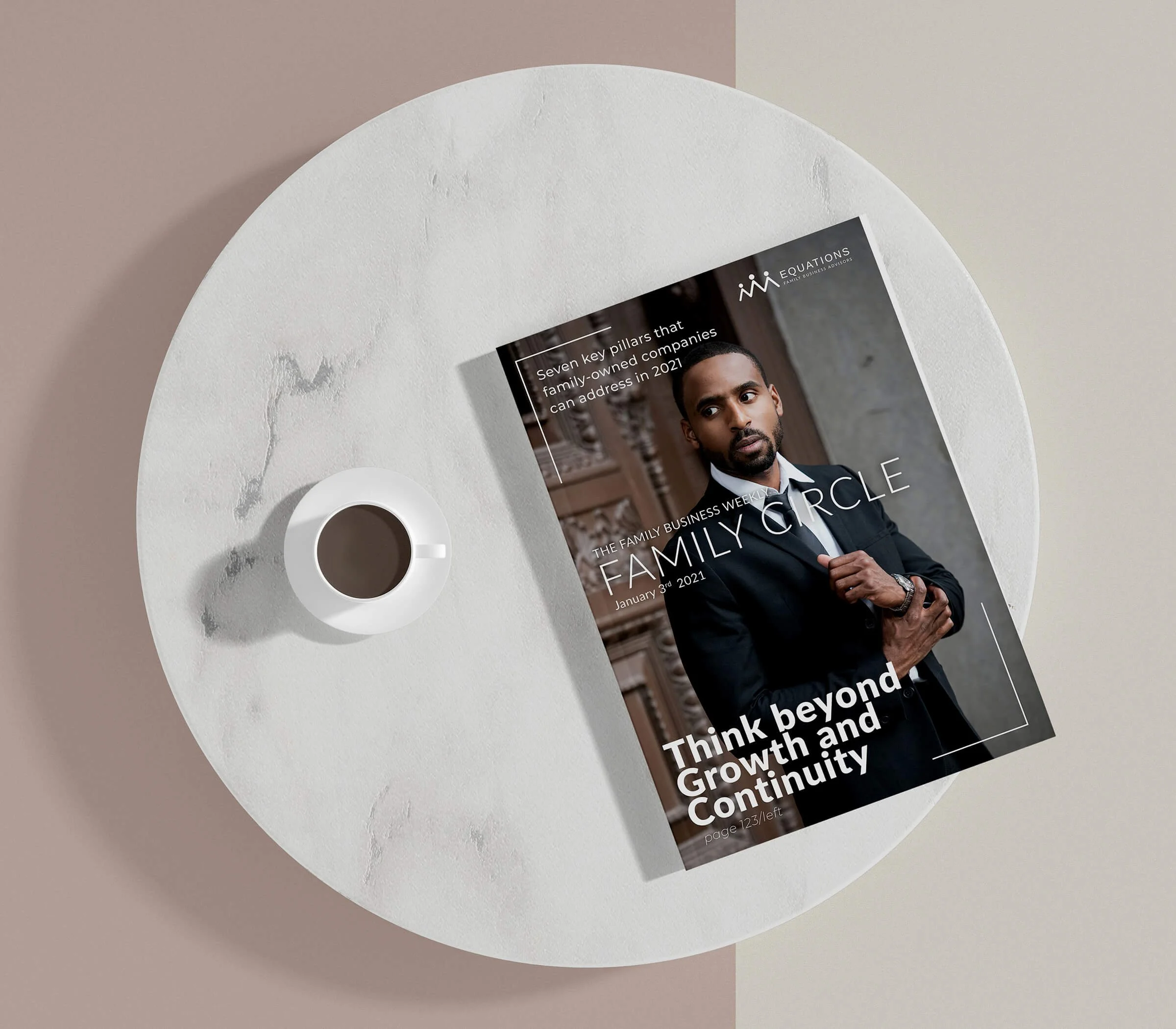
B2B Magazine Cover
The bi-yearly magazine cover was designed to help generate trust, communicate the brand values, showcase professionalism, and strengthen the brand recall value. The purpose of the communication was to help the brand create awareness and bring the business to the top of customers' minds.
Visiting Card Design
In the visiting card design, we wanted to make our website address a very prominent element on both sides. Since the company operates in the B2B consulting business, the website is the main platform for new clients. We wanted people to easily locate it on both sides of the visiting card.

Brand Office Signage Design
It is important to reach the right customers and the minimal eye-catching signage design helps the customer know where the company office is located. Unlike other means of advertising like radio, TV, and newspaper, signage is cost-effective.

EXPLORE SOME OTHER LATEST WORK
Case studies of some other brands we’ve built.
Branding is at the core of everything we do. Every design, every detail, every decision — all purposefully crafted to strengthen the brand. Our outcome-focused solutions span research, strategy, creativity, engagement, and execution.


