

BRAND IDENTITY / BRAND EXPRESSION SYSTEM / BRAND STATIONERY DESIGN / PACKAGING DESIGN / RESTAURANT MENU CARD DESIGN / RESTAURANT FACADE DESIGN
Italian Restaurant Branding Case Study
Project background: House of Gourmet (HOG) is an Italian Patisserie and Café startup project based in the affluent Jubilee Hills area of Hyderabad, India. HOG bakes everything from dessert jars and cupcakes to customized cakes. HOG also supplies baked goodies to popular cafés and outlets in Hyderabad like Tabula Rasa, Autumn Leaf Café, Chit Chat Chai, Rangrez, and more. The founder, Ms. Shalini Grosu approached us for the branding of the cafe and the Italian restaurant. Having grown up in a family that's been in the hotel business for generations, Shalini wanted to bring the homely touch to commercial baked goods. The brief was to create a brand that would give the restaurant a feeling of liveliness, recreation, and well-being.

Restaurant’s Brand Archetype
The Innocent - House of Gourmet
Nature and natural living / Desire is to experience paradise / Simplicity / Faithful and optimistic / Doing things right.


Brand Identity Design
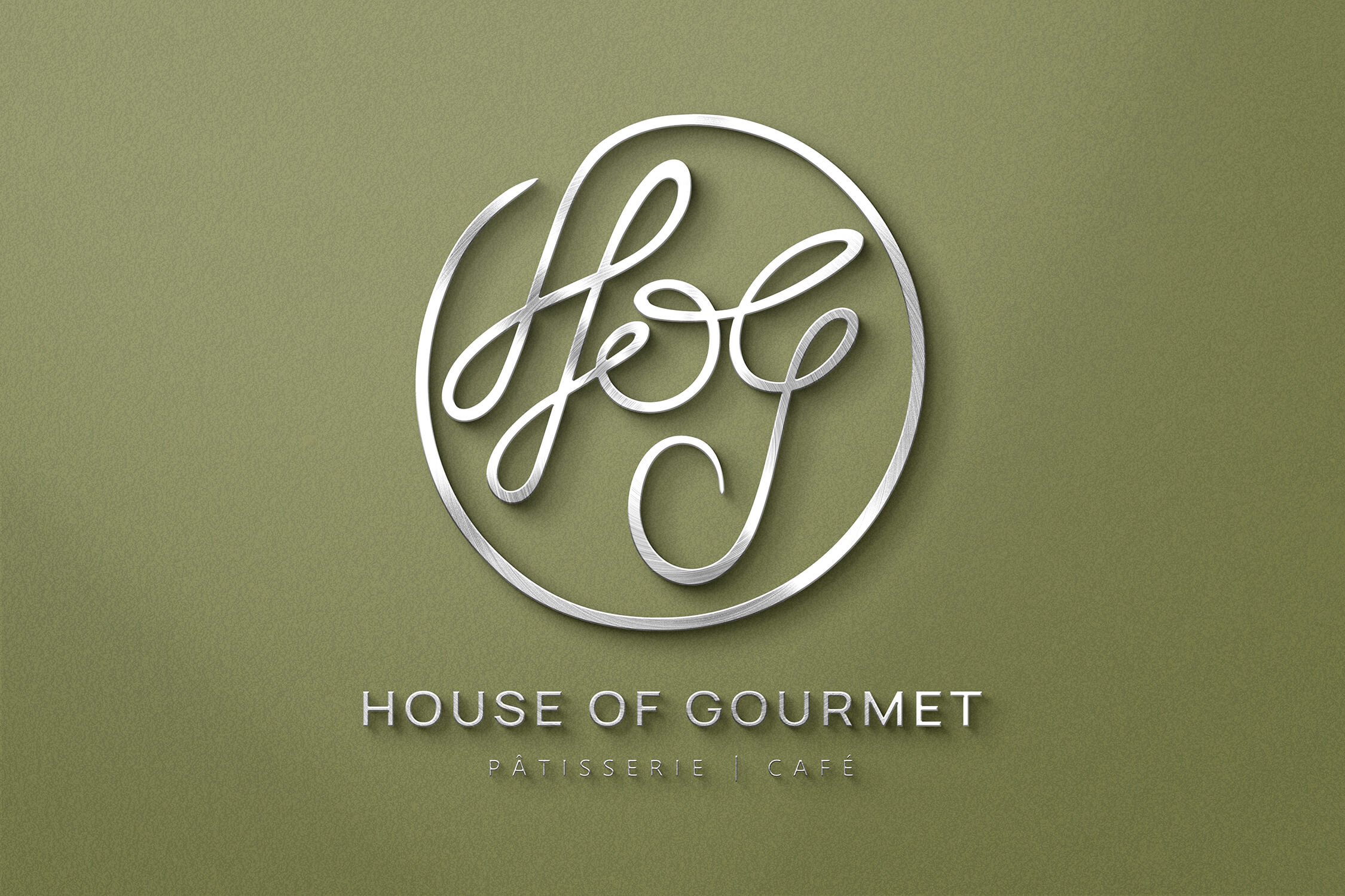
Recommended logotype: Combination mark type
The logo is a signature of the initials of the brand name as that is how we wanted the brand name to get popularized - HOG. The logo is inspired by a Celtic symbol denoting joy, embracing life, and happiness. To bring it alive, the curves were made as organic and humanly as possible to resonate with our hand-cooked delicacies and go well with the organic curves of food such as bread, fruits, and drinks. The icon was designed to exude elegance. The circle encapsulating was designed to represent totality, wholeness, originality, perfection, eternity, and timelessness.
Graphic family: Organic (food and plants) + Geometric (cutlery and restaurant interiors)
Look and feel: Simple, elegant, and good feel.
Brand Typography Family and Font Styles
Choosing the right fonts that reflected the restaurant’s Italian personality was essential for communicating the correct message to customers. Typography is the major element in a design that literally speaks to the customers in a business like a restaurant. It plays a major role in menu card design and other marketing and advertisement-related communications. The modern fonts were chosen to bring alive elegance and also because these fonts cover all the special characters of the Italian language.

Recommended brand color palette to bring alive the desired Italian restaurant branding look & feel.
Since the brand is an Italian restaurant, i.e. in food-related business, we wanted to evoke a sense of hunger and taste while looking beautiful and elegant. We recommended an earthly feel to be associated with the modern brand. The color palette consists of shades from the earth, like, mud brown, brick red, grass green, etc. The subtle hues were chosen to bring a natural feel to the cafe in-line with the core Italian restaurant branding strategy.
Earthen shades of colors are one of the most satisfying color groups to work with because they come together so harmoniously. As these colors are all present in nature they go along naturally with each other. Red-tinted earth colors look beautiful teamed together, together with nature-inspired green colors lifted from plants. All nature colors make equally good companions. Earth tones are usually considered to be friendly, contemporary, and inviting. They are a mixture or tonalities of browns and tans, which can include richer colors containing some brown, such as orange, red and green. They tend to be more muted and flat colors. Earth tones are also considered to be more appealing and functional and tend to be perceived as warm, reassuring, and settling.


Demonstration of brand colors and typography usage
These creatives show the importance and weightage of different brand colors. The guidelines were recommended to ensure consistency in communication and complete uniformity in style and formatting in alignment with the decided Italian restaurant branding strategy.

Cake Box Design
It is the design of the packaging that builds up the value of the product inside. We used design as a tool to increase the product’s value and enhance the brand image of the cafe and bring alive the desired Italian restaurant branding feel. Our packaging was designed to outshine the brand’s competition, generate trust, and persuade shoppers to purchase the offerings. The premium and elegant designs were achieved while keeping the main focus on the brand’s identity. The overall minimal theme of the brand was maintained for every packaging design.


Takeaway Packaging Sleeve Design
The taste of food is not the only factor that can make a difference in the consumer experience. What we see, feel and touch can also influence how we enjoy the meal. The branding and packaging design was intended to build a clean elegant image that would make the food even more appealing than what one eats in the cafe.

Branded Carry Bag Design
When it comes to brand recognition, some are struggling, especially smaller businesses because they cannot afford the huge amounts of money bigger corporations allocate to advertising. This is where merchandise bags come in to give struggling businesses a push forward. The packaging bags were designed to help significantly in increasing brand recall while maintaining the overall brand look and feel.

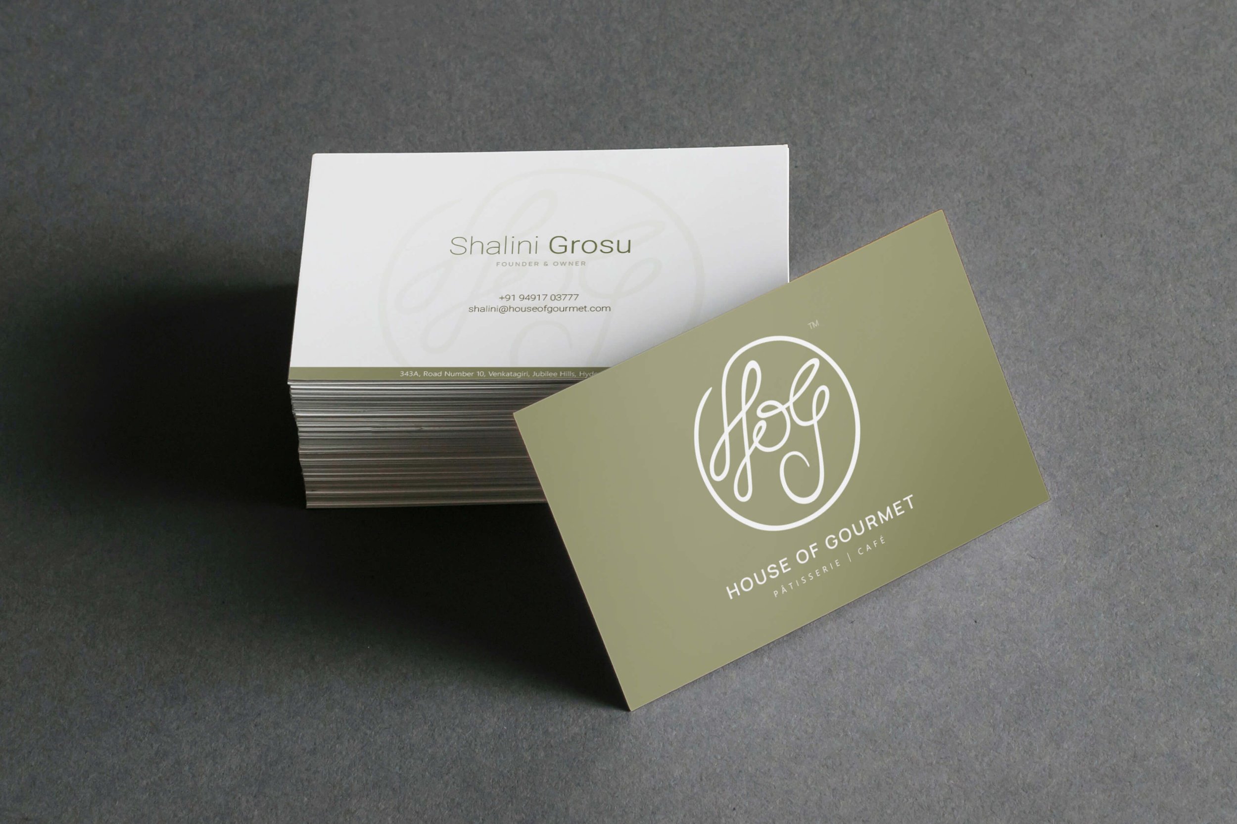
Brand Stationery Design
The stationery and collateral were designed to bring alive the Italian restaurant branding essence. They help generate trust, communicate brand values, showcase professionalism, and strengthen the brand recall value at every touch point.
We designed these assets for the cafe and Italian restaurant to help the brand deliver a consistent, unified experience and bring the business to the top of customers' minds.


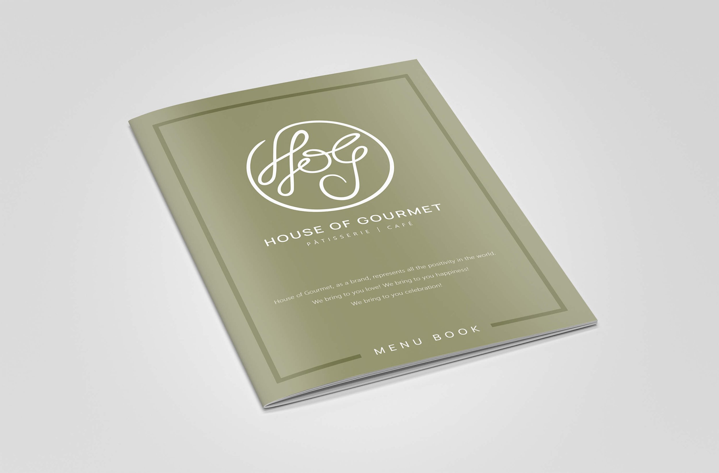
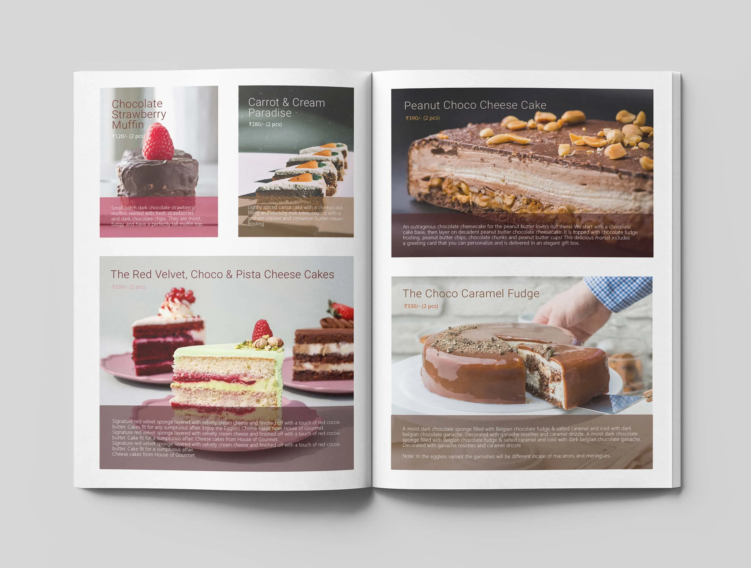
Restaurant Menu Design
The menu for the patisserie section of the Italian restaurant is designed in the form of a book/magazine. This is derived from the insight that the patisserie business has a lot to do with the visuals of the bakery items. Hence it was decided to visually show each item elegantly, while also speaking a little bit about the item.
EXPLORE SOME OTHER LATEST WORK
Case studies of some other brands we’ve built.
Branding is at the core of everything we do. Every design, every detail, every decision — all purposefully crafted to strengthen the brand. Our outcome-focused solutions span research, strategy, creativity, engagement, and execution.


