

BRAND IDENTITY DESIGN / BRAND EXPRESSION SYSTEM / BRAND STATIONERY / WEBSITE UX AND UI / BRAND ADVERTISEMENT
Luxury Real Estate Branding Case Study
Project background: Domo Real Estate Private Limited is a company focused on improving the buying/renting experience in the luxury sector. Headquartered in Mumbai, India, the real estate company is operative in India, the UK, and UAE. The company founders, Mr. Vedant Bhardwaj, and Ms. Hetavi Jain approached Arabella Design for the branding of his company. The brief was to design a globally appealing, minimalist, simple, and yet luxurious-looking and highly powerful differentiated brand for the startup.

Brand Archetype
The Sage: Domo Real Estate
The Sage is motivated by independence, cognitive fulfilment, and truth. This archetype has a foundational identity attachment to the belief that thinking is what defines the human experience. They're also known as experts, scholars, advisors, researchers, thinkers, mentors, or teachers. Possessing a high need for autonomy, the sage values learning for its own sake because it allows for detachment from the masses and the capacity to remain objective.
A sage in any category always stays in the top position in terms of brand perception. The sage relies on knowledge and is a firm believer in the fact that goodness and truth will prevail and set us free.

Brand Identity Design
The logo was designed to exude luxury, trust, and professionalism to bring alive the essence of luxury real estate branding. An original and unique mark, the bold typefaces were custom-crafted to match the brand’s personality and make it highly powerful and differentiated. The line on the top of DOMO visually communicates that ‘Real Estate Starts and Ends at ‘Domo’. It also denotes a ‘roof’/‘shelter’/‘home’. Ultra spacious and distinct letters were crafted to ensure high visibility and legibility even at small sizes. The premium and sophisticated feel of the logo was achieved while keeping the design minimal.
Graphic family: Geometric (Real Estate Buildings)
Look: Luxurious / Premium / Minimal but Informative
Feel: Trustworthy / Knowledgeable

Brand Typography Family
To outstand in the luxury real estate market, the fonts were chosen to reflect the brand’s highest degree of professionalism and set an appropriate brand image, reasserting and adding value to all the communication made by the brand. The below set of sans-serif fonts was chosen while keeping the luxury and trustworthy look and feel in mind.

Brand Color Palette
We defined what colours the brand should use to express itself and bring alive the desired emotions in the customer’s mind, and help differentiate itself meaningfully in the luxury real estate market. The primary brand colour, ‘blue’, was chosen to represent the sage personality in the real estate management business, as blue signifies loyalty, freedom, and trust.

Dark Blues: Blue frequently invokes words like dependable, loyal, logical, soothing, calm, and focused. Blue also tends to increase personal productivity.
Bright Blues: The color blue represents both the sky and the sea and is associated with open spaces, freedom, intuition, imagination, inspiration, and sensitivity. Blue also represents the meanings of depth, trust, loyalty, sincerity, wisdom, confidence, stability, faith, and intelligence.
Subtle Greens: The color meaning of green is vitality, freshness, growth, wealth, balance, health, and youthfulness.
Brand Advertisement Design
Designed for the company’s launch in Mumbai, India, the brand advertisement was designed to exude the brand’s essence and values. The purpose of the communication design was to create brand awareness and strengthen Domo Real Estate’s brand image in the South Mumbai real estate market.
Visiting Card Design
The visiting card becomes ultra important in a service business like luxury real estate management. We strategically designed the layout to include a picture of the concerned associate to connect with people at a human level. The design was thoughtfully developed to deliver a consistent, unified experience and bring Domo Real Estate to the top of customers' minds.

Company Stamp Design
Branded stationery and collateral were designed to bring alive the luxury real estate branding visual language. The design was aimed at generating trust, communicating brand values, showcasing professionalism, and strengthening the brand recall value at every touch point.

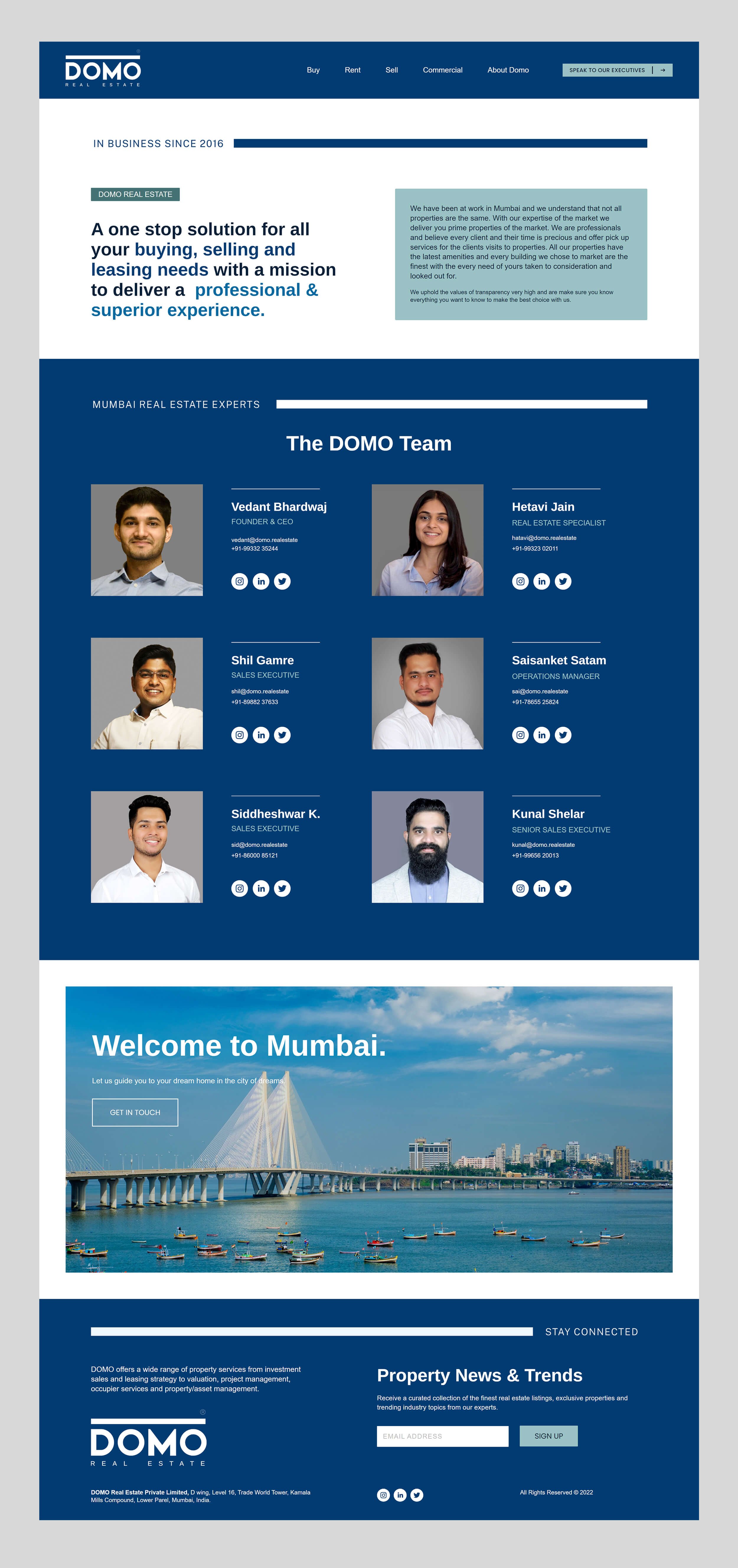
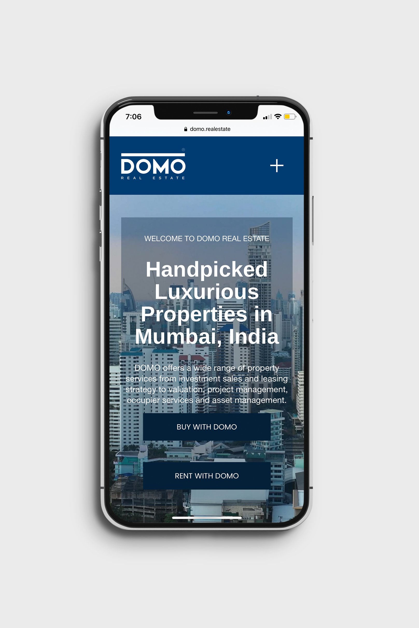
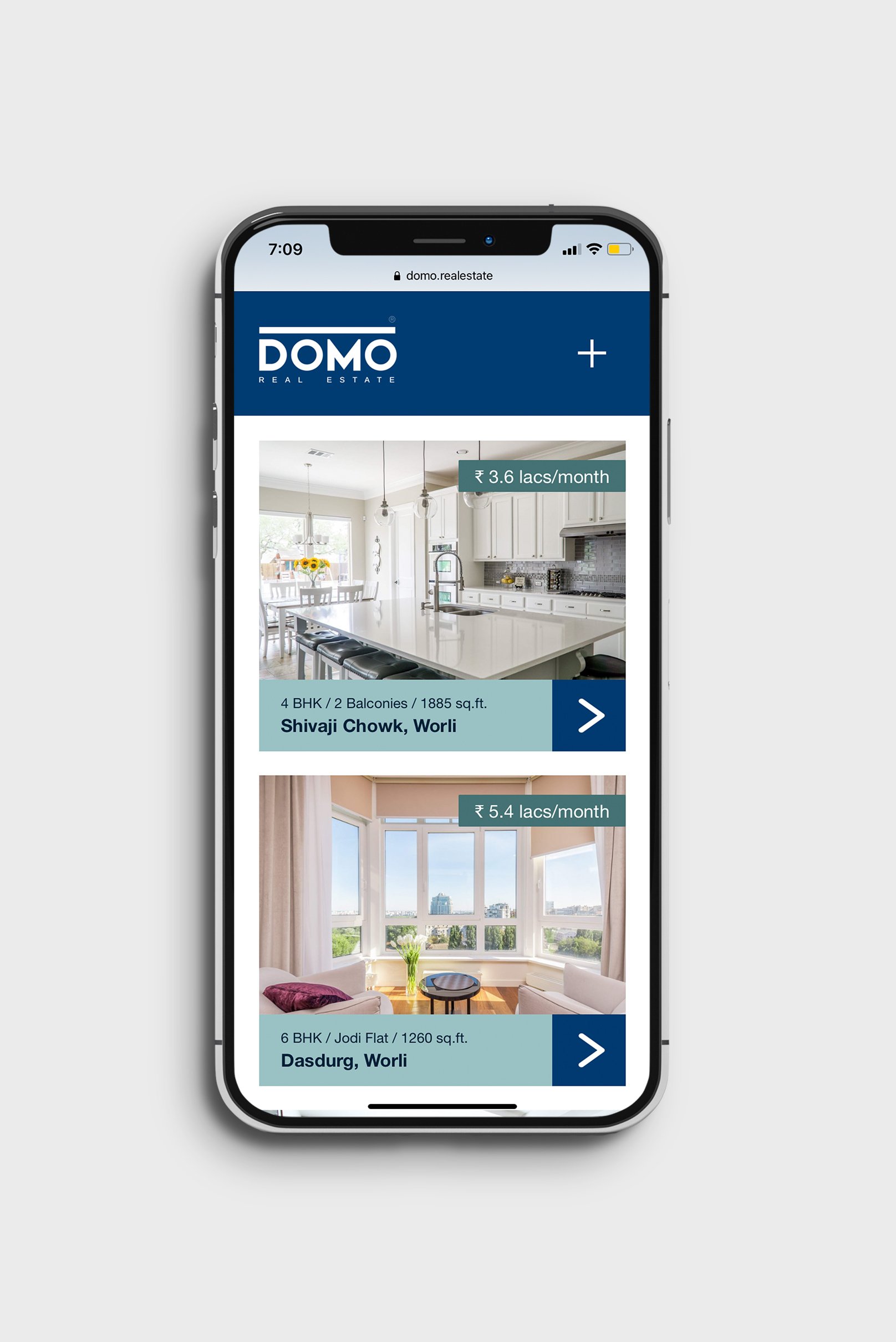
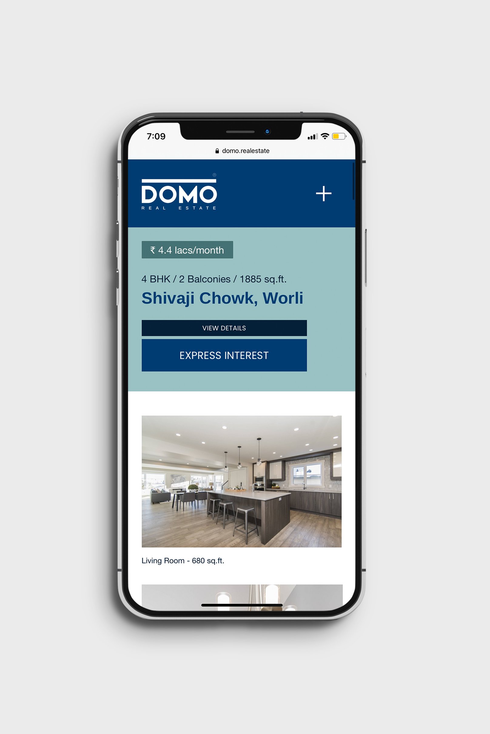
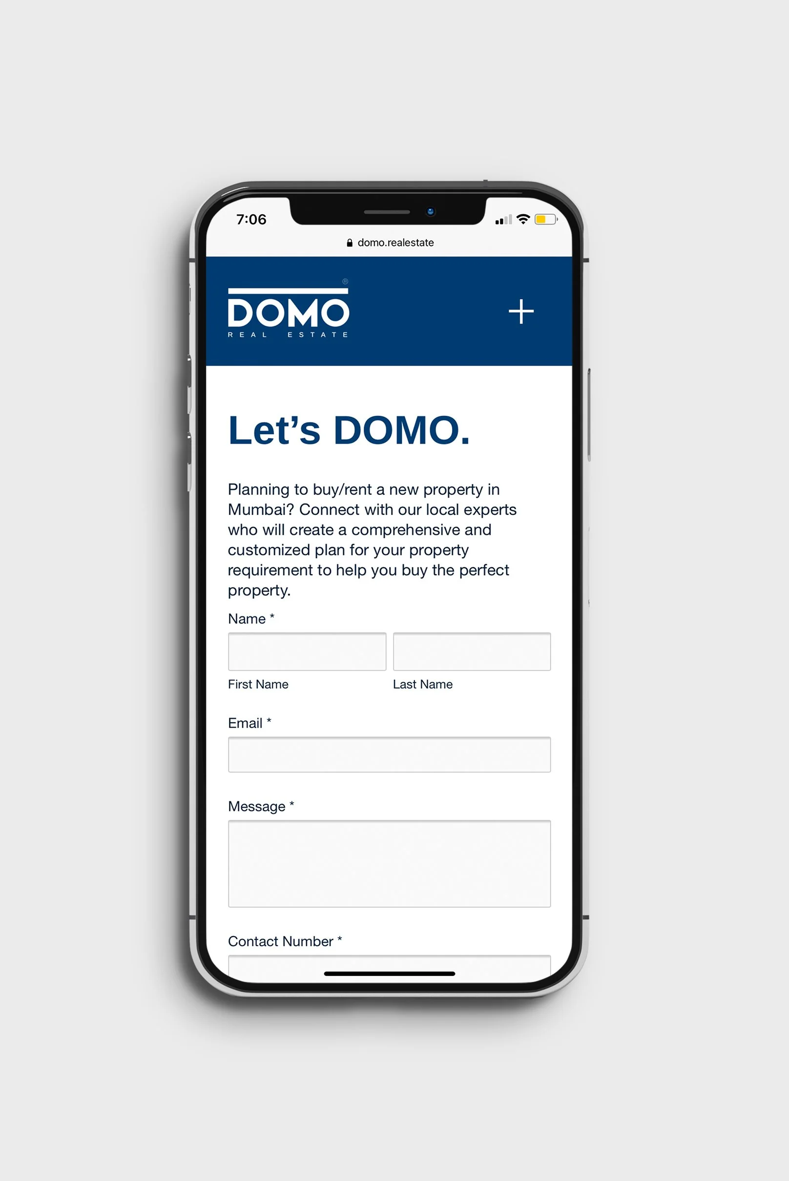
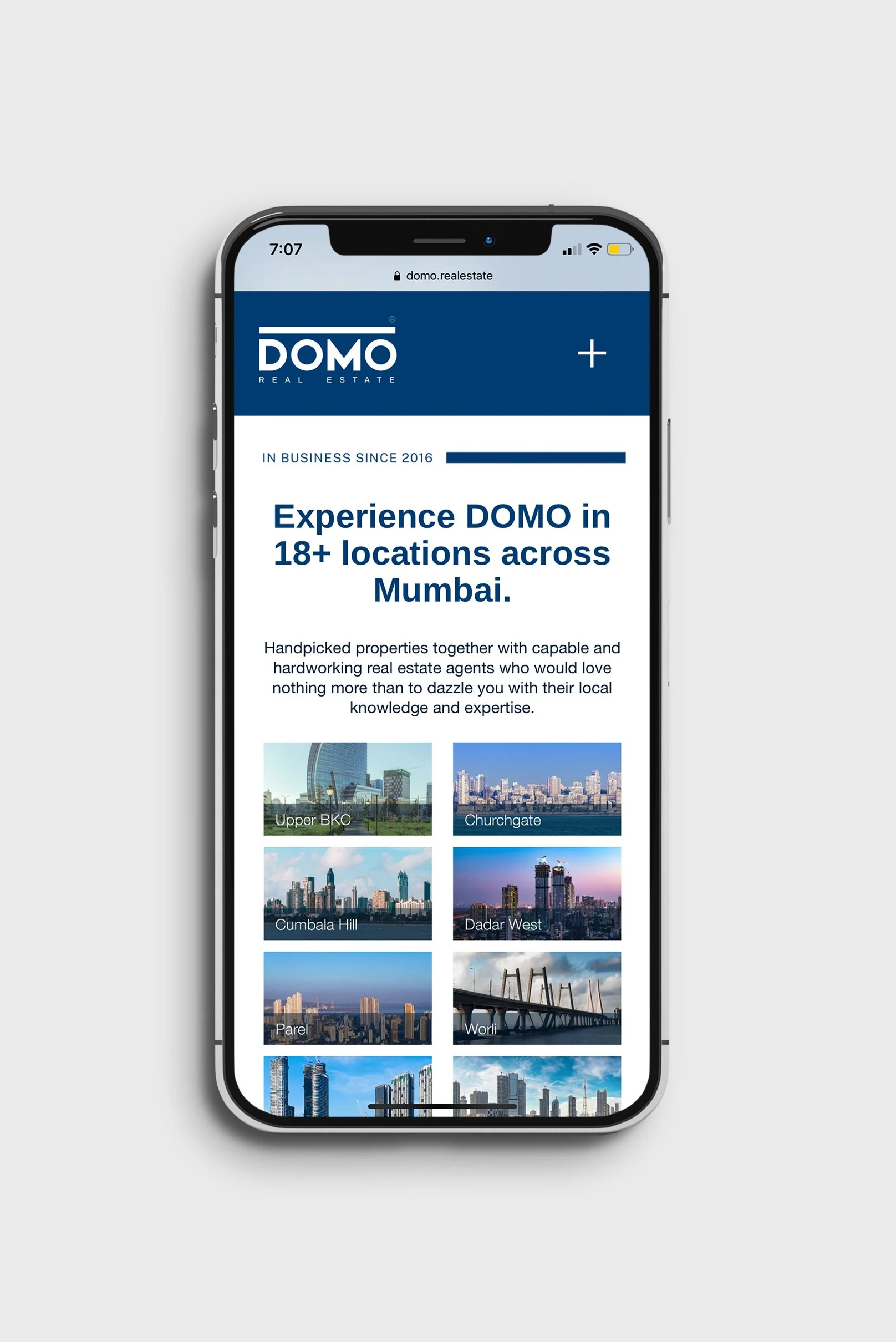
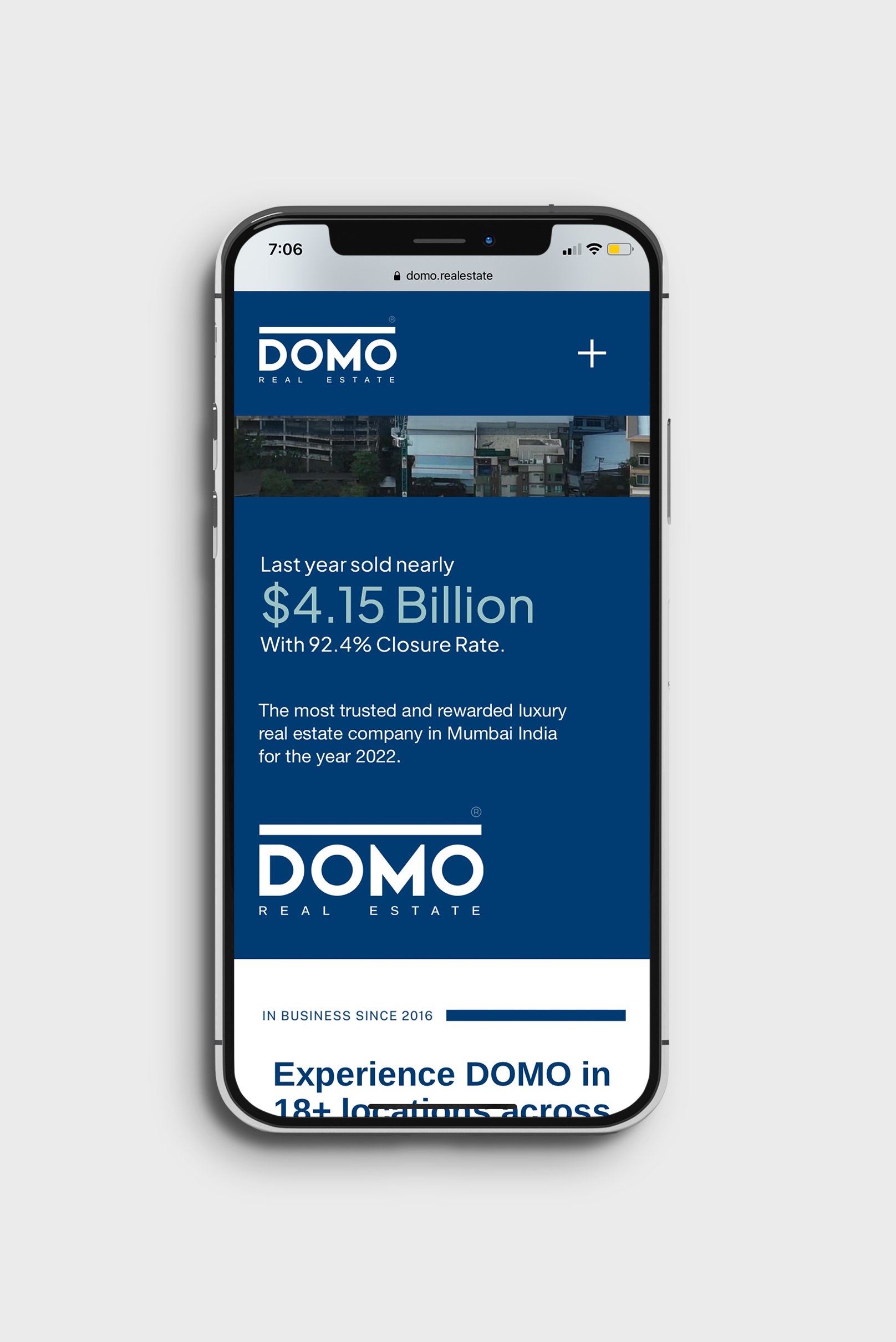
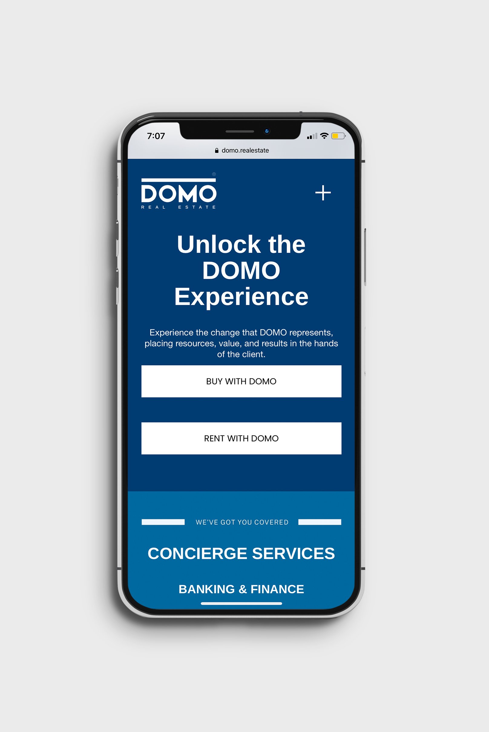
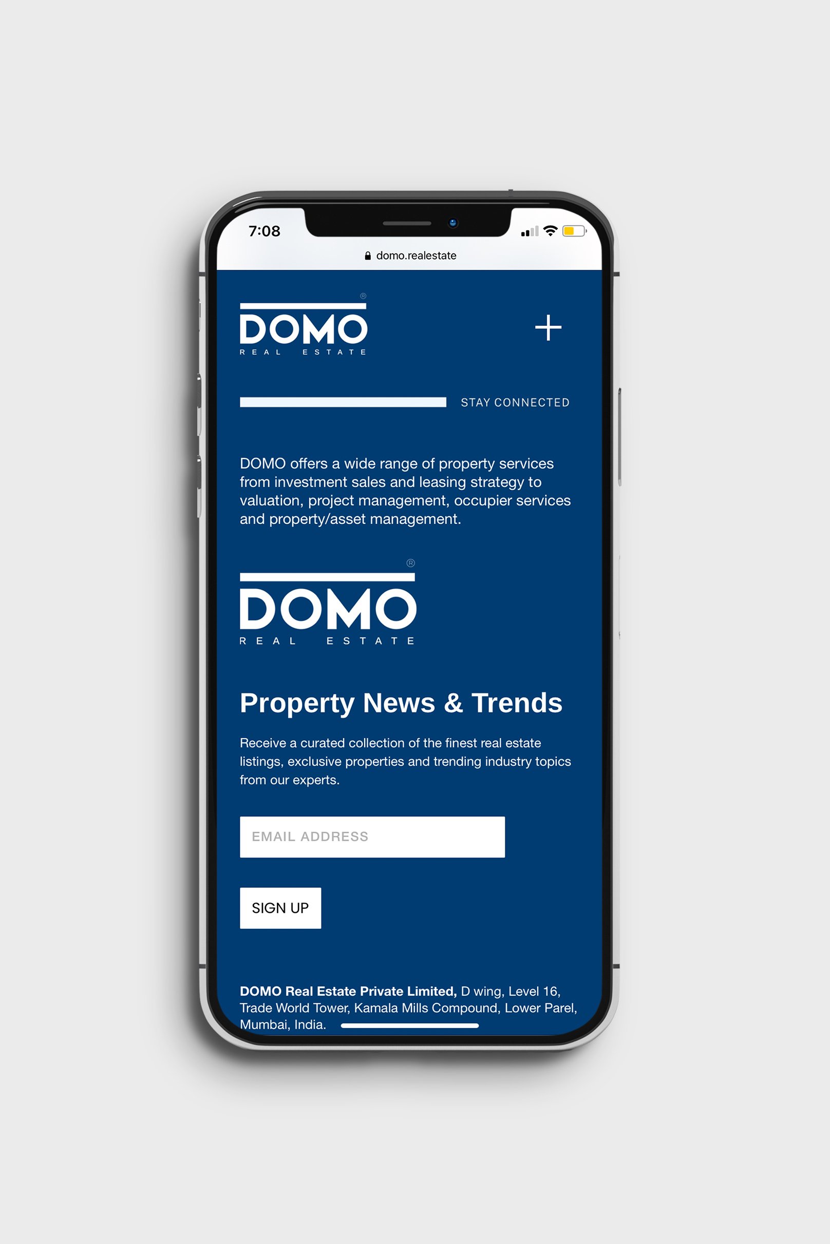
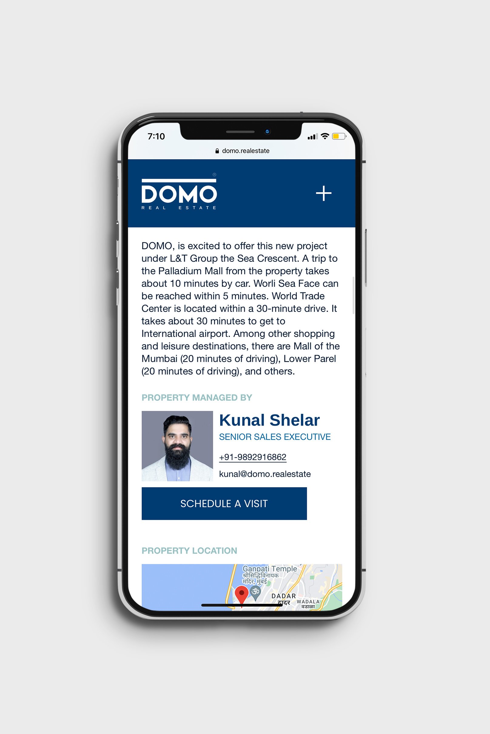
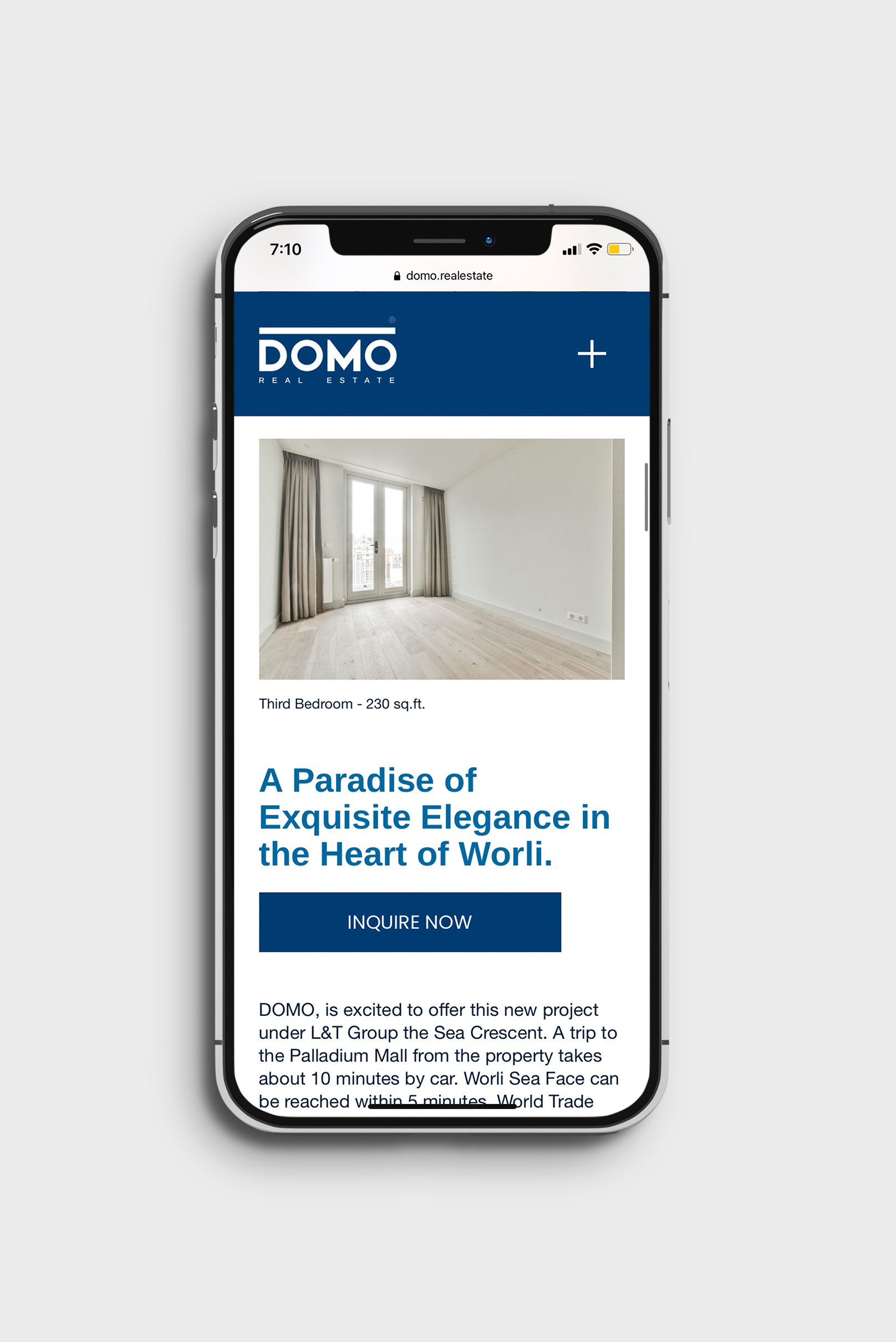
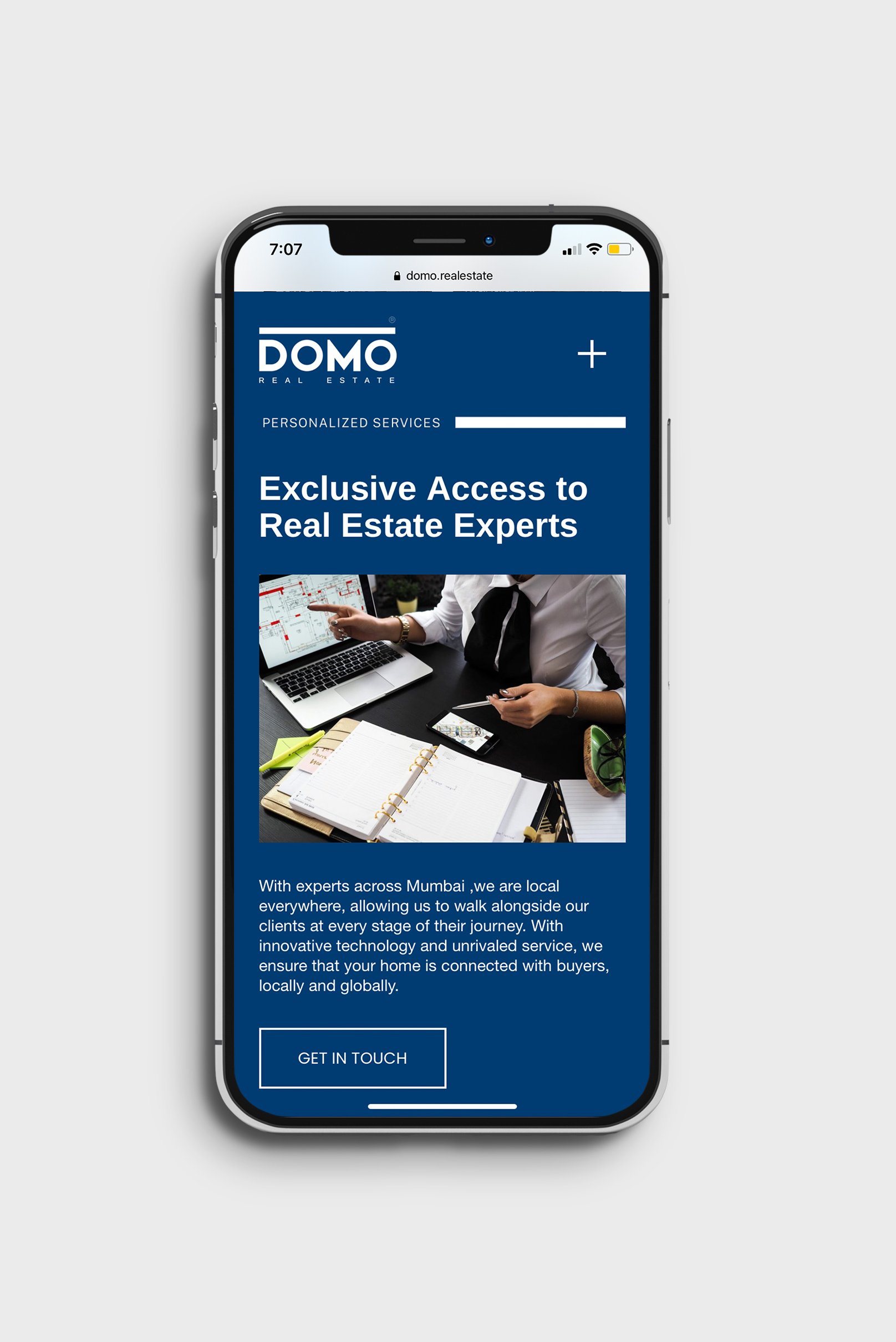
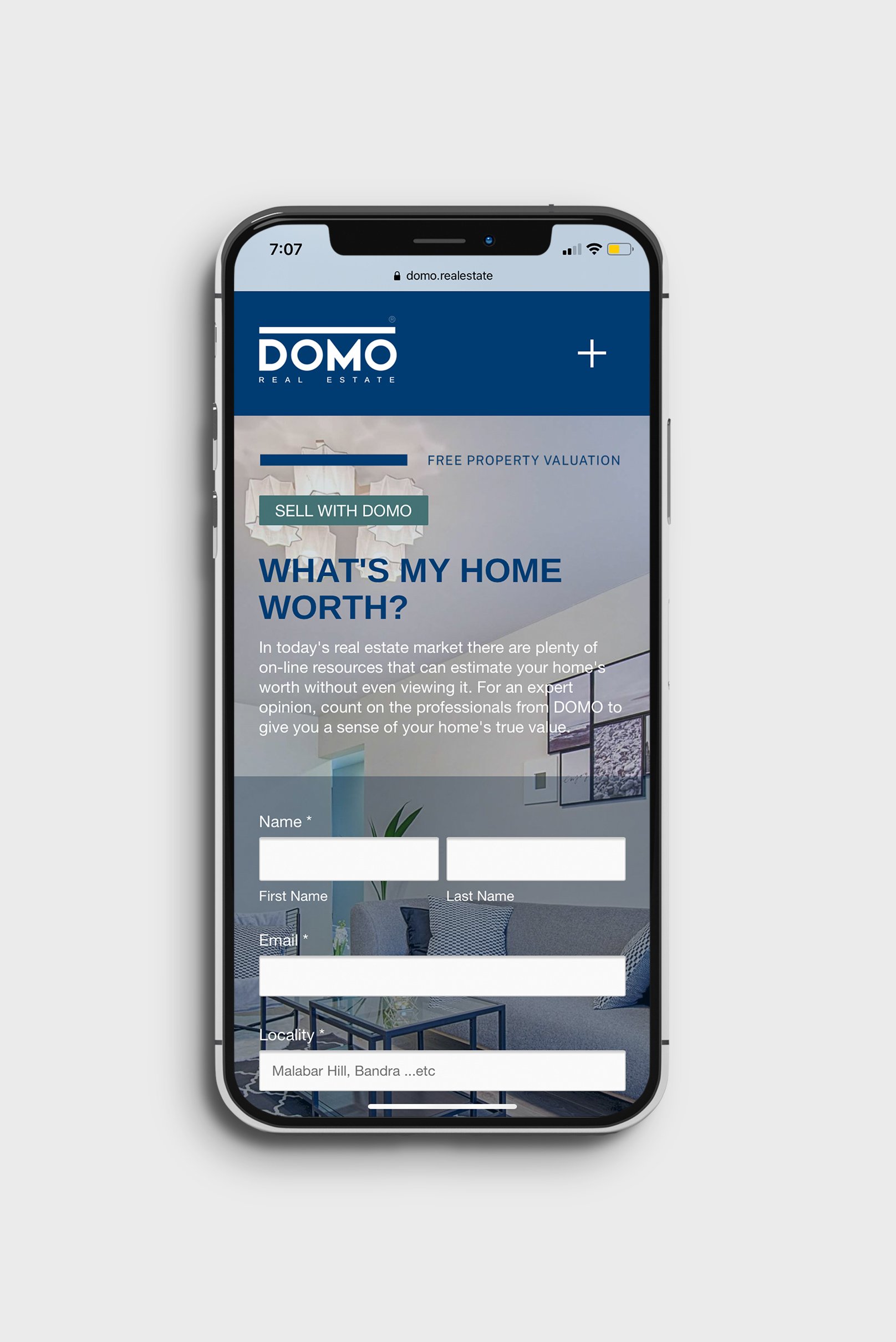
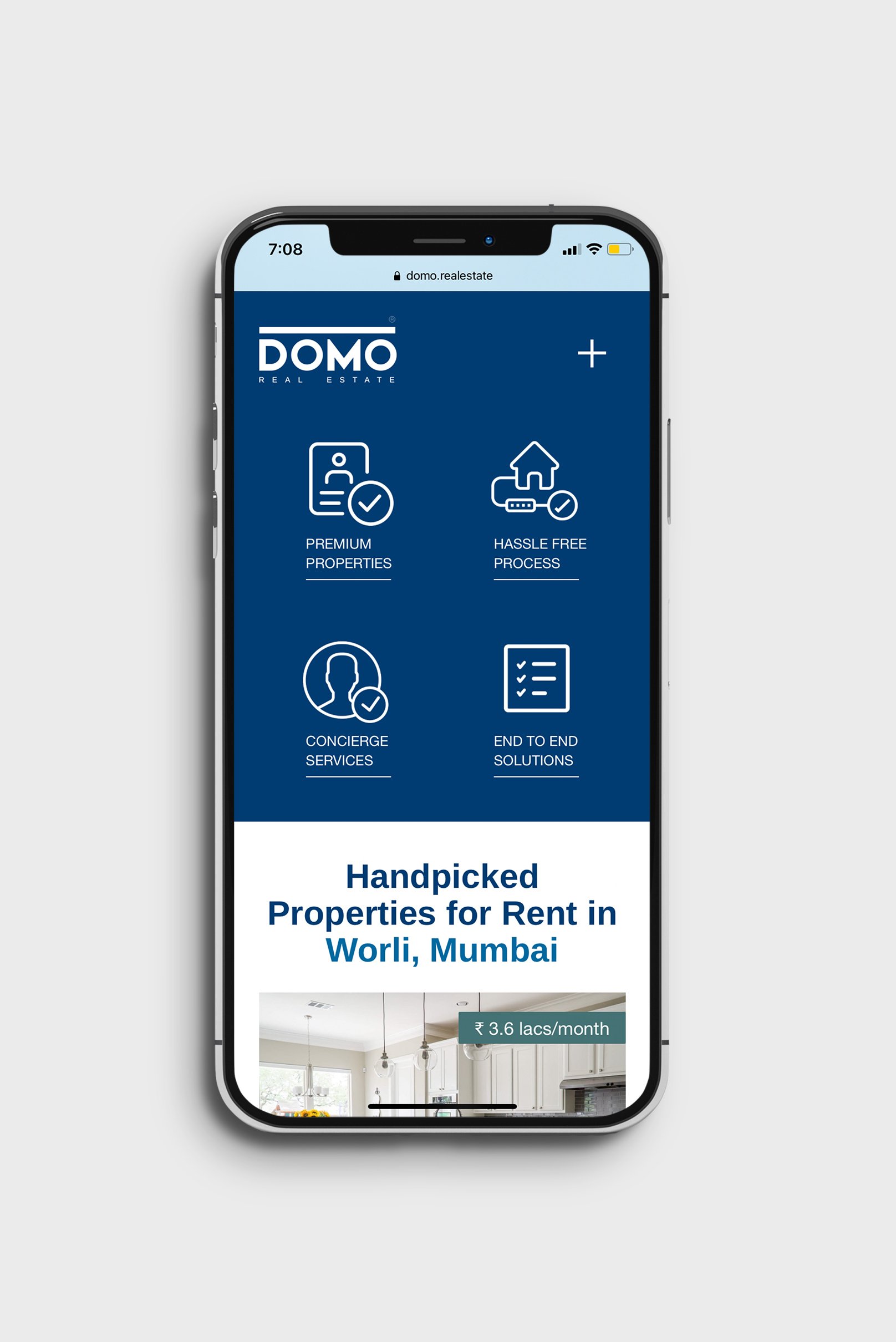
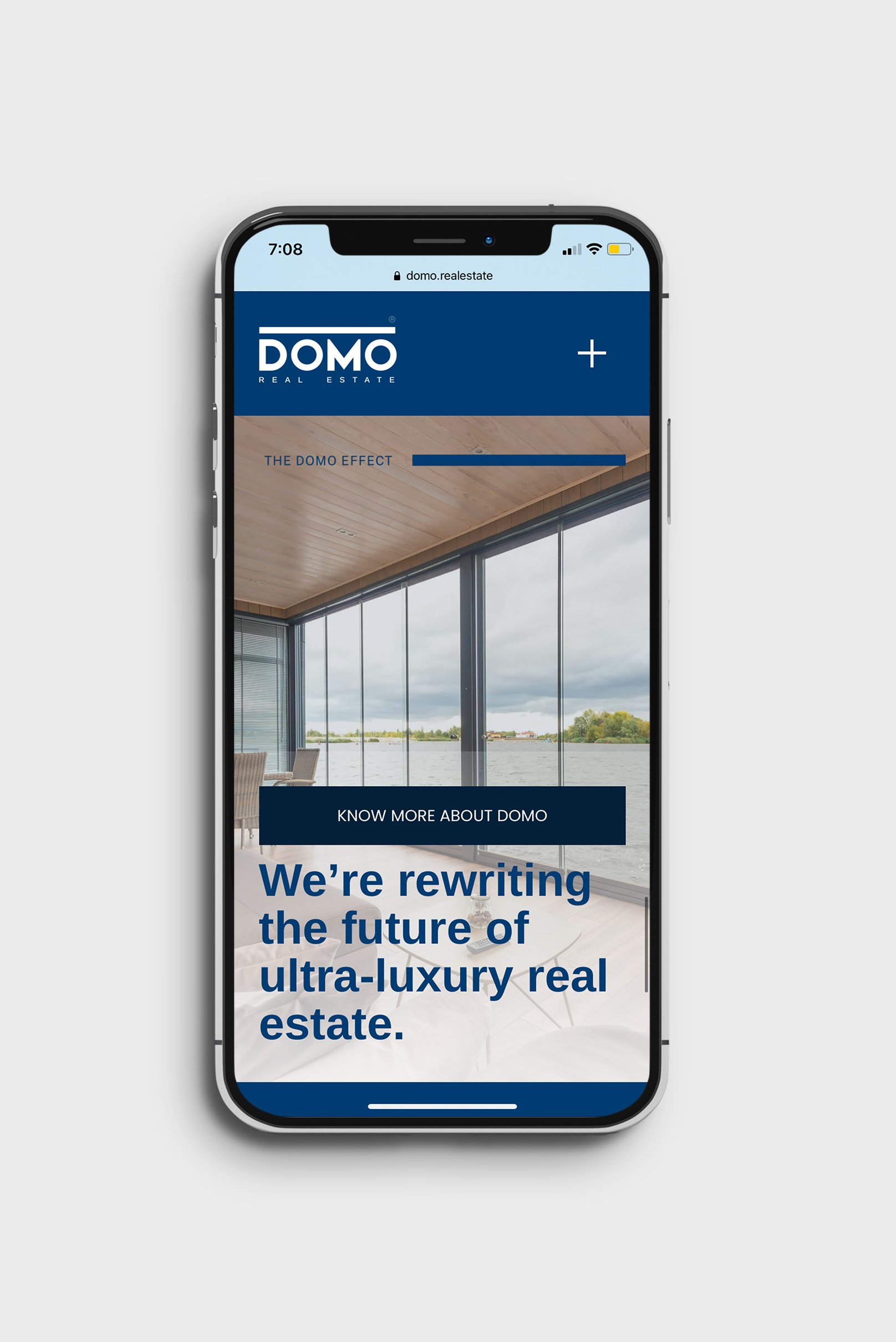
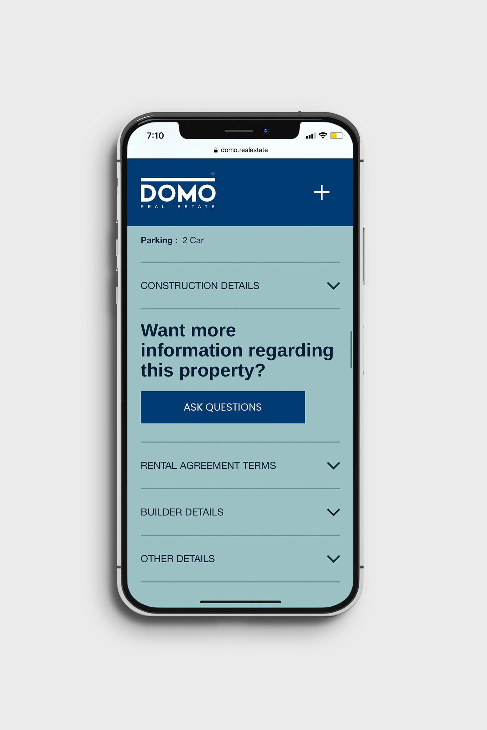
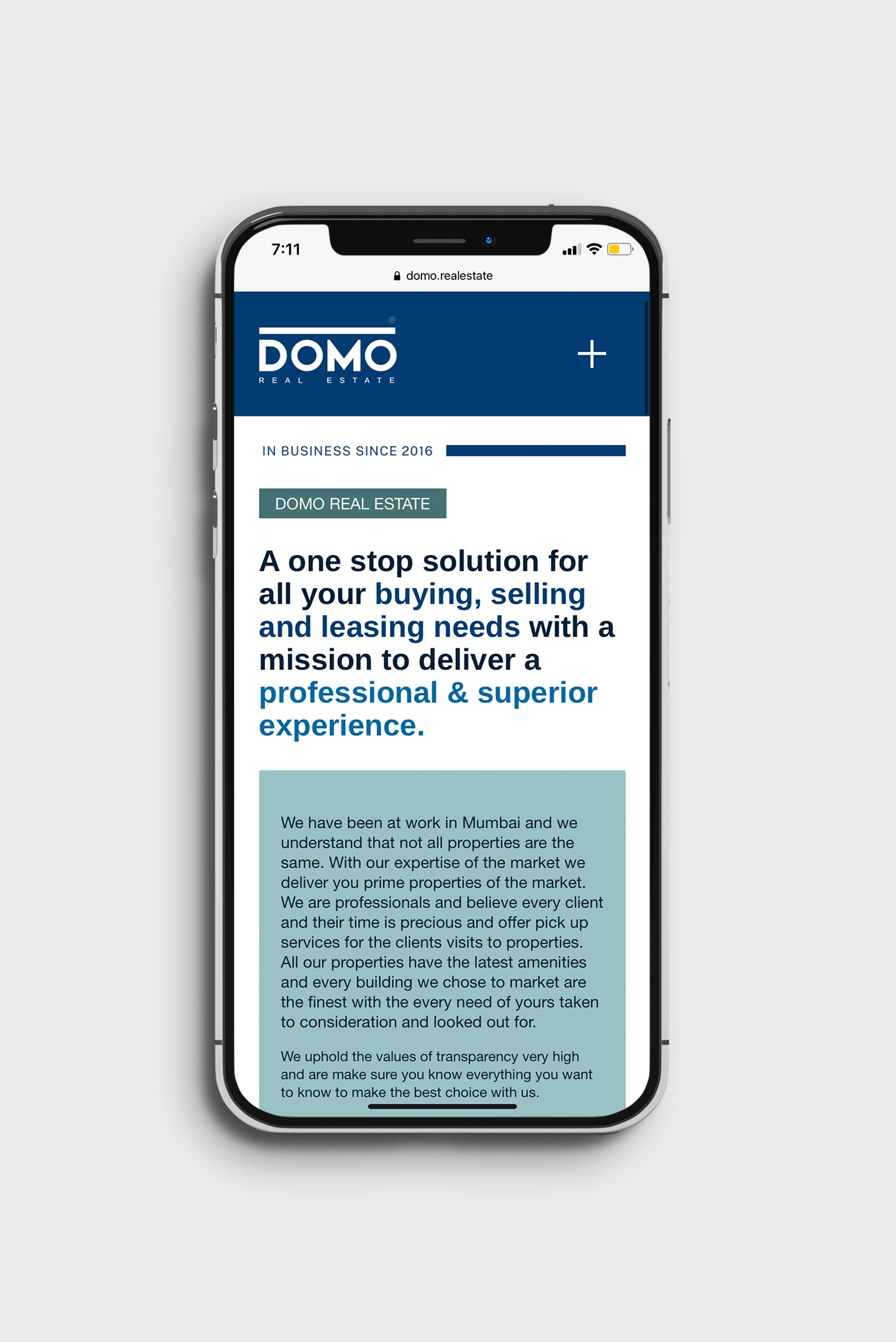
Website UX & UI Design
The website is the primary customer touchpoint in the real estate business. Therefore, the UI was strategically designed to bring alive our luxury real estate branding strategy.
Website is the backbone of the luxury real estate’s buying, selling, and management business. In our case, we built a highly engaging website that showcases premium properties in the best possible way, narrates the brand’s story, and describes how things work. It was designed to build brand memorability, drive conversions, and reinforce and increase the brand’s value and customer loyalty.

A strategic proud & bold luxury real estate branding was activated at the office premises for employees, encouraging and motivating them to act as brand ambassadors.
It was designed to reinforce the external brand message in the minds of the company employees.

Company Email Signature Design
Branded stationery and collateral were designed to bring alive the luxury real estate branding language and essence at the email touch point, which is one of the primary touch points. The email signature was designed to generate trust, communicate brand values, showcase professionalism, and strengthen the brand recall value at every touch point.
To get more details about this luxury real estate branding case study, kindly get in touch with us.

EXPLORE SOME OTHER LATEST WORK
Case studies of some other brands we’ve built.
Branding is at the core of everything we do. Every design, every detail, every decision — all purposefully crafted to strengthen the brand. Our outcome-focused solutions span research, strategy, creativity, engagement, and execution.


