

BRAND IDENTITY DESIGN / BRAND EXPRESSION SYSTEM / WEBSITE UX DESIGN / BRAND ASSETS DESIGN
Indoor & Outdoor Sports Business Branding Case Study
Project background: Based out of NCR, India, Sanin is India's fastest-growing sports guidance platform, helping hundreds of recreational sports players become better players, from planning to booking to playing a sport. Players use the Sanin site to discover where to play, and how to play based on guidance from those who have played the sport before. With reliable reviews and opinions of numerous sports businesses, players turn to Sanin to find deals on clubs and facilities, book activities, reserve spots at famous venues, and discover great places nearby. As a sports guidance company, Sanin makes playing any sport easy, fun, and enjoyable.
Launched in 2020 by Mr. Kshitij Saxena, Sanin’s technology platform connects people with great local sports activities and experiences, serving their multiple needs. Customers use the platform to search and discover sports activities, read and write customer-generated reviews, and view and upload photos. On the other hand, they provide venue and activity partners with industry-specific tools which enable them to engage and acquire customers to grow their business while also providing a reliable and efficient service. The aim is to bring together a community of sports enthusiasts and help people find sports activities that make their true selves come alive.

Brand Archetype
The Hero
The hero wants to save the day and prove their worth to themselves as well as everyone else. They always make efforts to rescue the victim or defend the underdog.
They're willing to work harder than everybody else to make it happen. The Hero's core desire is to prove one’s worth through courageous action. And they fear weakness, vulnerability, or “wimping out”.

Brand Identity Design
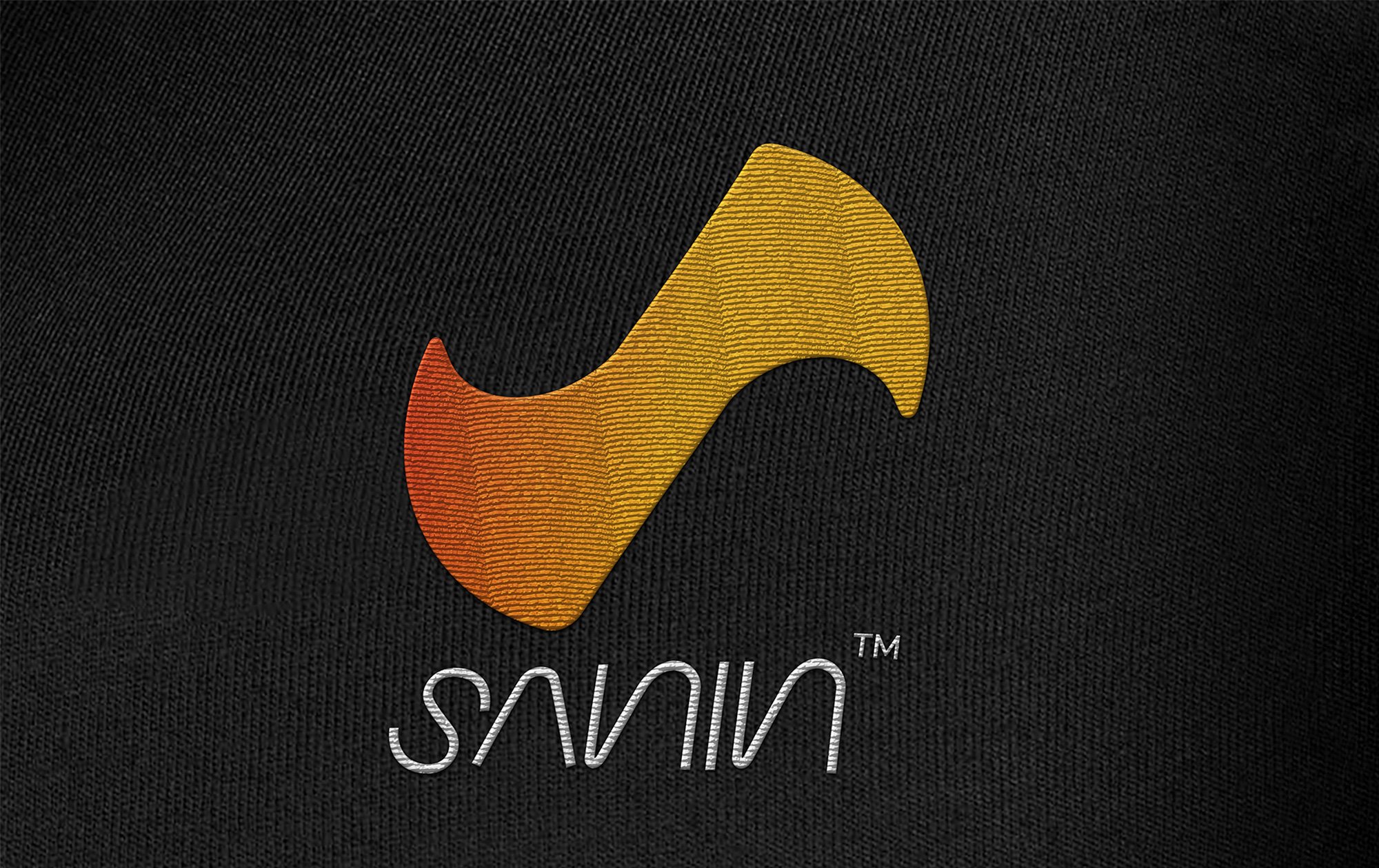
The logo was designed to symbolize energy and motion, relevant to sports. The logo graphic is an original iconic mark that was designed to represent two balls in high speed cutting through the oval to create the letter ‘S‘. The typefaces were designed with the same architectural form and family of curves, as is the logo icon.
Logotype: Combination mark type
Graphic family: Geometric and Organic
Look and Feel: Energetic, Sporty, and Professional
Brand Typography Family
The fonts were chosen to evoke emotions around sports, i.e. energetic/active. Fonts are an integral piece of a brand. The choice of text style was made to have a huge impact on the 'feel' of the business, connecting the consumers to the very core of the brand.

Brand Color Palette
Brand colors were selected to reflect the associated feelings, i.e. high energy, and a sporty attitude.
Energetic Red (#e43915): The color red can create physical effects such as elevated blood pressure, enhanced libido, increased respiratory rates, enhanced metabolism, increased enthusiasm, higher levels of energy, and increased confidence.
Bright Yellow (#fbae17): Yellow symbolizes happiness, warmth, and sunshine in most cultures; these are characteristics of the yellow sun and its effects.
White (#ffffff): White is clean, simple, and pure. It stands in stark opposition to the black, and its meanings are unequivocal. As white light contains all the colors of the spectrum, it’s an inclusive, impartial color, favoring no single hue and refusing to take sides.
Black (#000000): The color black is a shade/color that comes off as mysterious, serious, prestigious, and powerful to most people. When worn, it is a symbol of class, business, elegance, and sportiness.

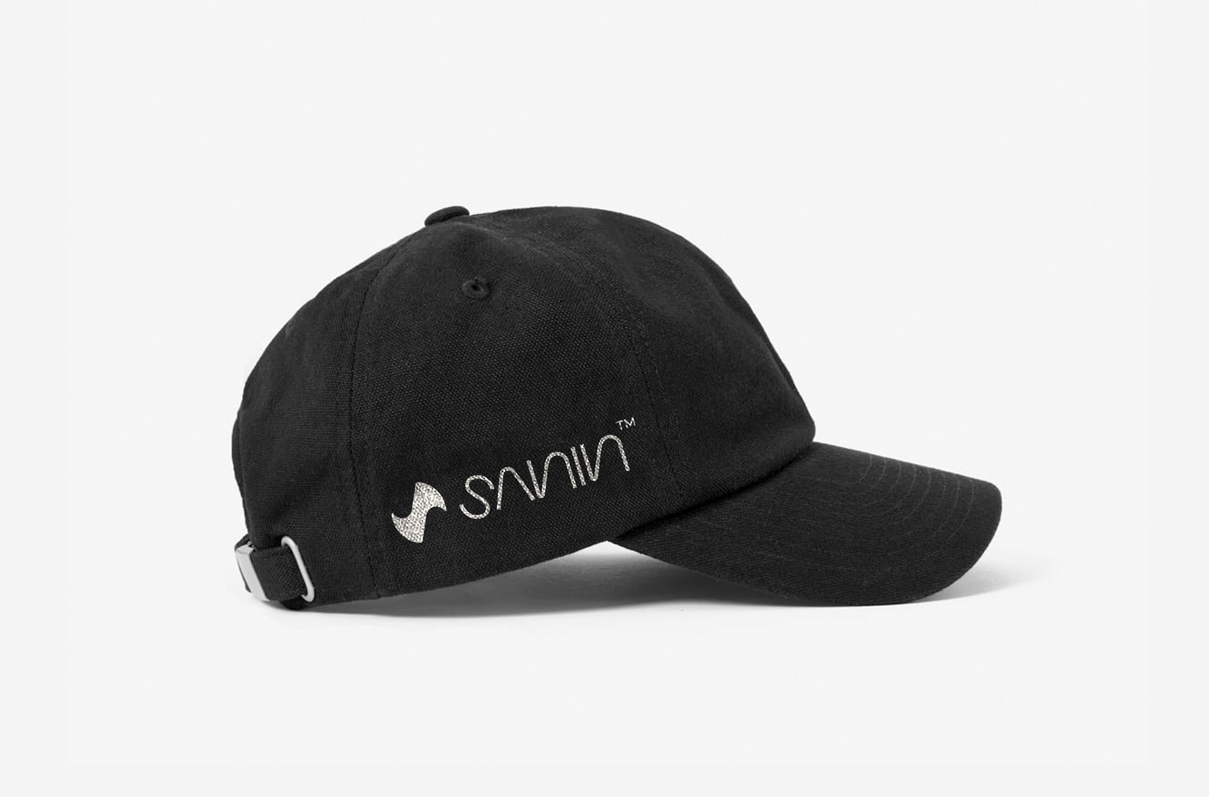
Brand Assets Design
Branded stationery and collateral were designed to bring alive the brand’s essence. They were designed to help generate trust, communicate the brand values, showcase professionalism, and strengthen the brand recall value at every touch point. The well-designed brand assets helped the brand deliver a consistent, unified experience and bring the business to the top of customers' minds.

Outdoor Launch Hoarding
Billboards present a unique marketing method that can directly impact growth and provide results shortly after they have been placed around the city. Outdoor hoarding is an excellent way to get instant mass visibility around a particular geographic location. The backlit hoarding was recommended to be displayed inside a subway to ensure maximum visibility and attention span. The hoarding was designed to visually position the brand ‘Sanin’ in the sports domain.

EXPLORE SOME OTHER LATEST WORK
Case studies of some other brands we’ve built.
Branding is at the core of everything we do. Every design, every detail, every decision — all purposefully crafted to strengthen the brand. Our outcome-focused solutions span research, strategy, creativity, engagement, and execution.


