

BRAND IDENTITY DESIGN / BRAND EXPRESSION SYSTEM / PRODUCT PACKAGING DESIGN / BRAND ADVERTISEMENT
Hard Seltzer Gluten Free Alcohol Branding Case Study
Project background: OG Hard Seltzer Gluten Free Alcohol is a brand to be launched soon in the Indian market by ‘4 Brothers Craft Spirits Pvt. Ltd.’, a company based out of Nagpur, India. With global clients like Carlsberg and Heineken, the parent company is in a 30-year-old family business of alcohol brewing and bottling. The younger generation of the Chandwani family approached Arabella Design to design their brand ‘OG’ as a minimal yet attractive brand, appealing to all genders in the 18+ age group.

Brand Archetype
The Explorer
The Explorer has this thirst for discovery and to connect with nature. Their motto is: You only get one life. Make it count. They may also be known as the seeker, adventurer, wanderer, individualist, or rebel.
Restless, always searching, exploring, trying to find themselves, the explorer never stops searching. Whether they are searching for themselves or new challenges, activities, or experiences, they are always on the run.
As an explorer, the alcohol brand will help people go on a journey: to find themselves, a new place or experience.
Explorers hate stability, which is boring for them. They are restless types always searching, always exploring, and always trying new things. They need to feel free and this freedom is something they are always drawn to.

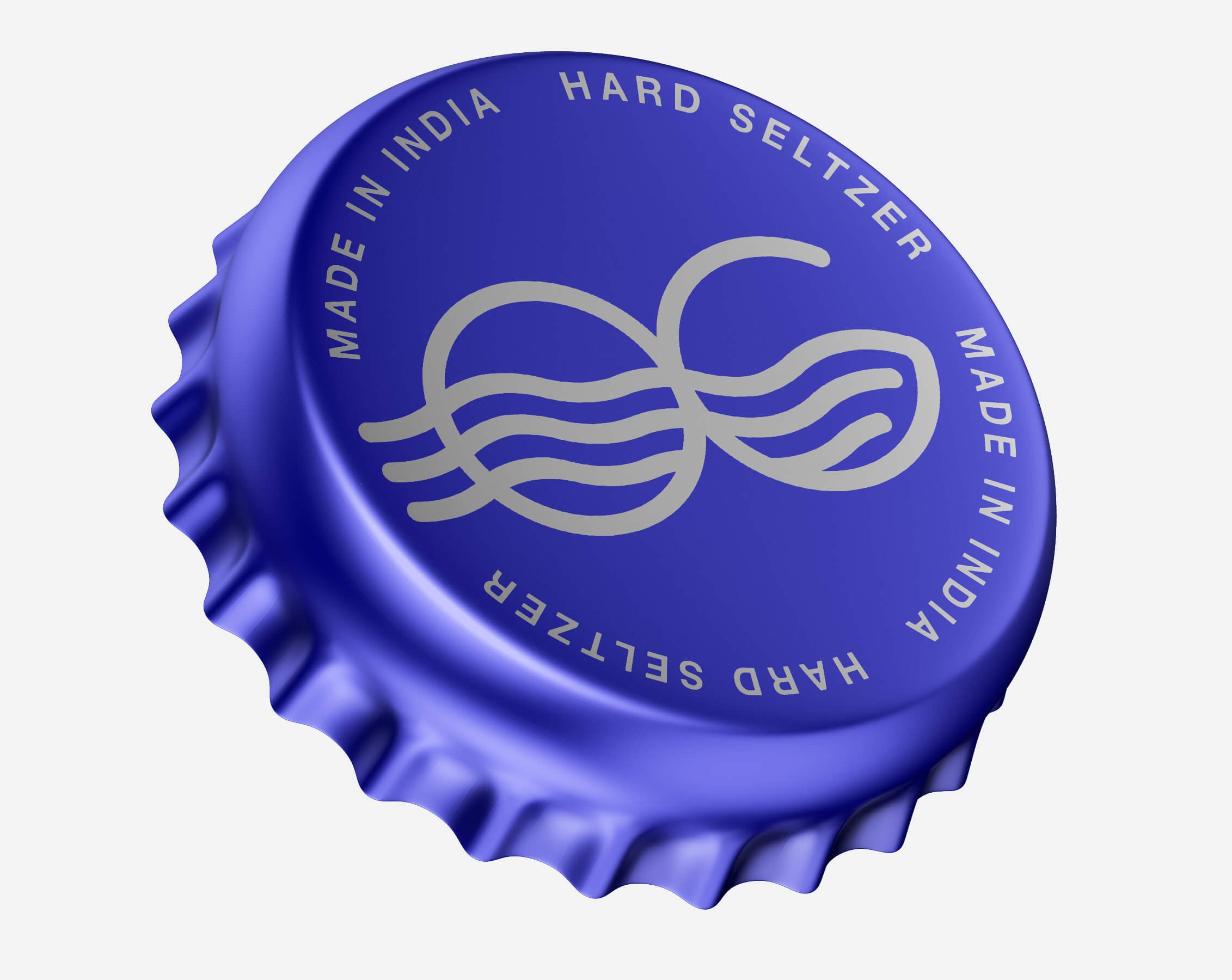
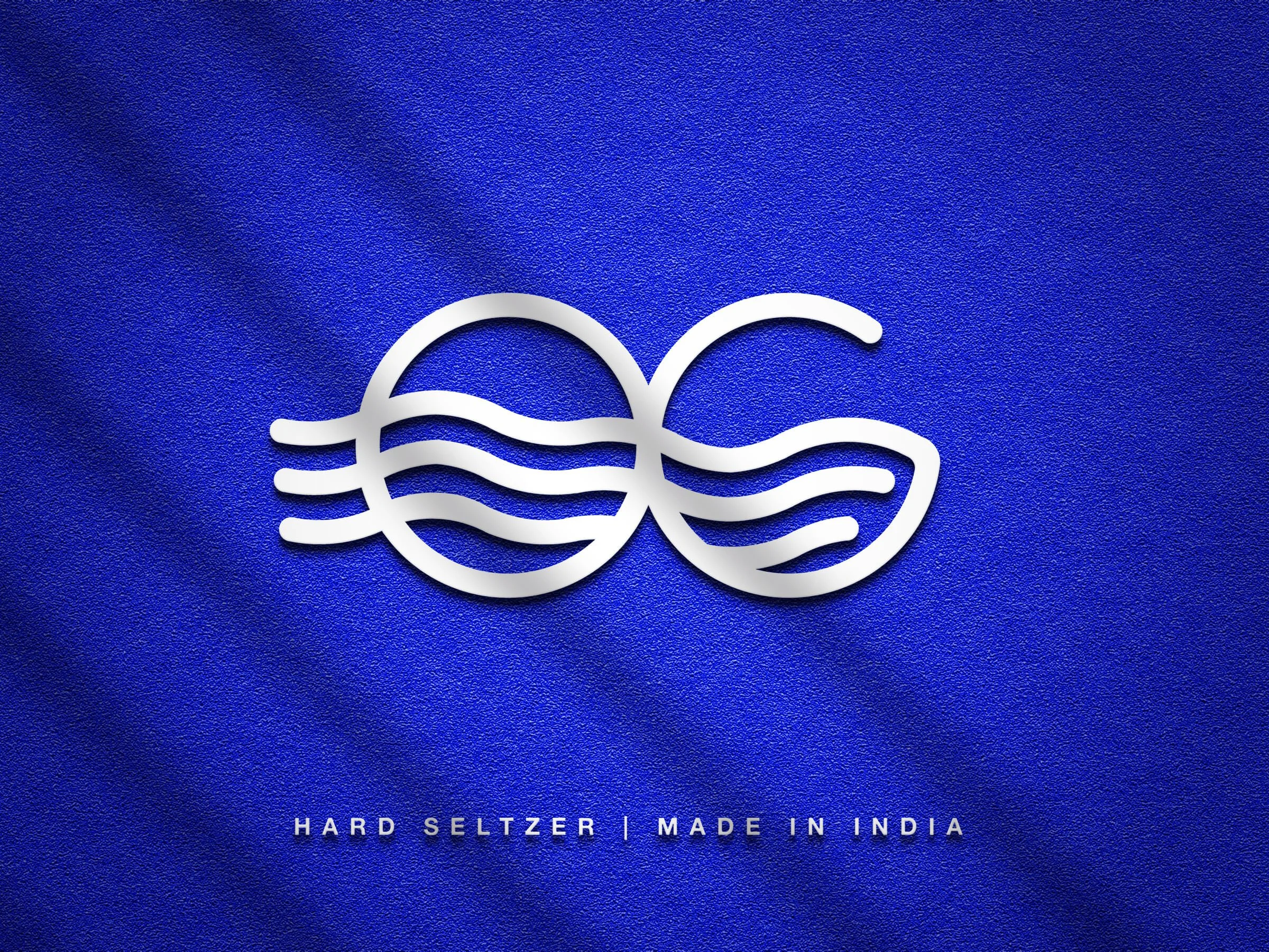
Recommended Logotype
Wordmark Type Logo: Since our brand name ‘OG’ is small and crisp, a nice detailed designed custom word-mark was recommended to create a higher brand association and recall.
Brand Identity Design
Being an alcoholic beverage brand, the logo was designed to visually depict ‘liquid’. It enhances and associates itself with thirst. The logo artwork is an infinity symbol connecting with positivism and abundance.
The brand logo was also designed to resemble sea waves, which connect with outdoor fun activities, a common ground for our target customers. The logo construct is minimal, modern, and very suitable for application on various marketing variants like neon lights, embroidery, embossing, print, etc.
The logo looks cool and happening and sets the mood for chilling and enjoyment. The logo is highly unique, catches immediate attention, and has a very strong recall. The logo is a distinct mark, easily visible and identifiable even in small sizes.
Brand Look - Minimal / Bold / Modern / Young / Premium Quality / Addictive
Brand Feel - Aspirational / Energetic / Desirable / Association
Brand Color Strategy
The strategy recommended was to have a dual-palette color system for the brand. Since we will be having flavor-based variants in the future, to have consistency in the brand colors and yet have a unique color palette for each variant, we recommended a dynamic brand color palette. The brand color palette comprises of two parts - the primary palette (static) and the product palette (dynamic - changes as per flavor).
Primary Palette
The primary colors of the brand were finalized keeping in mind that they don’t interfere with the colors of the flavor variants. The primary colors were recommended to be used in combination with the product color palette. The primary colors would also be used for non-product-based communications, e.g. brand logo, colors of buttons on the website, colors of email footer, brand accent colors, etc.

Brand Typography Family
A crucial ingredient in a brand, these fonts were recommended to evoke the associated emotions of boldness and modernity. Choice of text style has a huge impact on the 'feel' of a business and can connect consumers to the very core of a brand.

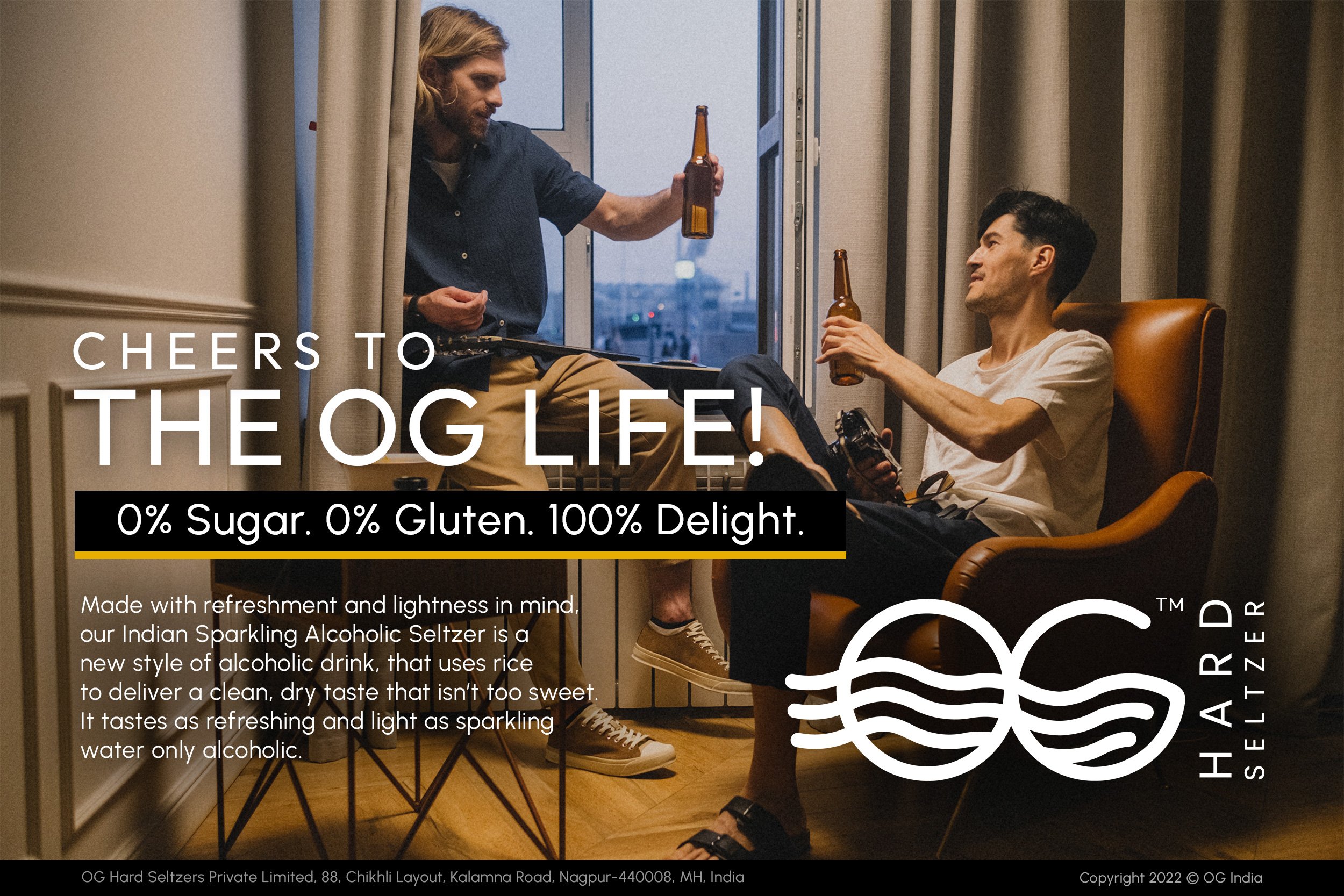
Brand Advertisement Design
Advertisements are important for building a brand via communication, they should exude the brand’s essence and values. These advertisements were designed to build a need in the customer’s minds and create awareness about the alcohol brand.

Product-Based Palette
This is the product variant-specific color palette which was recommended for the berry blast flavor. Likewise, a unique color palette was recommended for every variant, inspired by the flavor of that particular alcoholic drink.

Berry Mix Seltzer Can Design
It is the design of the packaging that builds up the value of the product inside. We used design as a tool to attract customers, increase the product’s value and help command the desired premium.

EXPLORE SOME OTHER LATEST WORK
Case studies of some other brands we’ve built.
Branding is at the core of everything we do. Every design, every detail, every decision — all purposefully crafted to strengthen the brand. Our outcome-focused solutions span research, strategy, creativity, engagement, and execution.


