

BRAND NAME / BRAND IDENTITY / BRAND EXPRESSION SYSTEM / PRODUCT PACKAGING DESIGN
Processed and Dehydrated Food Branding Case Study
Project background: Go Fresh Food Processing Pvt. Ltd., based out of Ahmednagar, Maharashtra, India, was incorporated on 31st Dec 2020. The company is into manufacturing, processing, and preserving food products and beverages and offers a range of dehydrated processed foods including fruits, edible nuts, vegetables, oils, fish, meat, etc. The unit has large integrated packhouses with cold storage chambers and dehydration units.
The founders, Wing Commander Ajit Namdeorao Dhokane (Retired), Dr. Supriya Radhakrishna Vikhe Patil, and Mr. Jimmy Olsson approached Arabella Design to create a food brand under their company for India and international markets. The company directors wanted to position the brand in the premium segment of the market as a natural and round-the-year alternative to fresh fruits, nuts, vegetables, etc.

Brand Archetype
The Innocent
The Innocent is a positive personality with an optimistic outlook on life. They're honest and pure and they have no ill will toward anyone. Ultimately they want themselves and everyone else around them to be happy.
The brand is Modern / Value for Money / High Quality / Experience Oriented
Brand Look: Minimal / Subtle / Clean
Brand Feel: Premium / Professional / Hygienic / Goodness

Brand Naming
Fresh Gold
The brand name ‘Fresh Gold’ was recommended because it is crisp, simple, and highly relatable for the brand. The name was designed to instantly create an aura of high quality and premiumness for the brand - ‘Gold that too Fresh’! Fresh and Gold also worked in the brand’s favor because they are highly searched keywords, and hence beneficial for getting digital traffic via SEO. ‘Gold’ was used in the brand name to set a very high benchmark for the quality of the products, and the word ‘fresh’ was used as an adjective to communicate the all-year-round goodness of our products.

Brand Identity Design
The logo was designed to attract attention and evoke a feeling of food/hunger. Bold calligraphic custom-made fonts were designed for the brand identity to generate human trust for the food brand.
Fresh and Gold were given equal visual weightage. The yellow circle in the background was created to denote a fruit/vegetable and the two dynamic leaves around it were designed to give a perception of keeping the freshness intact. The gradient style given to the logo gave it a fresh/new/dynamic feel which worked in our favor. The logo was also designed keeping in mind that it should be visible in all sizes.
Recommended logotype: Combination mark type
Graphic family: Organic + Geometric

Brand Color Palette
Tomato Red: Appetizing: According to research, red is eye-catching and triggers appetite. It's useful for packaging design; this is because the color indicates ripeness or sweetness when found in natural foods like berries.
Orange: A blend of red and yellow, naturally lends itself to food as another appetizing color. Orange stimulates the appetite, increases energy levels, and even stimulates the thyroid to boost metabolism. Orange is powerful. We can’t ignore it.
Sunflower Yellow: Happiness: Consumers see yellow as the happiest color, and brands incorporate it in various products. As such, yellow tends to evoke optimism and general good feelings.
Fresh Green & Spinach Green: Natural/Healthy: With sustainability and organic being at the top of the mind for many consumers, green is one of the more popular colors in the food supply chain. The color green is now almost synonymous with health and well-being when it comes to food.

Brand Typography Family
Choosing the right font that reflects your brand is essential for communicating the correct message to customers. Typography is the major element in a design that speaks to the customers. The clean, organic-shaped, and elegantly styled fonts go well with the organic curves of fruits, vegetables, and dry fruits.

Demonstration of Brand Colors and Typography Usage
This creative shows the importance and weightage assigned to different brand colors. The application ensures complete consistency in the look and feel of the brand and consistent styling.

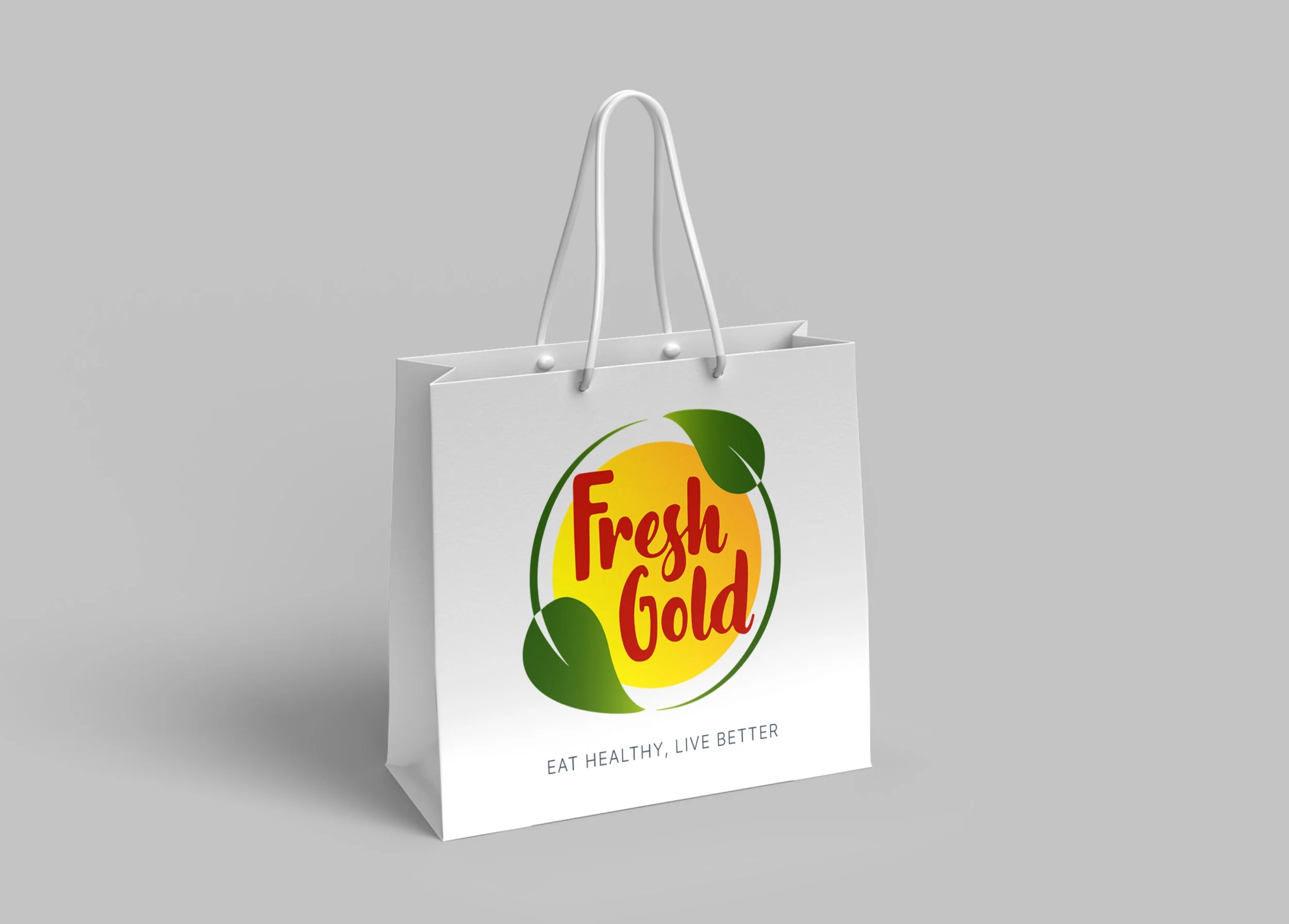
Branded Shopping Bag Design
When it comes to brand recognition, some are struggling, especially smaller businesses because they cannot afford the huge amounts of money bigger corporations allocate to advertising. This is where merchandise bags come in to give struggling businesses a push forward.
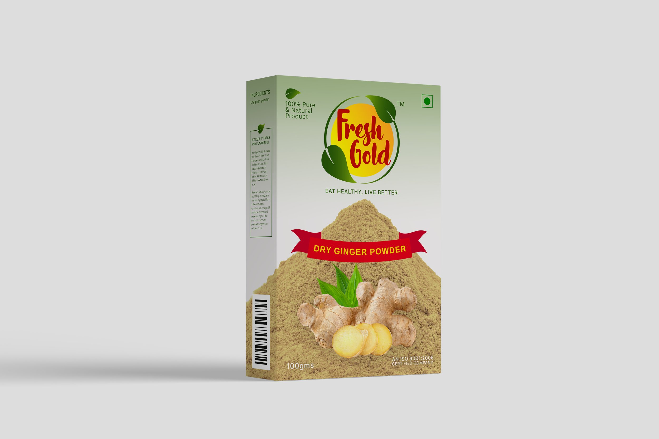
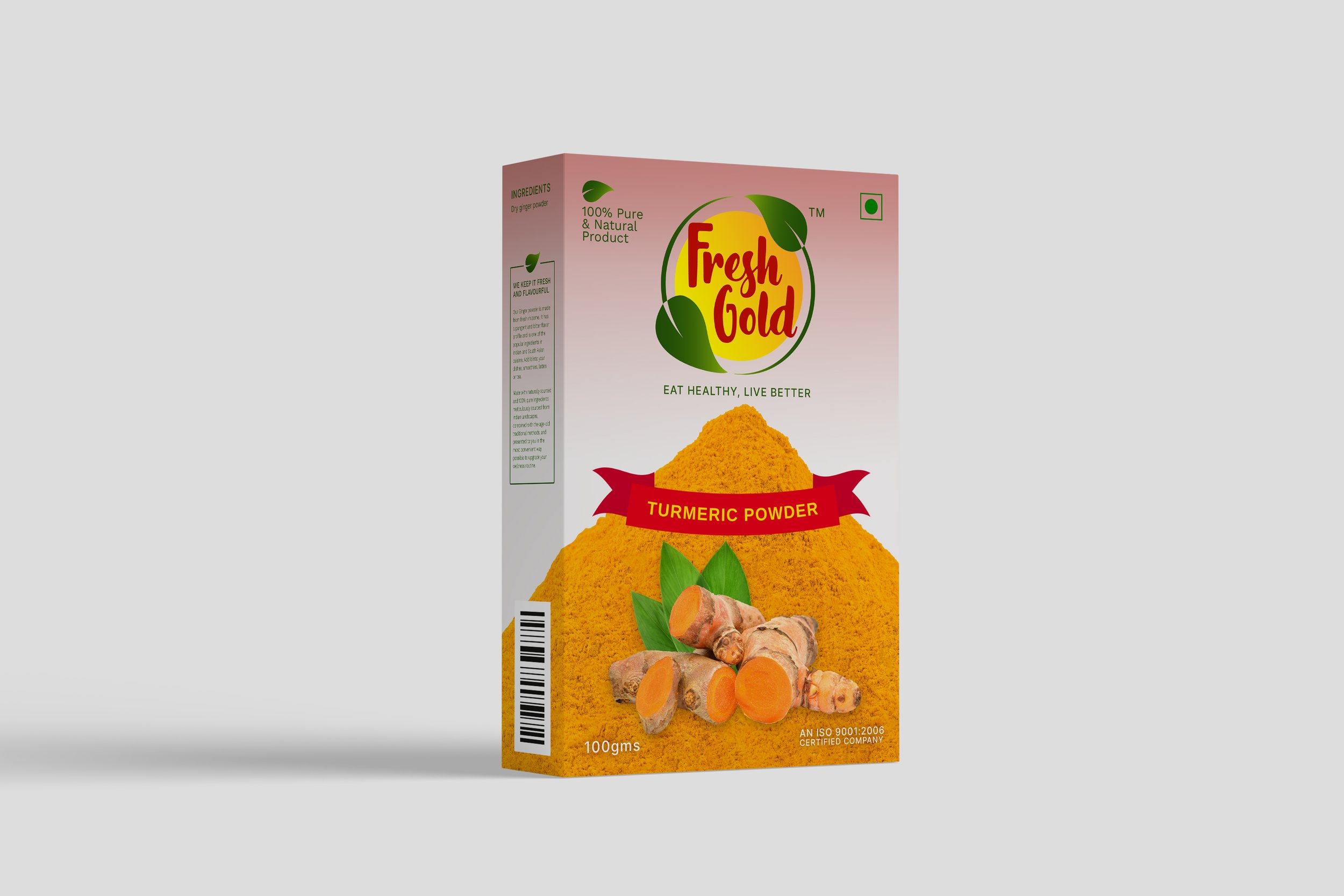
Product Packaging Design for Spices
It is the design of the packaging that builds up the value of the product inside. We use design as a tool to increase the product’s value and enhance the brand image. Our packaging designs outshine the brand’s competition, generate trust, and persuade shoppers to purchase the offerings.

Hoarding Design for Brand Visibility
To be able to increase sales and establish steady growth, ads have to influence the consumer to take the desired action. Billboards are perfect in this case, because they will remain publicly displayed 24/7 throughout various urban areas.

EXPLORE SOME OTHER WORK
Case studies of some other brands we’ve built.
Branding is at the core of everything we do. Every design, every detail, every decision — all purposefully crafted to strengthen the brand. Our outcome-focused solutions span research, strategy, creativity, engagement, and execution.


