

BRAND NAME / BRAND IDENTITY / BRAND EXPRESSION SYSTEM / PRODUCT PACKAGING DESIGN
Natural Organic Fertilizer Company Branding Case Study
Project background: Based out of Pravaranagar, Maharashtra, India, Pravara Fruits & Vegetables Producers Cooperative Society is a part of Padmashri Dr. Vitthal Rao Vikhe Patil Sahakari Sakhar Karkhana Ltd. Established in 1950, the mill holds the distinction of being the first cooperative sugar mill in Asia. Established in 1984, the society embarked upon a Green Project to manufacture fertilizer/Bio-Compost/Bio-Manure from Sugar Factory & Distillery by-products. The revolutionary fertilizer products are offered to the farmers of Maharashtra at highly subsidized prices. The Management of Dr. Radhakrishna Vikhe Patil Trust approached Arabella Design to handle the branding and packaging design of the project.

Brand Archetype
The Caregiver
The Caregiver is altruistic: the unselfish concern and/or devotion to nurture and care for others. This archetype is motivated to provide reassurance, service, advice, listening, and an open heart to support the welfare of others.
The Caregiver is moved by compassion and a genuine desire to help others through generosity or dedicated assistance.
The brand is Traditional / Responsible / High Quality / Selfless and Dedicated
Brand Look: Organic / Energetic / Bold
Brand Feel: Nurturer, Parent, Angel

Brand Name
Pravara Tejas +
The name of the fertilizer brand was recommended to amplify the value of our product offerings and to connect instantly with the native language-speaking local farmers. Our focus was also on ensuring that our brand name is highly differentiated from other products or services in the market and stays true to the business. ‘Tejas’ resembles brilliance, energy, and strength. For a fertilizer/agriculture brand, this creates a perfect perspective. Tejas has no ill associated with it in any region/religion. ‘Plus’ brings positivism and progress to the brand completing the meaning. Tejas Plus also gives a great product-centric perception that fertilizer is highly powerful/effective.

Brand Identity Design
The green leaf constructed within Pravara Tajas + following the same construct as the fonts connects the brand to a healthy crop. The bold veins of the leaf represent the strength and good health of a crop. The logo has been designed to give an equal weightage to ‘Pravara’ and ‘Tejas+’,. The clean bold look and perfectly aligned elements give this logo a premium and high-quality brand feel.
The logo is an icon and a unique mark, very appropriate for printing and stamping on various packaging materials.
Recommended logotype: Combination mark type
Graphic family: Organic + Geometric


Brand Color Palette
To bring alive the brand’s recommended natural and organic look and feel, we took cues from nature. The color palette combines fresh greens, warm earth tones, and more, to create a beautiful nature-inspired color scheme, channeling its calm and beauty.
Dark Green: It symbolizes growth, harmony, freshness, and fertility. Green has strong emotional correspondence with healthy plants & general safety. Dark green is also commonly associated with money. Green has great healing power.
Sap Green: A soothing and peaceful color, light green is an especially calm shade that represents renewal, luck, health, and optimism.
Fresh Green: This is high visibility freshest green, and catches immediate attention.
Plant Yellow: It's the color of happiness, optimism, enlightenment and creativity, sunshine, and spring.
Mud Brown: Brown is often seen as solid, much like the earth, and it's a color often associated with resilience, dependability, security, and safety. Being the visual representation of soil, this color is the prominent one in our brand palette.

Brand Typography Family
A crucial ingredient in a brand, the following fonts were chosen for the brand to evoke eco-friendly emotions and showcase the fertilizer brand's best side, i.e. of a nurturer. Fonts are an integral piece of a brand. The choice of text style was recommended to have a huge impact on the 'feel' of the business and connect consumers to the very core of the brand.

Demonstration of Brand Colors and Font Usage
The brand guidelines were recommended to ensure consistency in the fertilizer brand’s communication and complete uniformity in style and formatting for the brand.

Packaging Strategy & Design
Abstract subconscious relation to a growing plant.
The design background is an abstract visual for a growing plant/crop. The layout was kept simple and solid colors were used in the background to make the brand feel powerful/energetic.

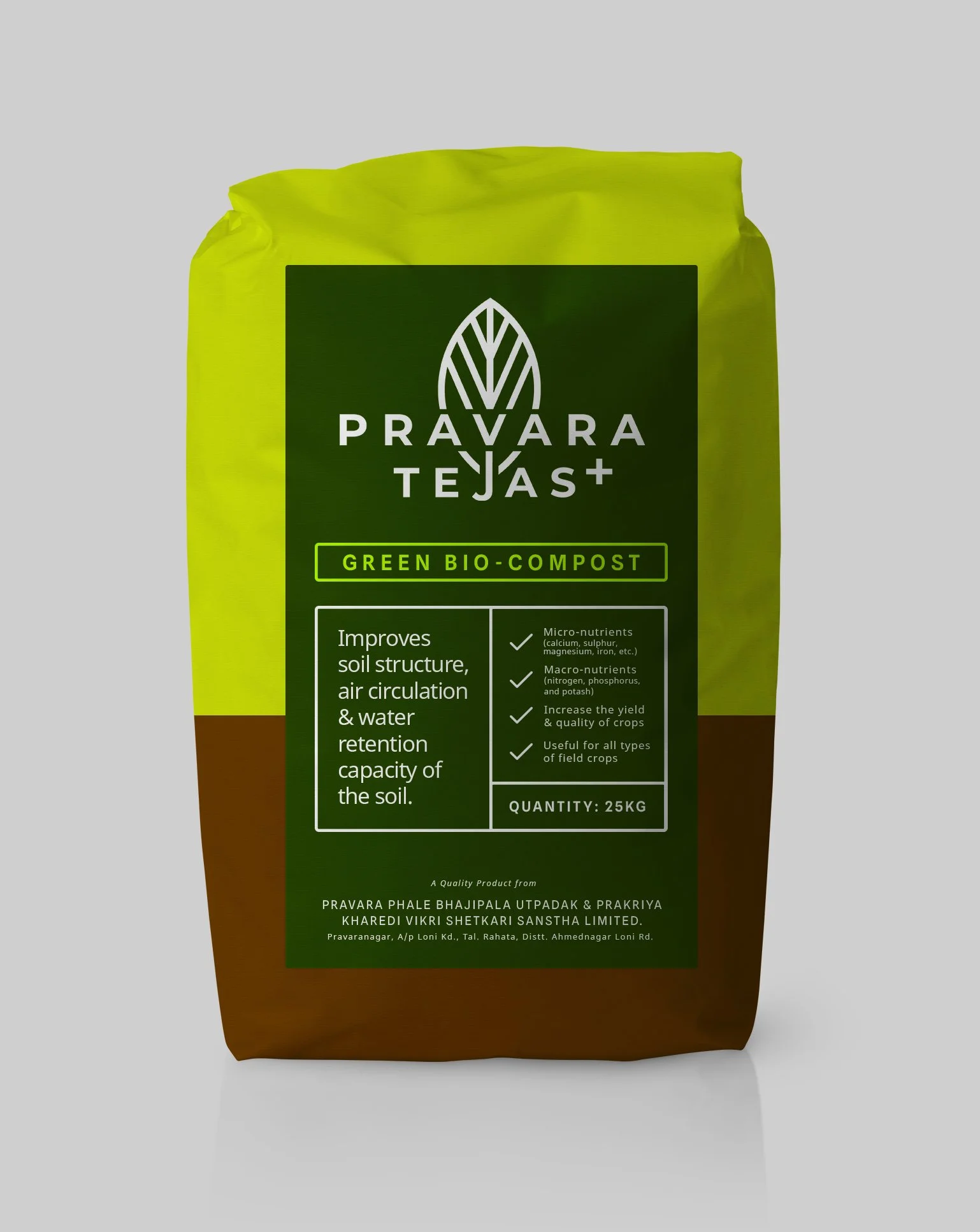
Fertilizer Bag Design
Formal/Serious Appeal:
The information layout was kept very simple and formal to make it look serious and thoughtful, making the products seem more trustworthy. The solid bright colors were given to the packaging design to bring alive a feeling of growth/power.
Design Flow:
The top space was given to the brand logo and we decided to make it big and bold so that it becomes the first visual element that the eye catches. From there, the eye moves on to the product name in green color and then to specifications, and then the company name, which was the desired eye movement flow.

Brand Office Signage Design
It is important to reach the right customers and an eye-catching signage design helps the customer know where the company office is located. Unlike other means of advertising like radio, TV, and newspaper, signage is cost-effective.

EXPLORE SOME OTHER LATEST WORK
Case studies of some other brands we’ve built.
Branding is at the core of everything we do. Every design, every detail, every decision — all purposefully crafted to strengthen the brand. Our outcome-focused solutions span research, strategy, creativity, engagement, and execution.


