

BRAND IDENTITY REDESIGN / BRAND EXPRESSION SYSTEM / PRODUCT PHOTO-SHOOT / SOCIAL MEDIA CONTENT DESIGN
Unisex Urban Streetwear Branding Case Study
Project background: Vero Ribelli is an American fashion house based out of Los Angeles, USA. It translates to ‘True Rebels’ in Italian. The brand aims to bring premium streetwear fashion to everyday life and indulge the fearless in every step of their unconventional path.
The company targets wild, bold, and unapologetic personalities with its lifestyle streetwear brand. Their range of minimalist hoodies is carefully curated for the adventurous globetrotters, who are breaking stereotypes. All their manufacturing is done keeping in mind ethical and social responsibilities. The brand wants the products to create a better world in every way, not just in people’s lives. The company plans to gradually evolve into a full-fledged streetwear brand, including products such as t-shirts, sweatshirts, knits, bottoms, jackets, and a denim line. The business owner, Mr. Ajay Sellappan, approached Arabella Design for the branding of their company.
Brand Archetype
The Rebel
Seeking revenge or revolution, the ‘Rebel’ is all about changing existing systems. To overturn what is not working, they will disrupt the norm, destroying what is not working. Their greatest fear is powerlessness or being viewed as inconsequential and so they strive to make an impact in everything they do. They are against the status quo and are catalysts for change. They break all the rules.
Goal: To change or destroy what is not working
Greatest Fear: Being powerless
Strategy: Disrupt, destroy, or shock
Vulnerability: Overstepping the mark

Brand Identity Design
The logo was designed to symbolize freedom, confidence, and professionalism. The typefaces were kept stark, aesthetically pleasing, and bold.
The orthogonal ends of the logo typeface were designed while keeping the brand icon intact.

Logotype - Combination mark type
Graphic family - Geometric and Organic
Look and Feel - High Quality and Premium

Brand Typography Family
Fonts are an integral piece of a brand. The choice of text style has a huge impact on the 'feel' of the business and connects consumers to the very core of the brand. The san-serif typography family was recommended to reflect strength and minimalism, going well along with the streetwear brand’s personality.

Brand Color Palette
The brand color palette was defined to reflect the strong and rebellious attitude that the streetwear brand wants to be associated with.
Powerful Orange ( #d4471a ): Orange is associated with meanings of joy, enthusiasm, success, encouragement, change, determination, stimulation, happiness, fun, enjoyment, balance, sexuality, freedom, and expression.
Mild Grey ( #e1e1e1 ): Grey represents neutrality and balance. Its color meaning likely comes from being the shade between white and black. Grey can be used for font color, headers, graphics, and even products to appeal to a mass audience.
Black ( #000000 ): The color black is a shade/color that comes off as mysterious, serious, prestigious, and powerful to most people. When worn, it is a symbol of class, business, elegance, and sexiness while also having an overbearing, strong character to it.

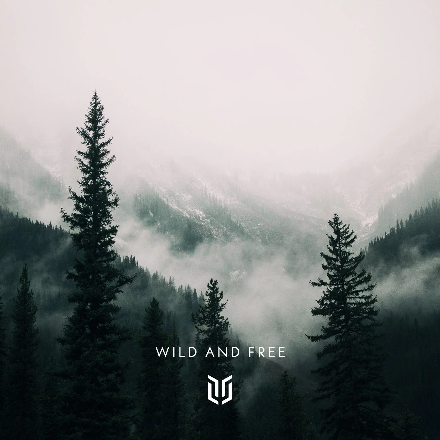
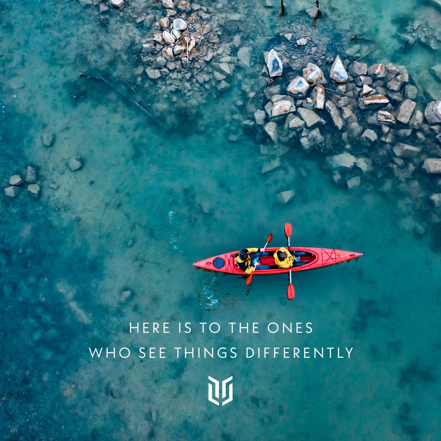
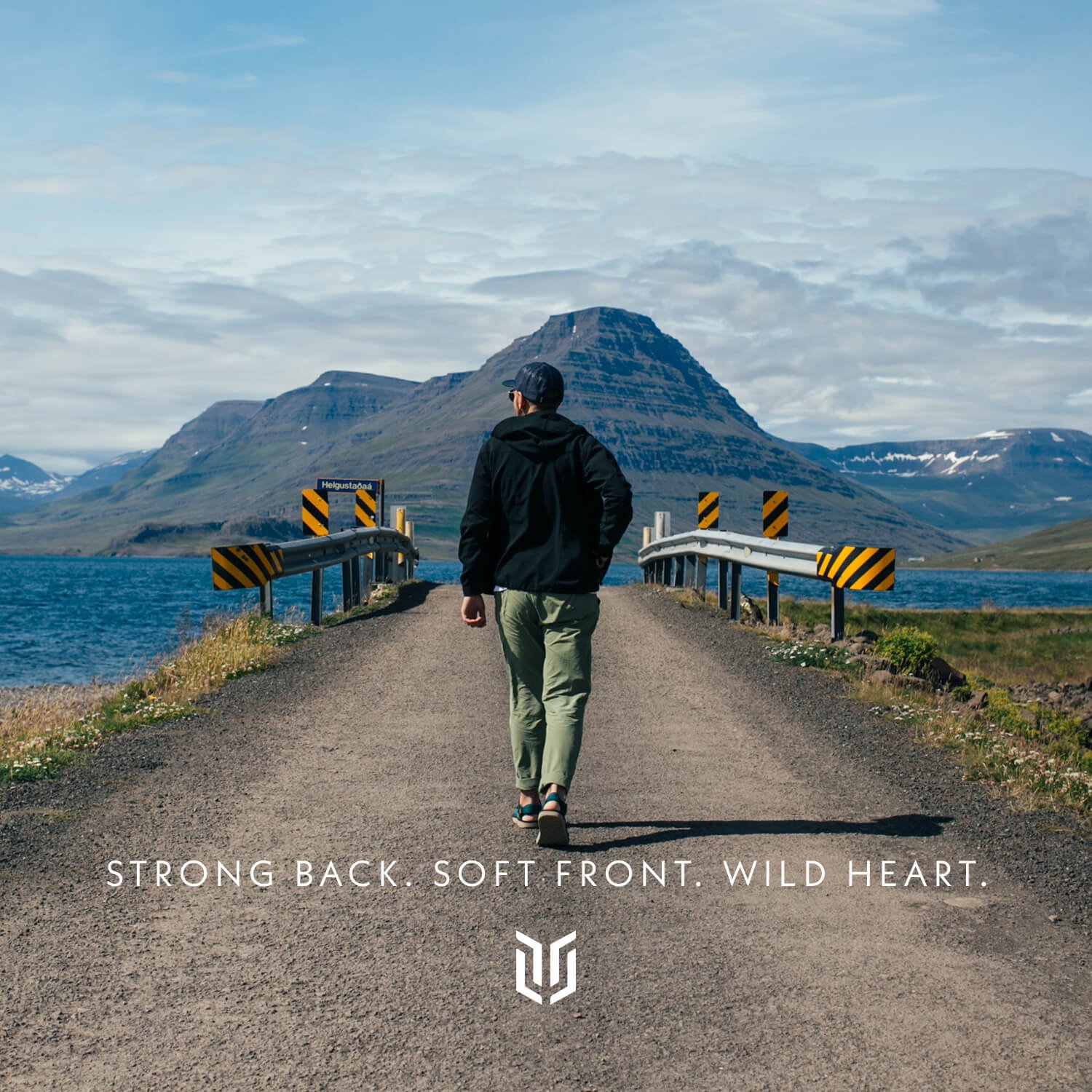
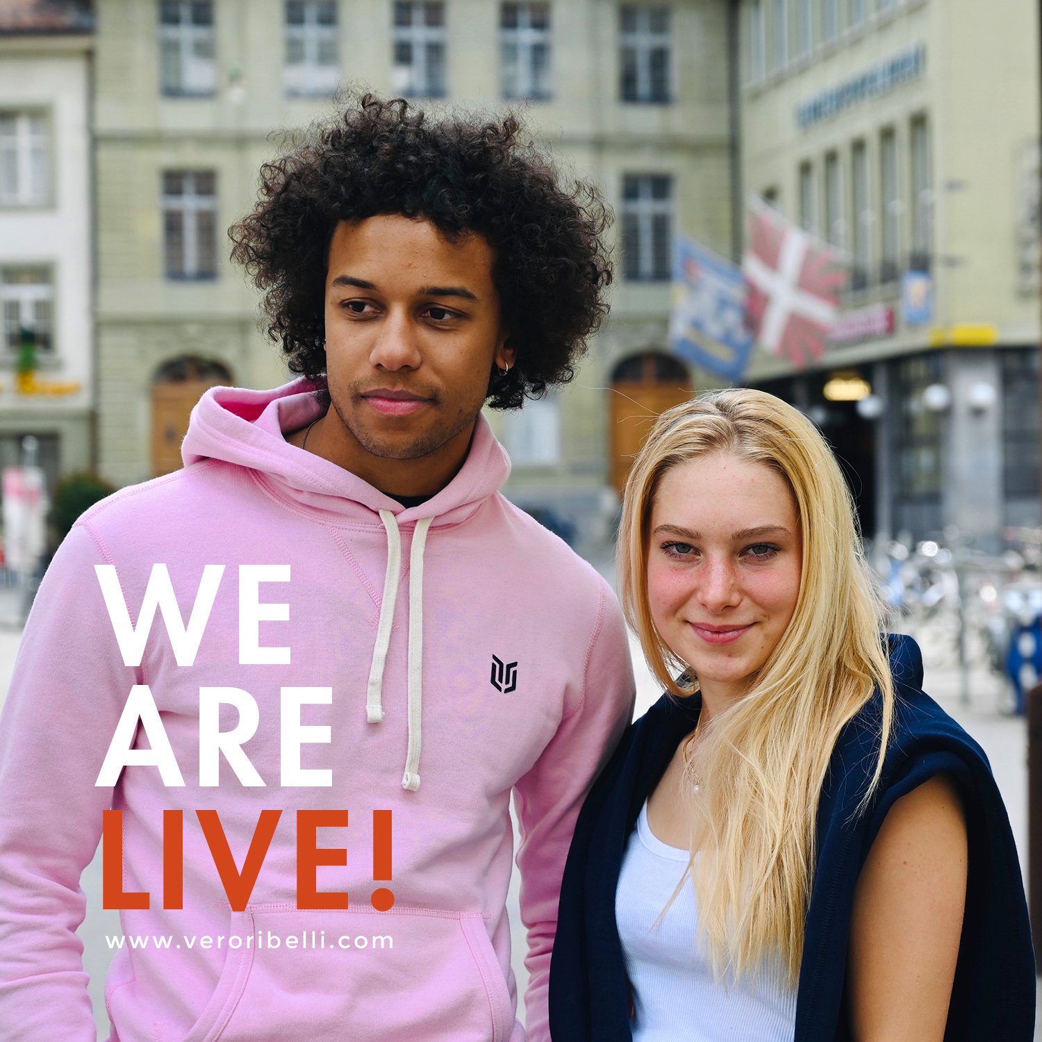
Snapshots of Social Media Content Design
The social media strategy recommended for the streetwear brand was to stand for equality, freedom, justice, peace, and love. The target audience is the free-spirited, fun-loving, strong, wild, bold, and rebellious people working towards a better world. The social media content was designed in line.


Product Photoshoot
Product photos are the primary reason for converting a sale online. 93% of consumers consider visual appearance to be the key deciding factor in a purchasing decision. The core purpose of the brand’s photoshoot was to showcase the garments as premium, and stylish while focusing on the fine detailing of the garments.


Store facade design
The facade of the upcoming store was designed to be appealing to the younger generation while keeping it extremely minimal. The metallic finish recommended on solid black background catches immediate attention and looks premium.

EXPLORE SOME OTHER LATEST WORK
Case studies of some other brands we’ve built.
Branding is at the core of everything we do. Every design, every detail, every decision — all purposefully crafted to strengthen the brand. Our outcome-focused solutions span research, strategy, creativity, engagement, and execution.


