

BRAND IDENTITY / BRAND GUIDELINES / STATIONERY DESIGN / PRODUCT PACKAGING / PHOTOSHOOT / WEBSITE UX & UI
Sustainable Clothing Branding Case Study
Project background: A startup based out of Bangalore, India, with a philosophy of slow fashion wanted us to position its clothing brand as minimal, sustainable, and premium. While it’s a men’s brand, to begin with, in the future the clothing company plans to expand into the kids’ category as well. With generations of his family in the clothing business (Bhatia Apparels), the founder, Mr. Rahul Bhatia, wanted us to create a brand identity that would work across all their current and future product segments and bring their brand proposition alive.

Brand Archetype
The Everyman: Zeruri Clothing
They are perceived as empathetic and understanding on an emotional level.
These brands usually put themselves on an equal footing with their customers. Every man’s core desire is to connect with others and just simply "to belong". Everyman brands value the regular and uncomplicated pleasures of life, and they value things like common sense, sincerity, and hard work. They also usually fear standing out or doing anything that could lead to rejection.
Archetype Values: Well-being / Fairness / Respect / Eco-friendly
Personality attributes: Down-to-earth / Humble / Honest / Non-pretentious / Relatable / Authentic

Brand Identity Design
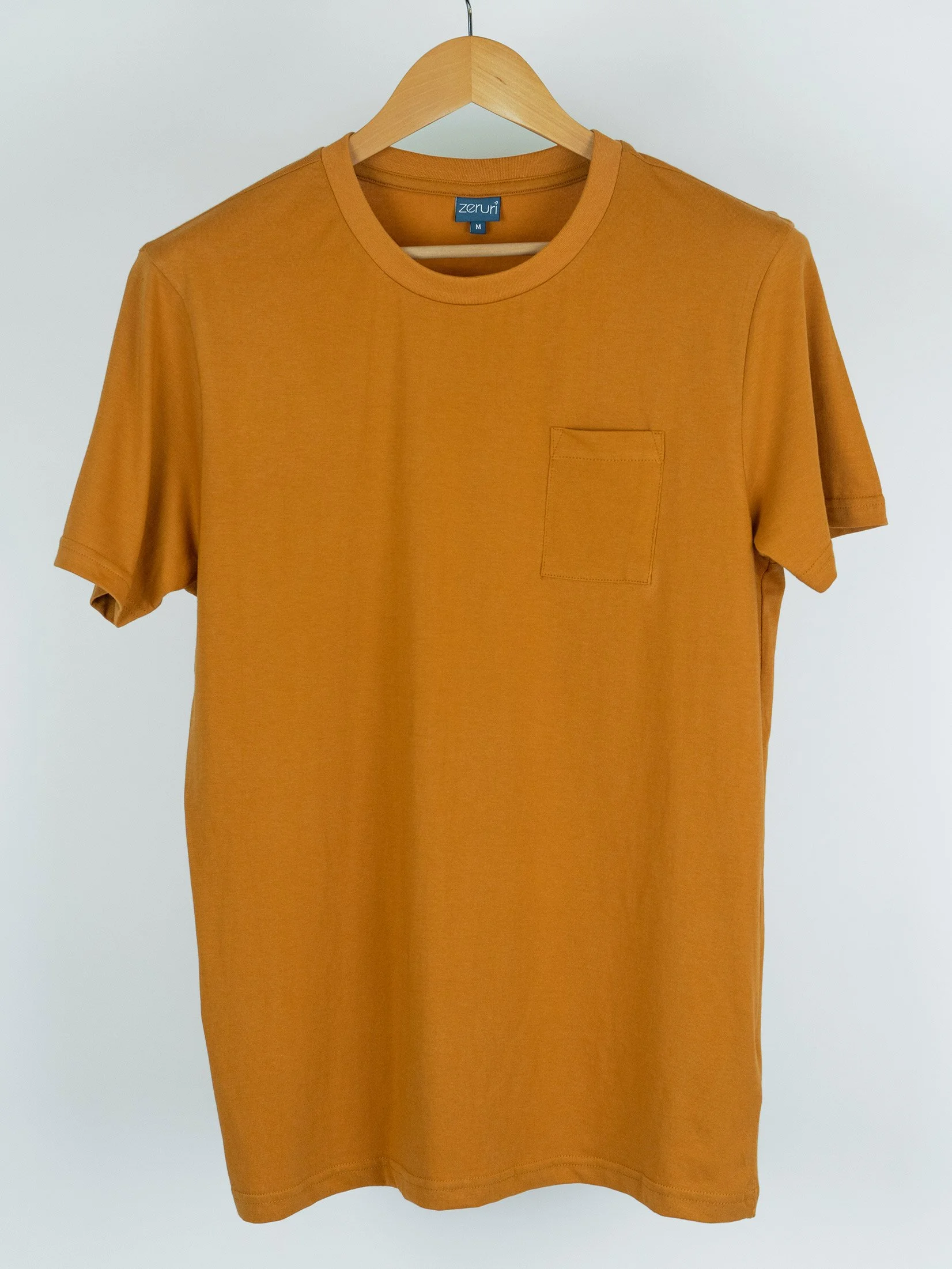
For effective sustainable clothing branding, the logo was designed using a custom-crafted organic typeface that is minimal in its construction. The round edges were given to add an organic touch and also make the brand a unisex identity. The logo was designed to be a simple and minimal logo unit that is comfortably visible even in small sizes. The minimal construction also made it easy to emboss and engrave on all surfaces and materials.
The brand is positioned as an eco-conscious revolution, meant to slow down the fast fashion trend which is responsible for adding enormous dumps/waste to our land and water bodies.
The brand mascot, the ‘joyful whale’ is a symbolic representation of the future we are looking forward to. Whales are endangered and also very unique/interesting for all, which made them a highly relatable mascot for the brand.
Recommended logotype: Word-mark
Graphic family: Organic
Look: Simple / Minimal / Elegant / Neat and Clean / Premium
Feel: High Quality / Thoughtful / Value for money / Sustainable


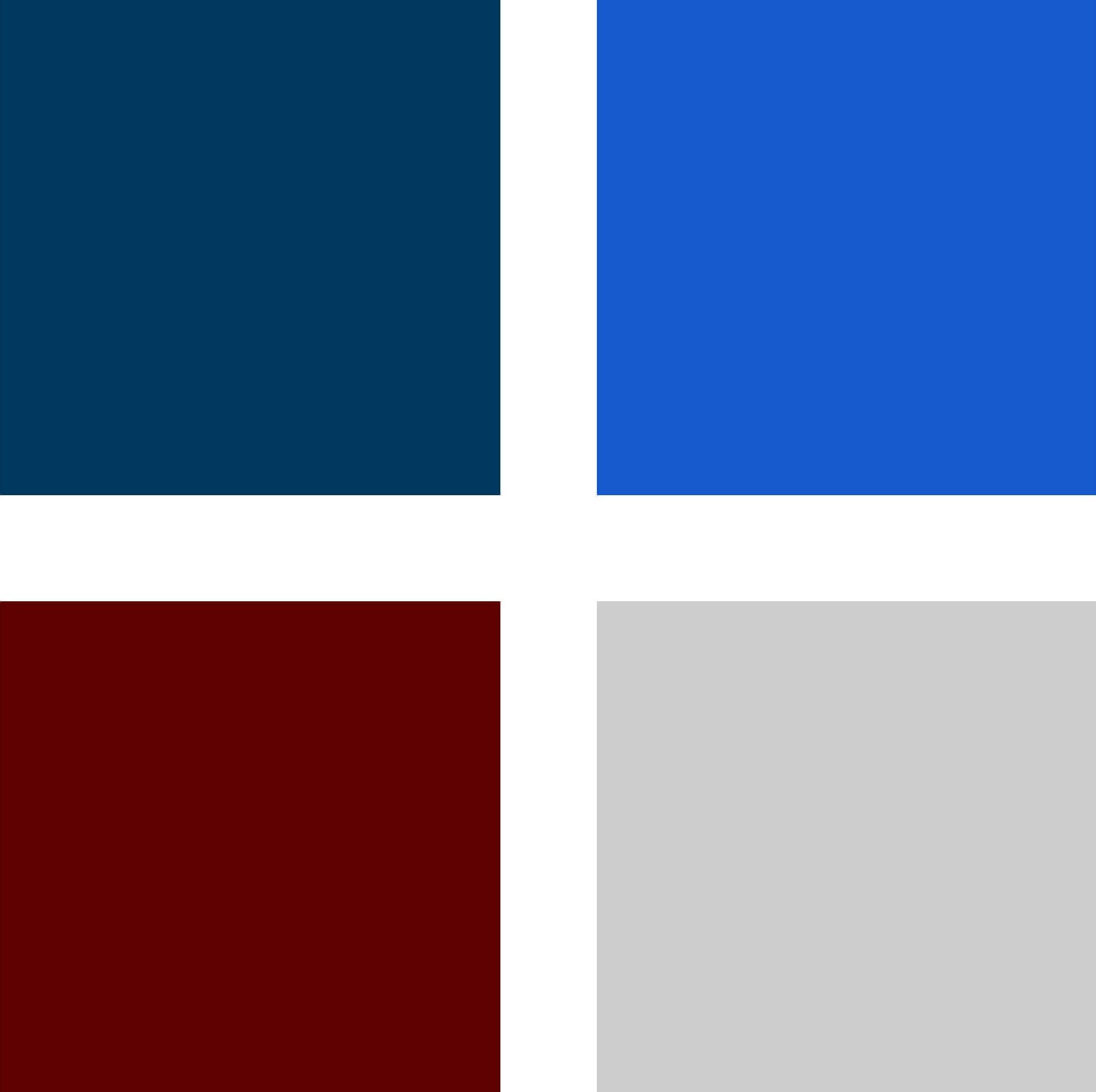
The brand color palette for an effective sustainable clothing branding feel.
Brand colors were kept minimal in line with the overall branding theme and personality. Since the brand caters to men, the colors were chosen while keeping in mind the universally most popular colors among this target segment. The chosen colors also became the primary colors of Zeruri clothing later on. White and Black were universally allowed for application.
Blues - Blue symbolizes trust, loyalty, wisdom, confidence, intelligence, faith, truth, and heaven. Blue is considered beneficial to the mind and body. It slows human metabolism and produces a calming effect. Blue is strongly associated with tranquillity and calmness.
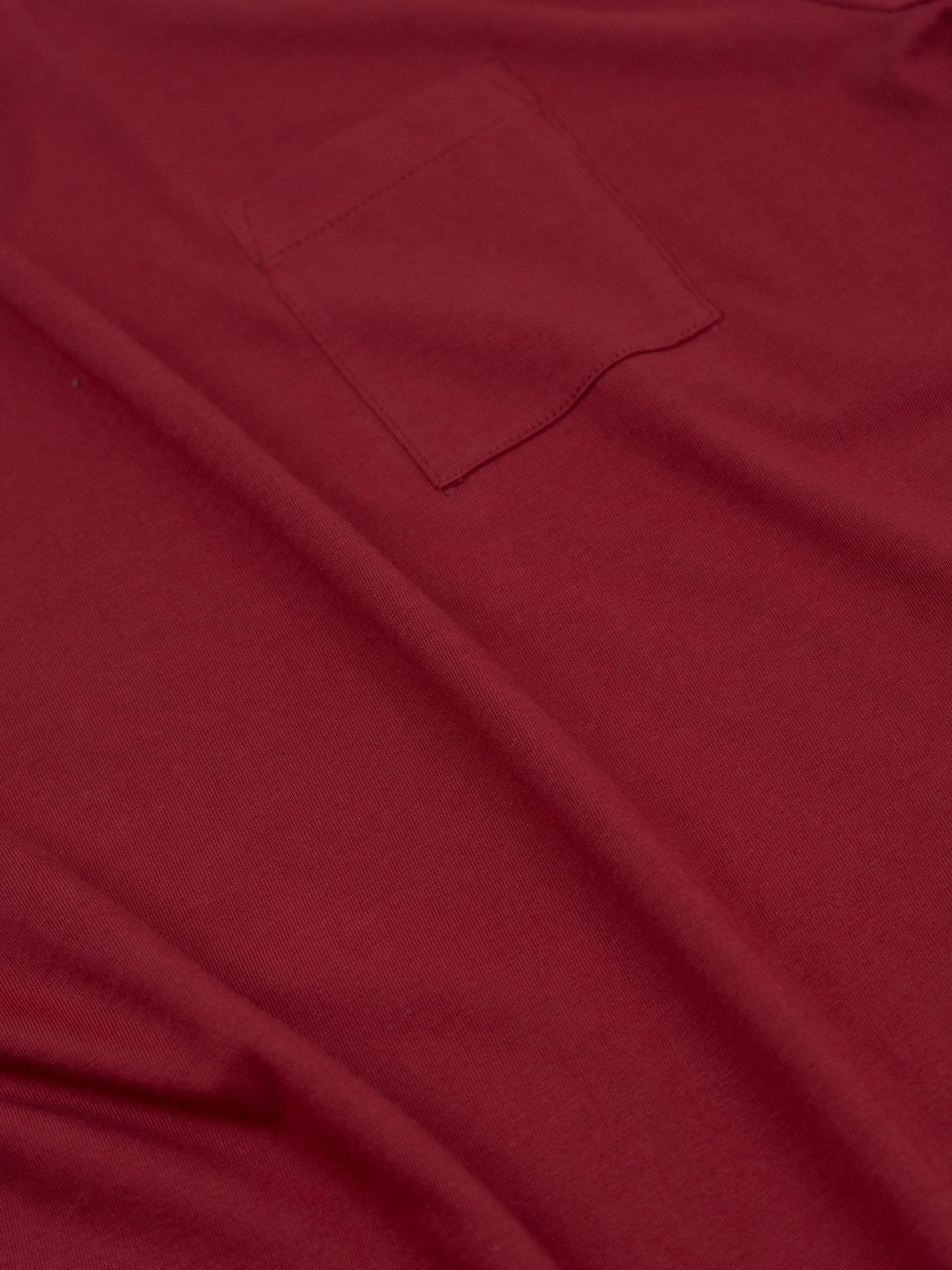
Royal Maroon - Maroon is often used to represent intense and passionate things such as; confidence, creative thoughts, excitement, strength, risk, passion, love, ambition, courage, strength, warmth, and beauty.
Light Grey - Grey is a cool, neutral, and balanced color. The color grey is an emotionless, moody color that is typically associated with meanings formal, conservative, and sophisticated.
Brand Recycling Icon
While approximately 60% of the brand’s clothing collection is sustainable, the startup is proud to have 100% eco-friendly packaging. The brand recycling icon was designed using the brand mascot, the whale, which connected the brand to the core of sustainability. The vision of Zeruri is to have 90-95% sustainable clothing in the next few years.


Logo Exclusion Zone
The exclusion zone is the designed clear space that ensures that the logo has some breathing space around it. It is to ensure that the logo is always visually distinct. Since our logo is minimal with a lot of negative space, the logo did not need much of a clearance/exclusion zone. The zone was kept equal to the height of the arrow icon.
Brand Typography Family
A crucial ingredient in a clothing brand, the family of fonts was chosen to evoke minimalism and simplicity in the look and showcase Zeruri's best sides - ‘top quality fabric’ and ‘sustainable clothing brand’. Fonts are an integral piece of a brand. The choice of text style was made in order to make a huge impact on the 'feel' of the business.

Demonstration of Typography and Color Palette Usage
The brand typography and color usage guidelines were recommended to ensure consistency in the brand’s communication and complete uniformity in style and formatting for the brand.

Demonstration of Color Usage
These creatives show the importance and weight-age of different brand colors and the application of the brand guidelines.

Branded Drawstring Bag Design
We designed a cloth bag using the leftover fabric from the manufacturing units with a clear message and a visual representation of the whale on the surface of the sea/ocean. Giving every last piece of garment a purpose - putting sustainability into practice - the cloth bag was designed to help build brand awareness and reinforce the brand’s primary mission of sustainability.

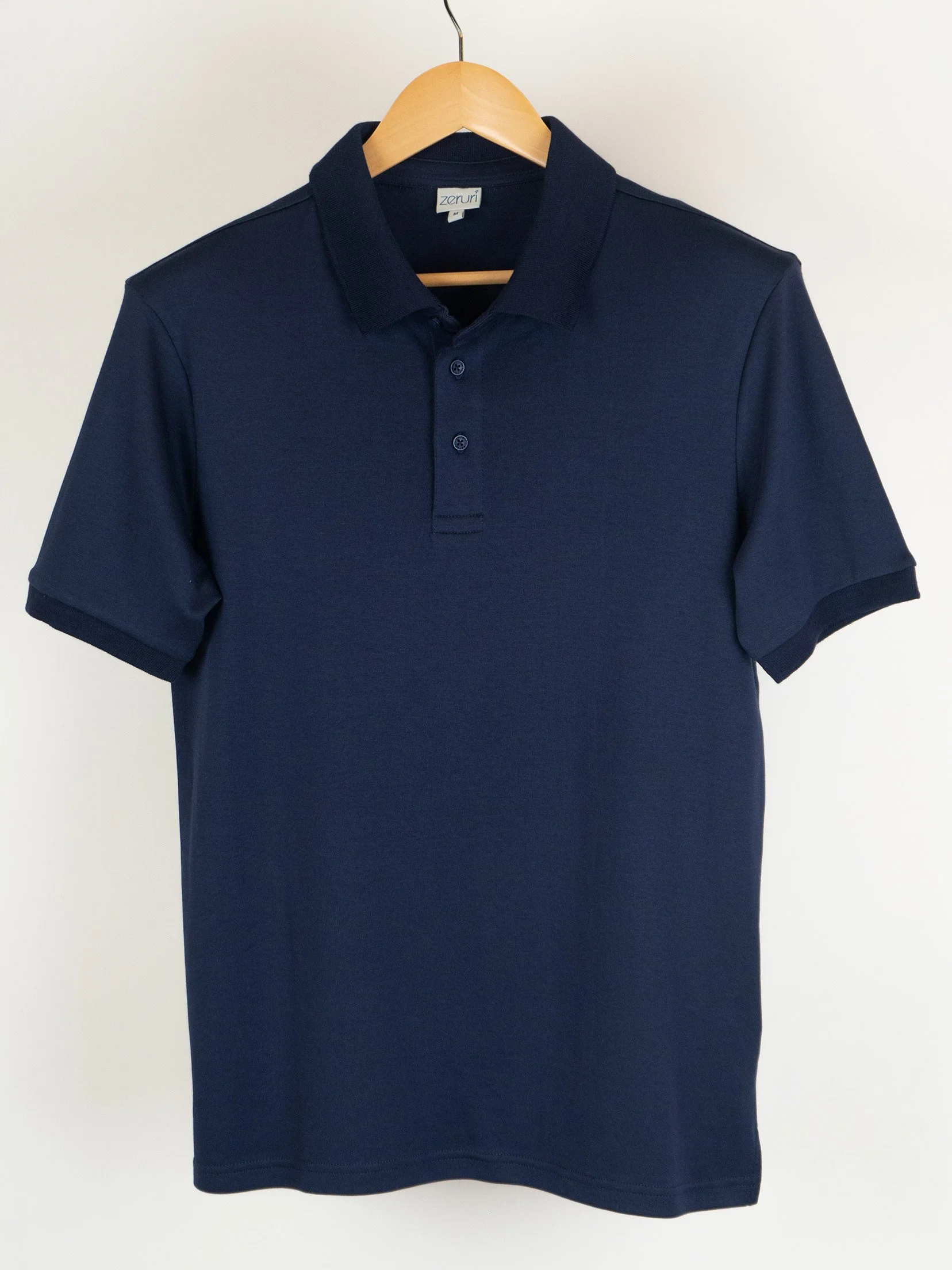
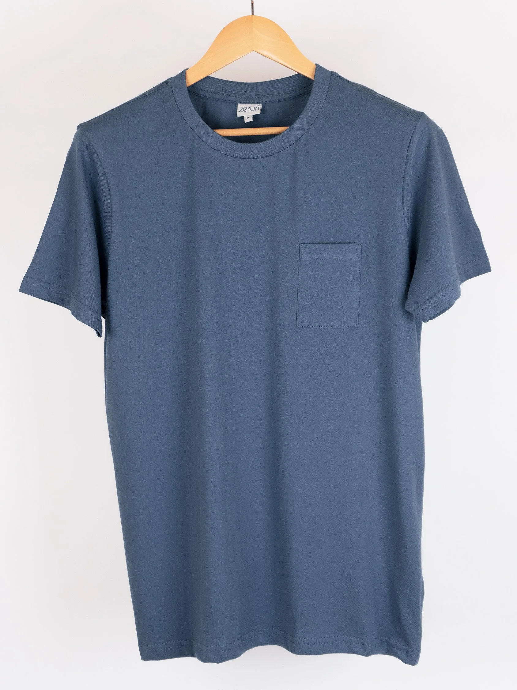
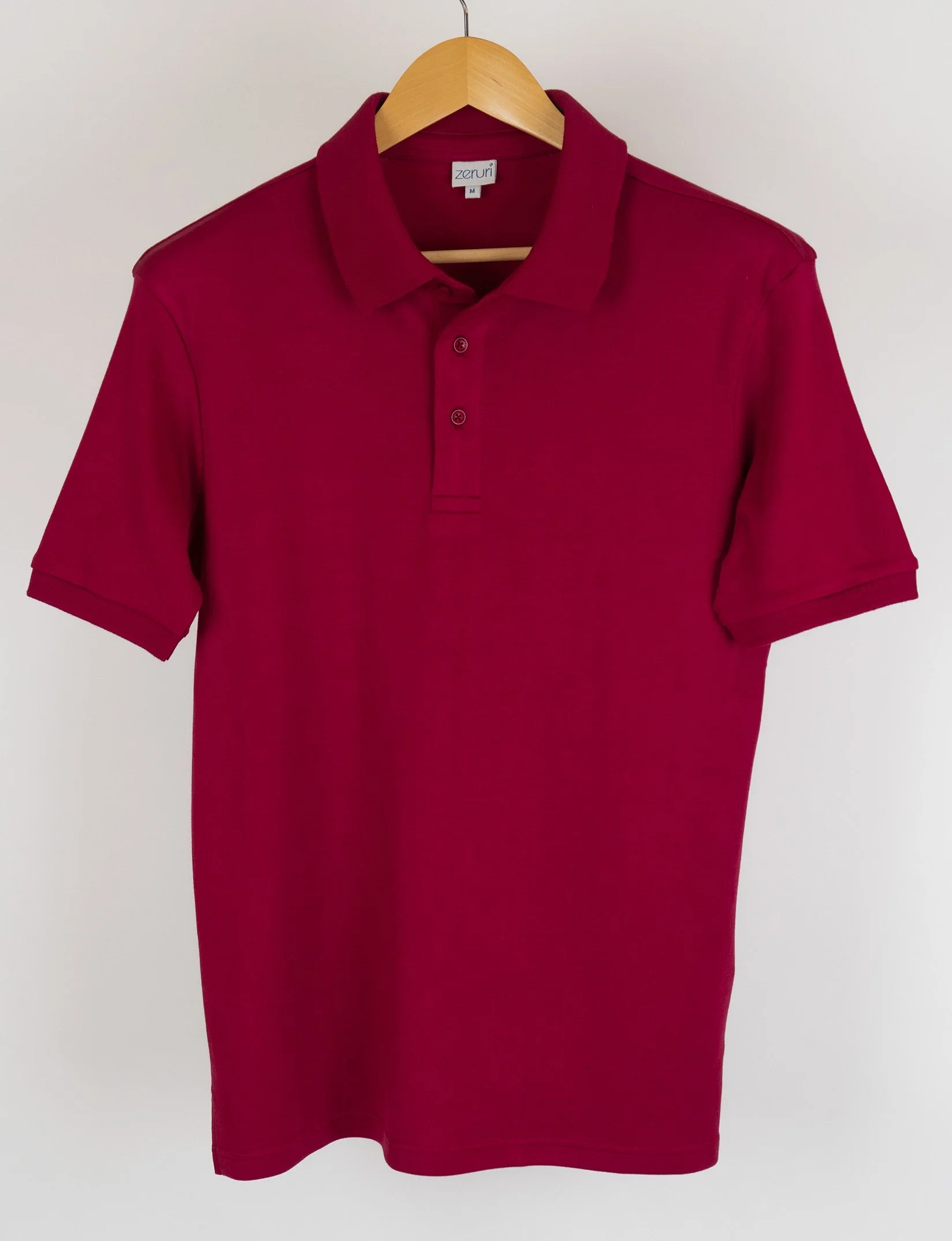
Brand Stationery & Product Branding
Branded stationery and collateral were designed to bring alive the sustainable clothing branding essence. They were designed to generate trust, communicate brand values, showcase professionalism, and strengthen the brand recall value at every touch point.


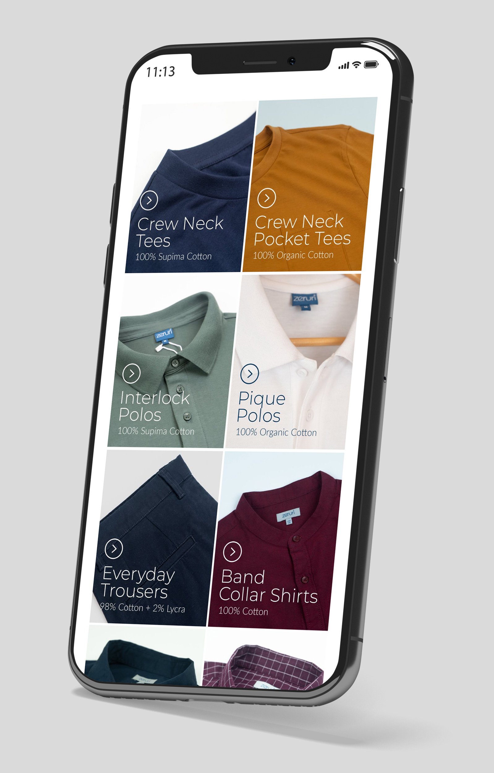
Website UX & UI Design
A website is the backbone of any business’s online presence. We built a memorable, conversion-focused, and future-proofed website and e-commerce store in alignment with the core sustainable clothing branding strategies.
We started by understanding the audiences and their mental model and married these insights with creativity to deliver impactful user experiences that produced the desired results, better engagement, and higher conversions. Providing a user experience that strengthened the brand perception, we translated the brand’s essence into the online store/website.


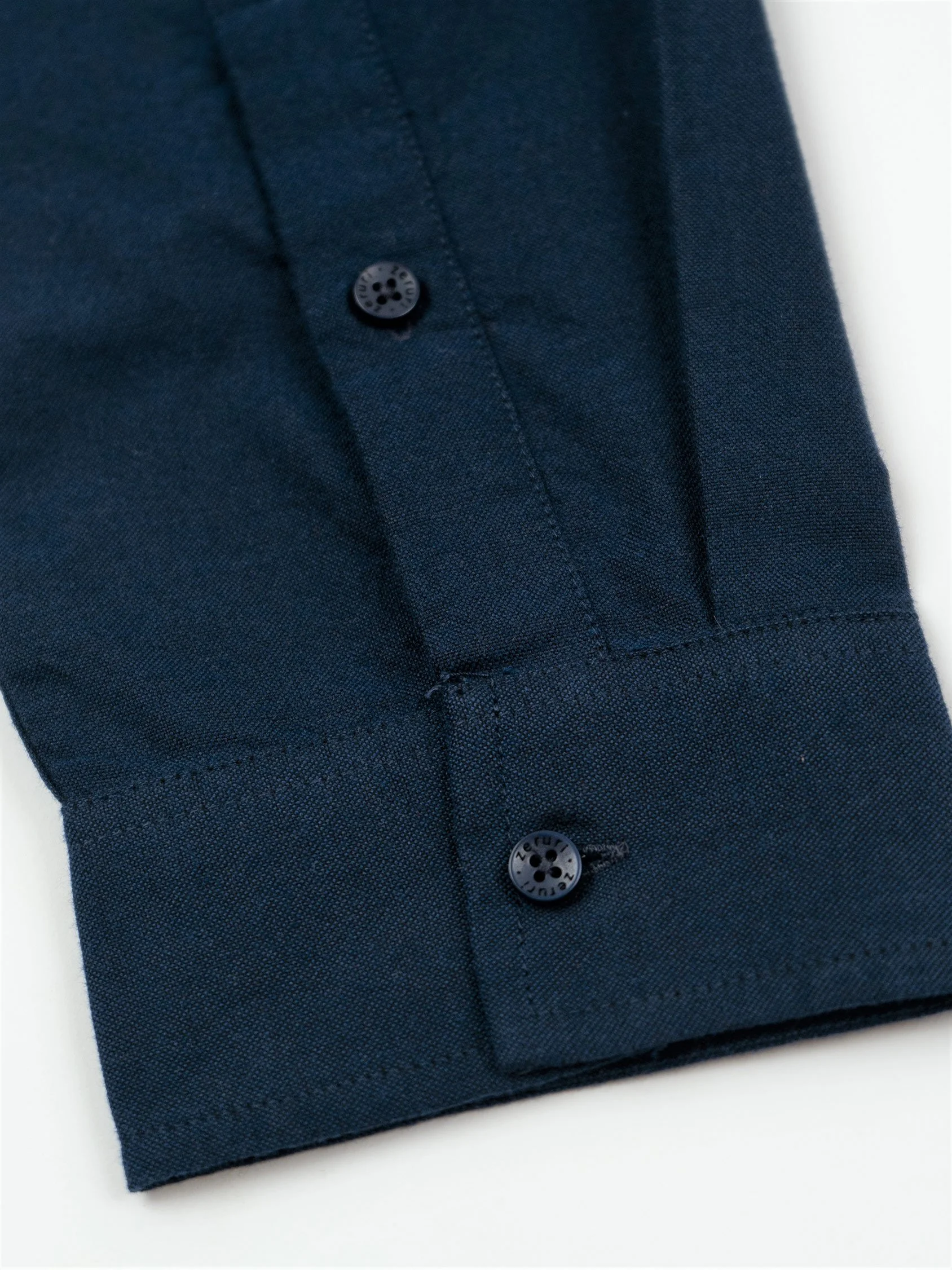
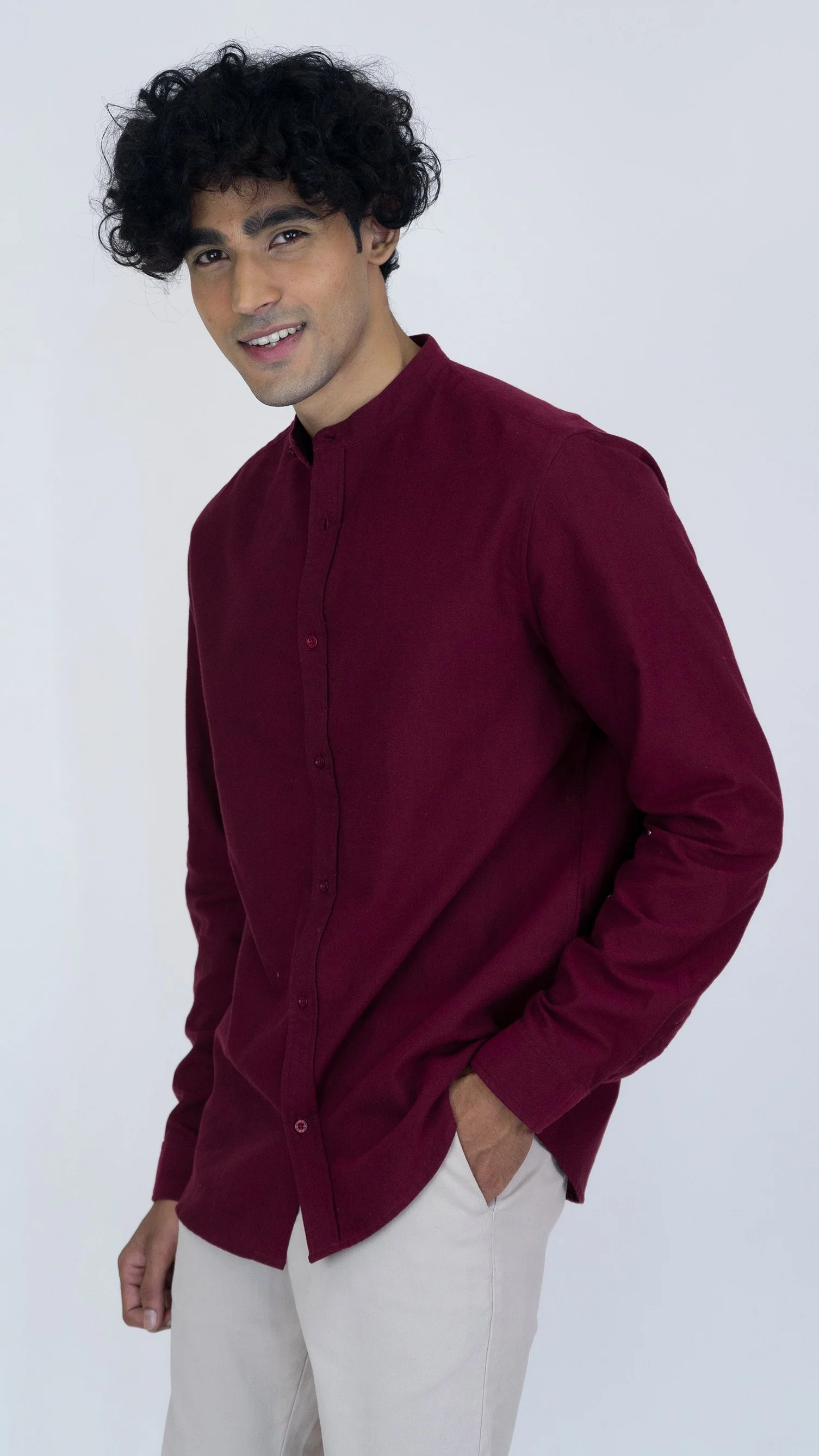
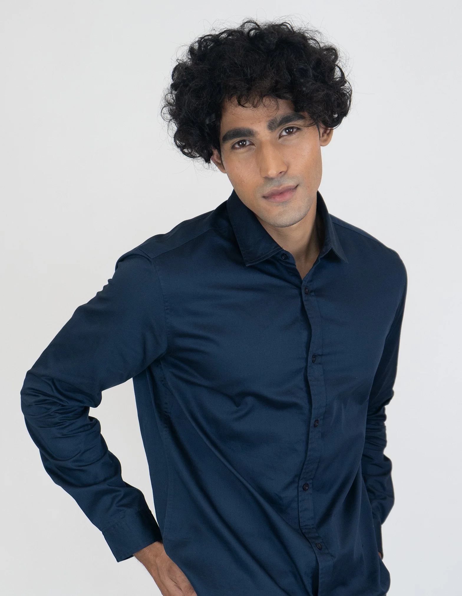
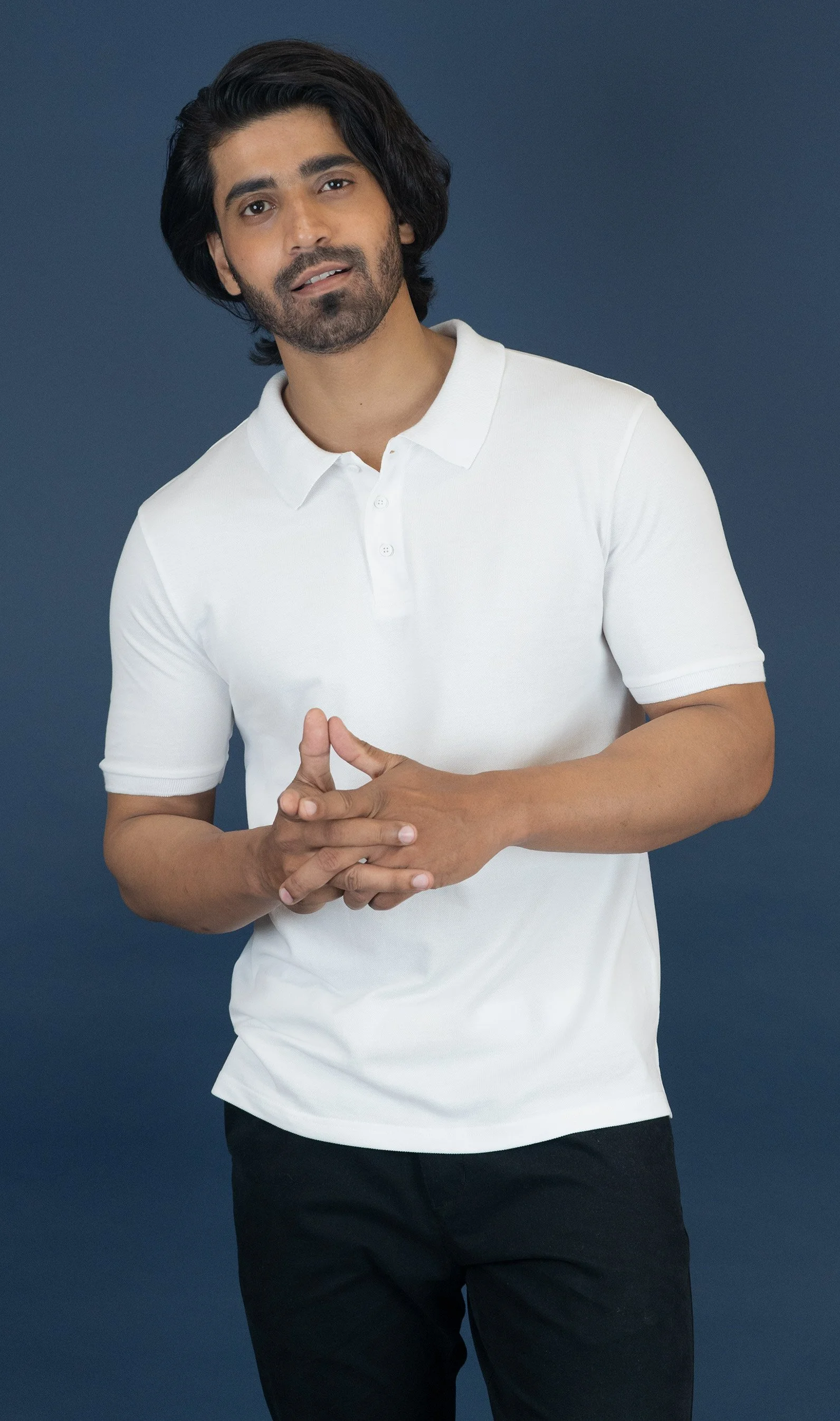
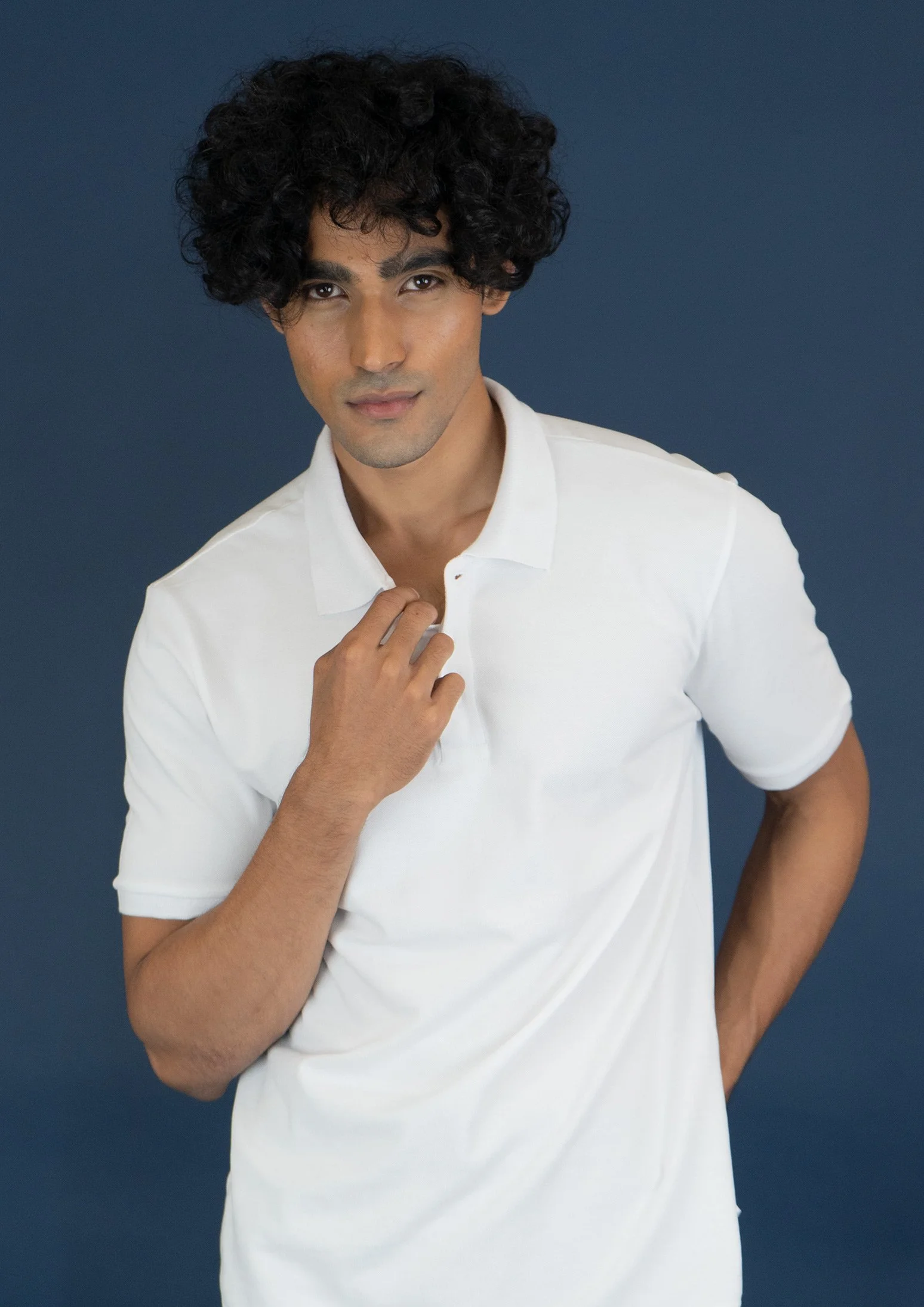
Model and Garment Photoshoot
Product photos are the primary reason for converting a sale online. 93% of consumers consider visual appearance to be the key deciding factor in a purchasing decision.


Store Facade Design
A great façade has the power to grab attention and keep it. The unique facade was designed to bring alive sustainable clothing branding strategies, and unique style and help it stand out from the surrounding buildings, thus creating a point of differentiation.

EXPLORE SOME OTHER LATEST WORK
Case studies of some other brands we’ve built.
Branding is at the core of everything we do. Every design, every detail, every decision — all purposefully crafted to strengthen the brand. Our outcome-focused solutions span research, strategy, creativity, engagement, and execution.


