

BRAND IDENTITY DESIGN / BRAND EXPRESSION SYSTEM / PRODUCT PACKAGING DESIGN / BRAND STATIONERY DESIGN
North Indian Restaurant Branding Case Study
Project background: A north Indian cuisine-based fine dining restaurant chain startup, founded by Mr. K. Goenka and, Mr. Rajesh Rastogi, wants to enter and establish itself in the southwest market of India. The founders hail from Rajasthan and Uttar Pradesh and they aim to bring authentic Rajasthani food from the well-known ‘Thakur’ community to Maharashtra, Goa, and Karnataka. The owner duo requested us to design a bold yet minimal brand, rooted in the traditional ‘Thakur’ culture and bring alive the feel of their north Indian delicacies through the brand identity.

Brand Archetype
The Hero
The Hero’s purpose in life is to improve the world.
They inspire others to believe in themselves as much as the hero believes in them. They inspire, motivate, and cheer-lead their customers to do more, be more, and have more. The hero wants to leave a legacy and doesn’t mind sacrificing for it. This makes the hero quick on his feet, making fast and smart decisions to save the world.
Values: Best-in-class / Perfection / Mastery / Authentic
Personality attributes: Genuine / Optimistic / Protective / Nurturing

Brand Identity Design
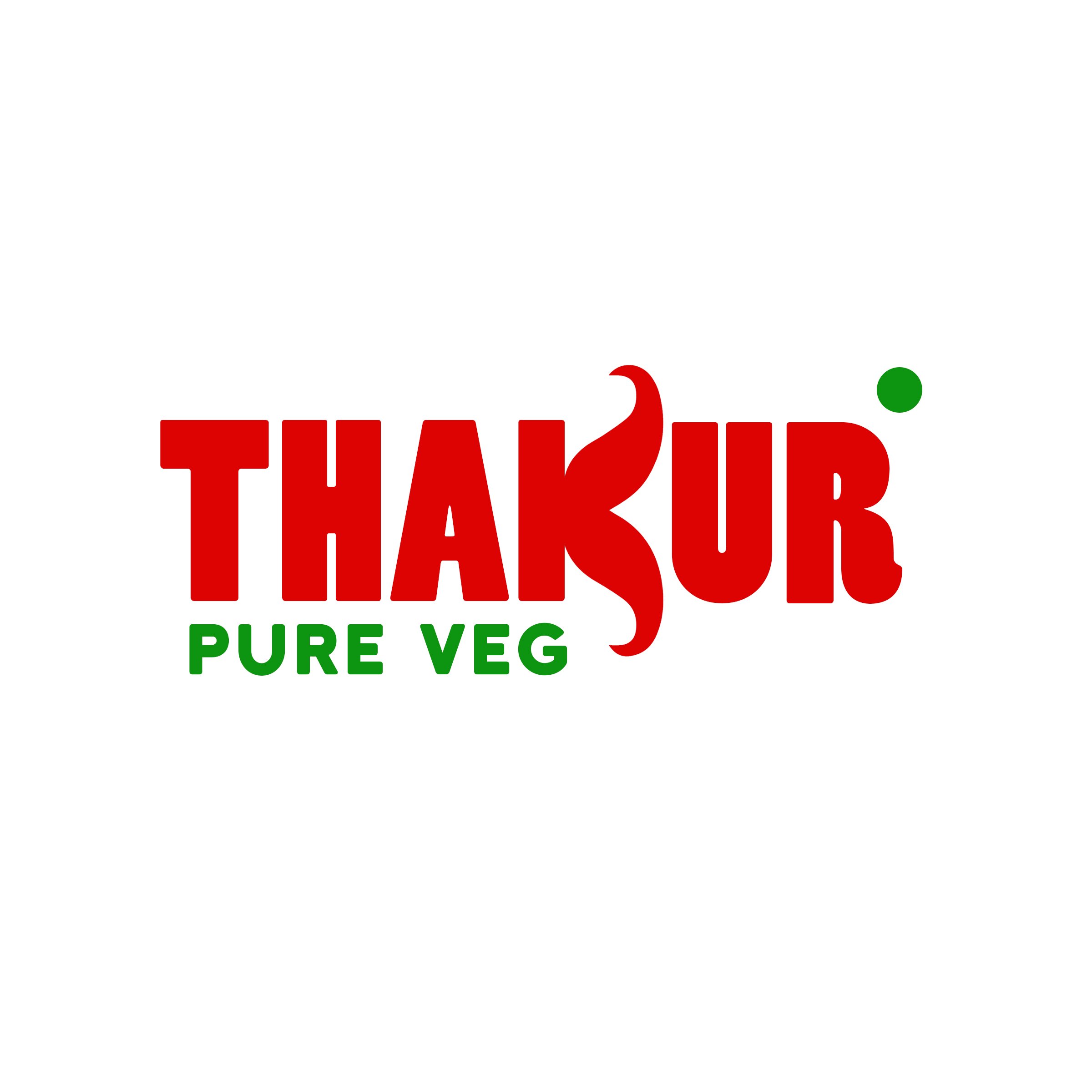
The logo was designed to bring alive the essence of the ‘Thakur’ community in the identity. The letter ‘K’ in the logo was designed to denote fat curved mustaches, traditionally associated with Thakur men, and also to represent two red chilies, a key food ingredient used in almost all Rajasthani dishes. The typefaces were kept bold, aesthetically pleasing, and inviting. The logo is a word-mark-type brand icon.
Thakurs have predominantly been treated as non-vegetarians. Hence a special emphasis was given to depicting that the brand is vegetarian by placing a green dot alongside the logo.
Graphic family - Organic (Food)
Look: Premium / Minimal but Bold / Appetizing
Feel: Pure & Natural / Premium
Brand Typography Family
Typography is the major element in a design that speaks to the customers. Choosing the right fonts that reflected the brand was essential for communicating the correct message to customers. The fonts were recommended to consistently showcase the bold yet minimal look that the brand wanted to convey.

Brand Color Palette
The key colors, chilly red and coriander green, were chosen in line with the premium and pure look and feel that the brand wanted to evoke.
In the food and hospitality industry, color has a huge role in visual perception, emotion, and human behavior.
Red is known to stimulate and excite and relates closely to passion and energy. In relation to food, red enhances the appetite. When we see red we get an energy boost, similarly, this happens when we are ready to feast and neurons fire up in the hypothalamus part of the brain.
Green is the main color associated with being fresh, healthy, natural, organic, or vegetarian, and is now a symbol of health and well-being.

Restaurant Signage
To reach hungry customers, eye-catching signage was designed to help the diners know where the restaurant is located. Unlike other means of advertising like radio, TV, and newspaper, signage is cost-effective.

Takeaway Packaging
The takeaway packaging was designed as an extension of the restaurant’s brand identity and, as such, to carry the values and essence of the brand. Strong branding on the delivery of food containers was recommended to showcase the brand to the customers and to serve them as a reminder about where their food was delivered from. The thought was that over time, brand recognition would make customers consider the brand directly, thus encouraging them to place orders with the restaurant directly, and not through random third-party food apps.

Menu Card
A good restaurant menu design is key to the restaurant’s marketing plan. The restaurant’s menu card was designed to express the eatery’s personality, focus on overall operations, promote profitability, establish the budget, and keep the brand fresh in the customer’s mind.

Restaurant Uniform
Employees’ uniforms are an integral part of the restaurant brand’s identity. The uniforms were designed to help increase brand recall and also let the customer know that the brand cares about customer service and cleanliness.

Restaurant Facade Design
A great façade has the power to grab attention and keep it. The restaurant brand’s facade was designed to offer the customers the opportunity to connect and associate themselves with the brand’s personality. The unique style was designed to make it stand out from the surrounding stores, thus creating a point of differentiation for the restaurant branding.

EXPLORE SOME OTHER LATEST WORK
Case studies of some other brands we’ve built.
Branding is at the core of everything we do. Every design, every detail, every decision — all purposefully crafted to strengthen the brand. Our outcome-focused solutions span research, strategy, creativity, engagement, and execution.


